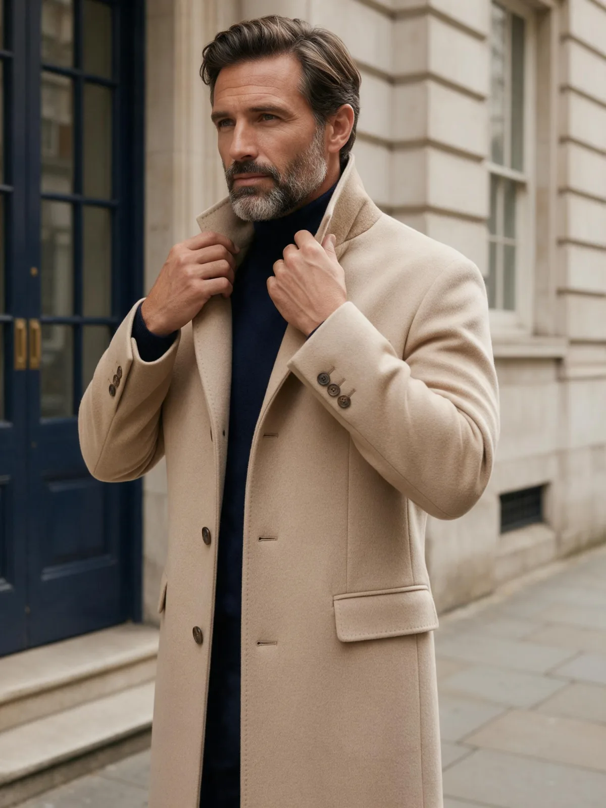
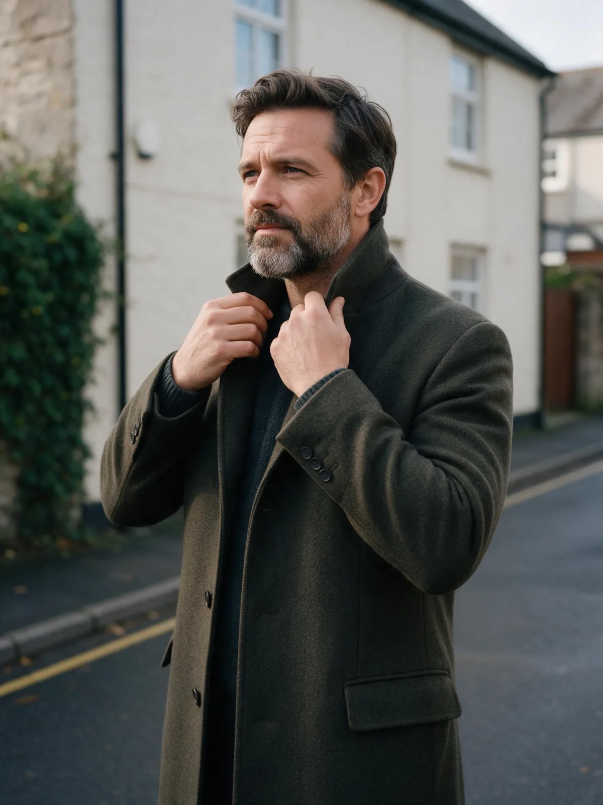
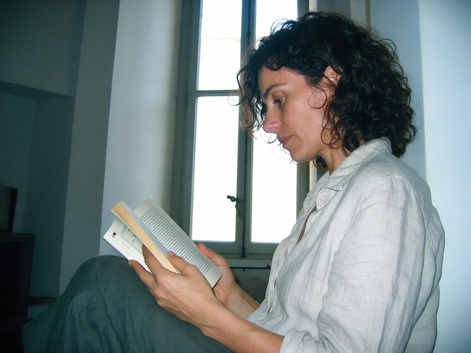
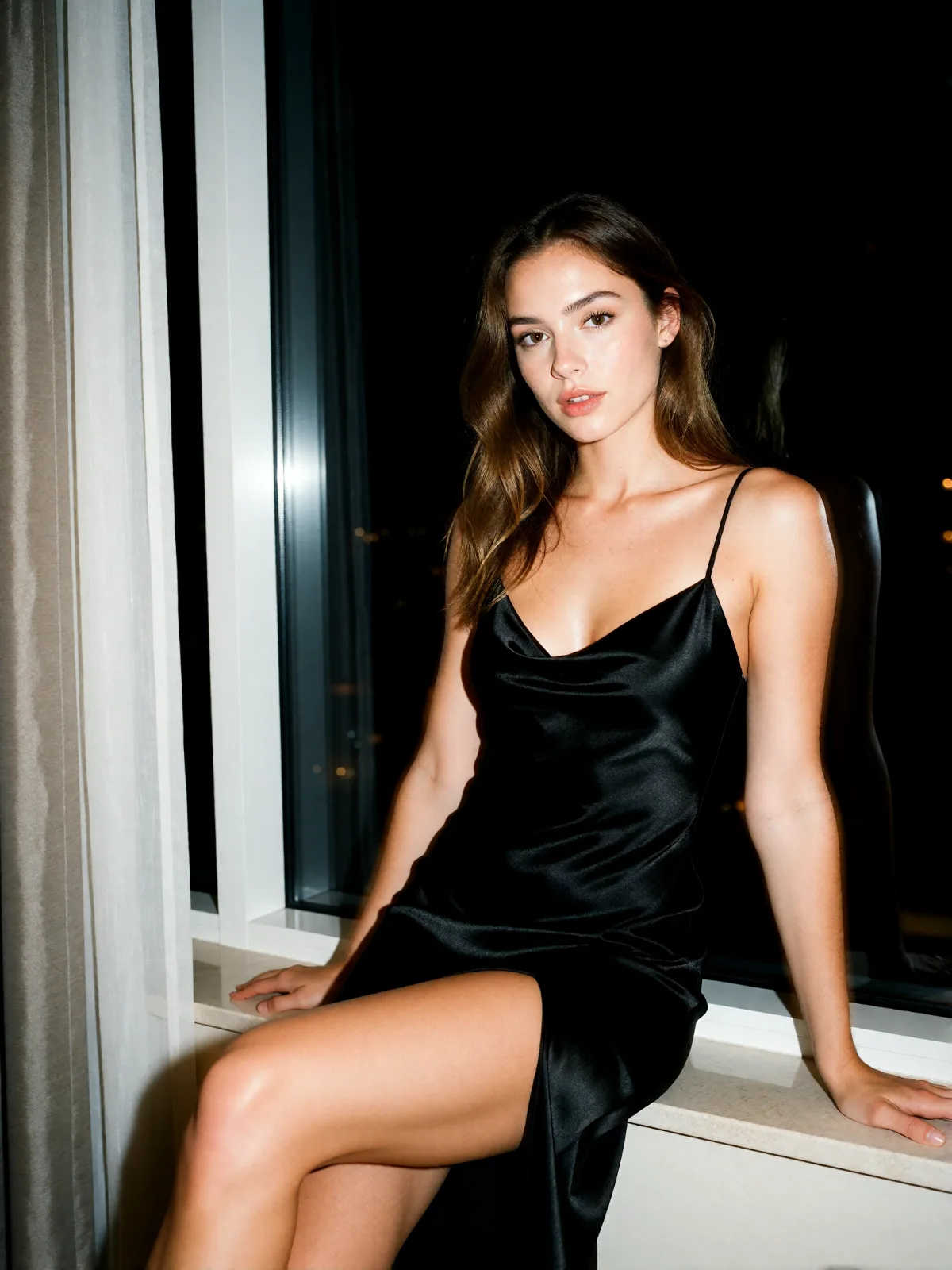
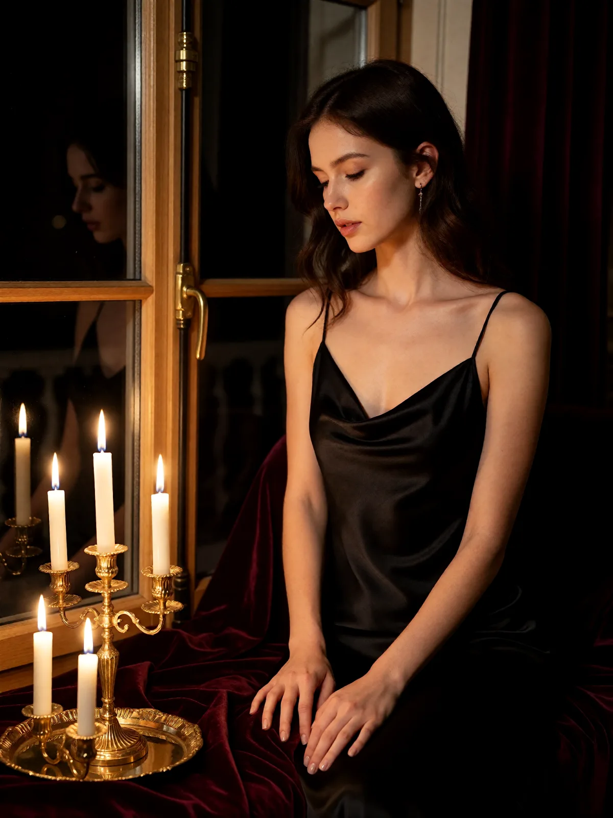
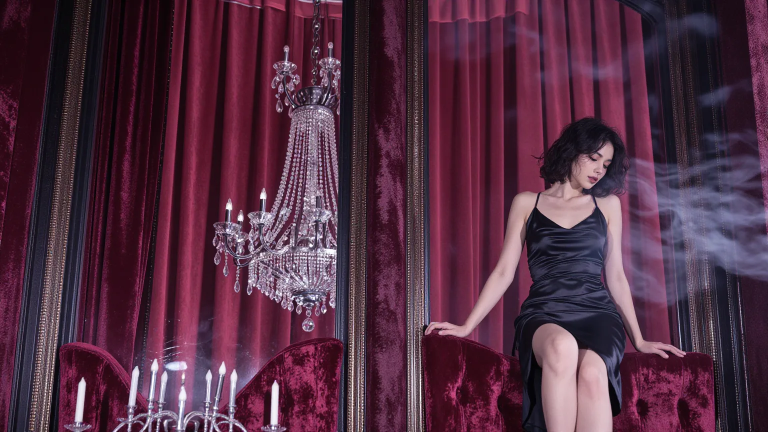
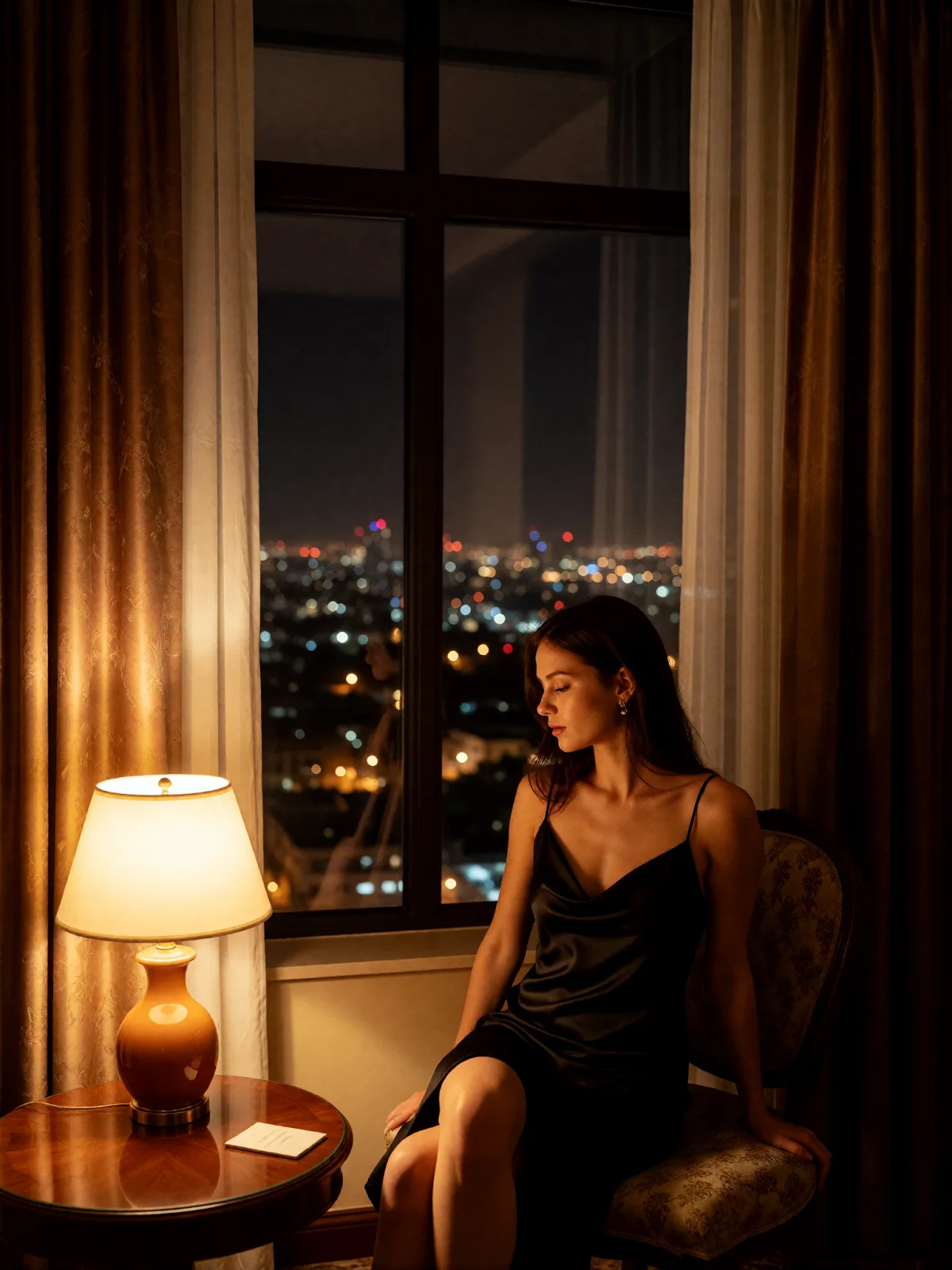
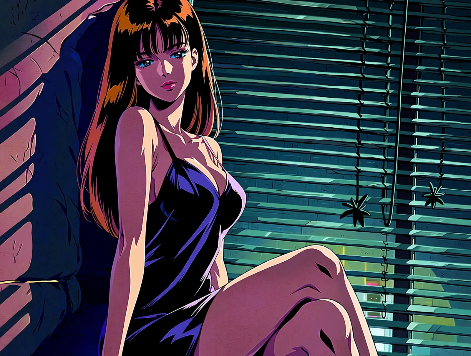
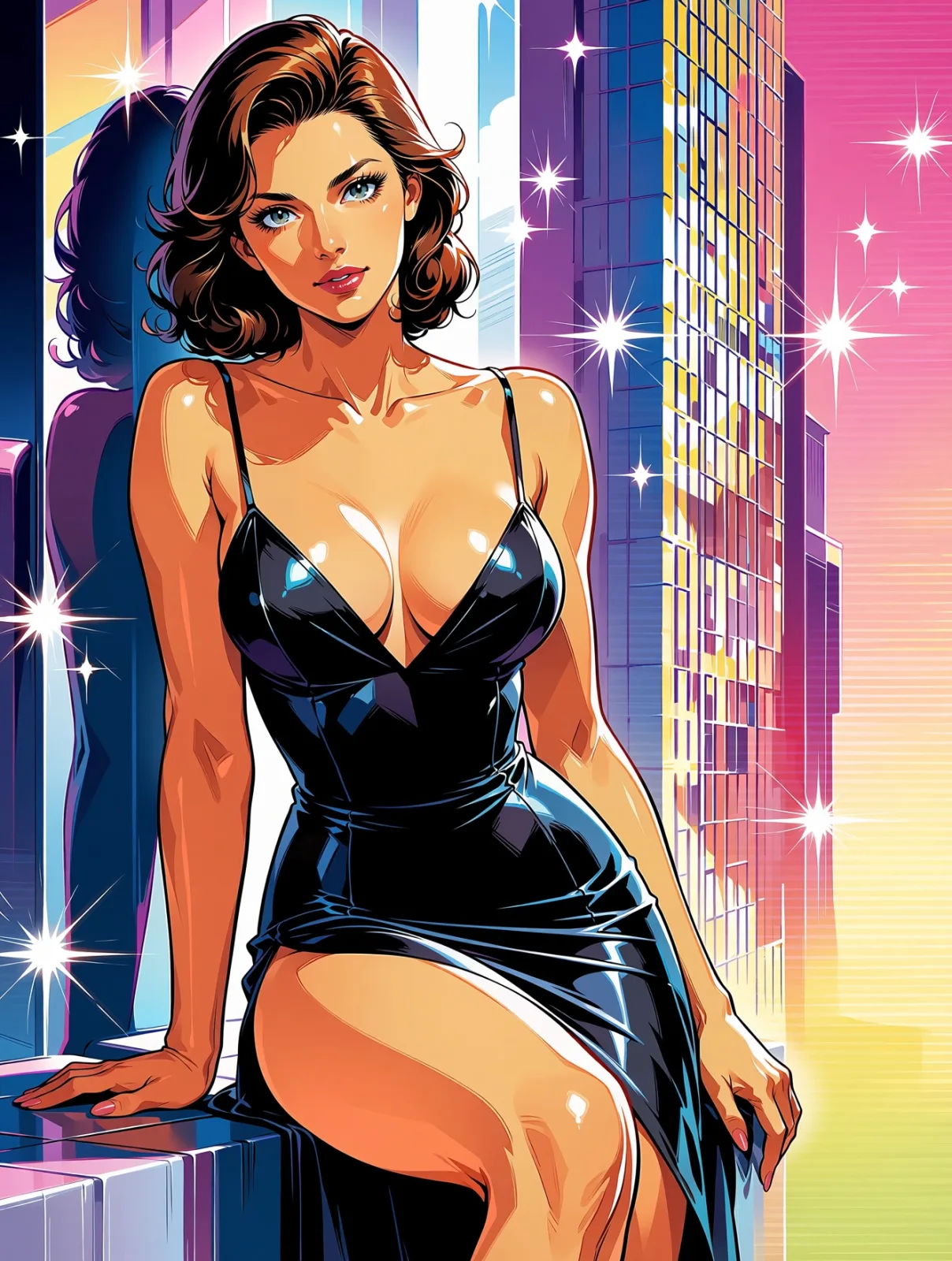
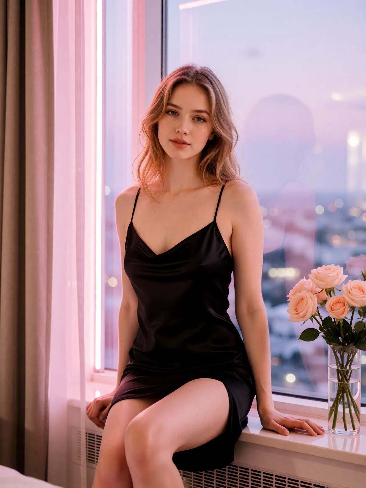
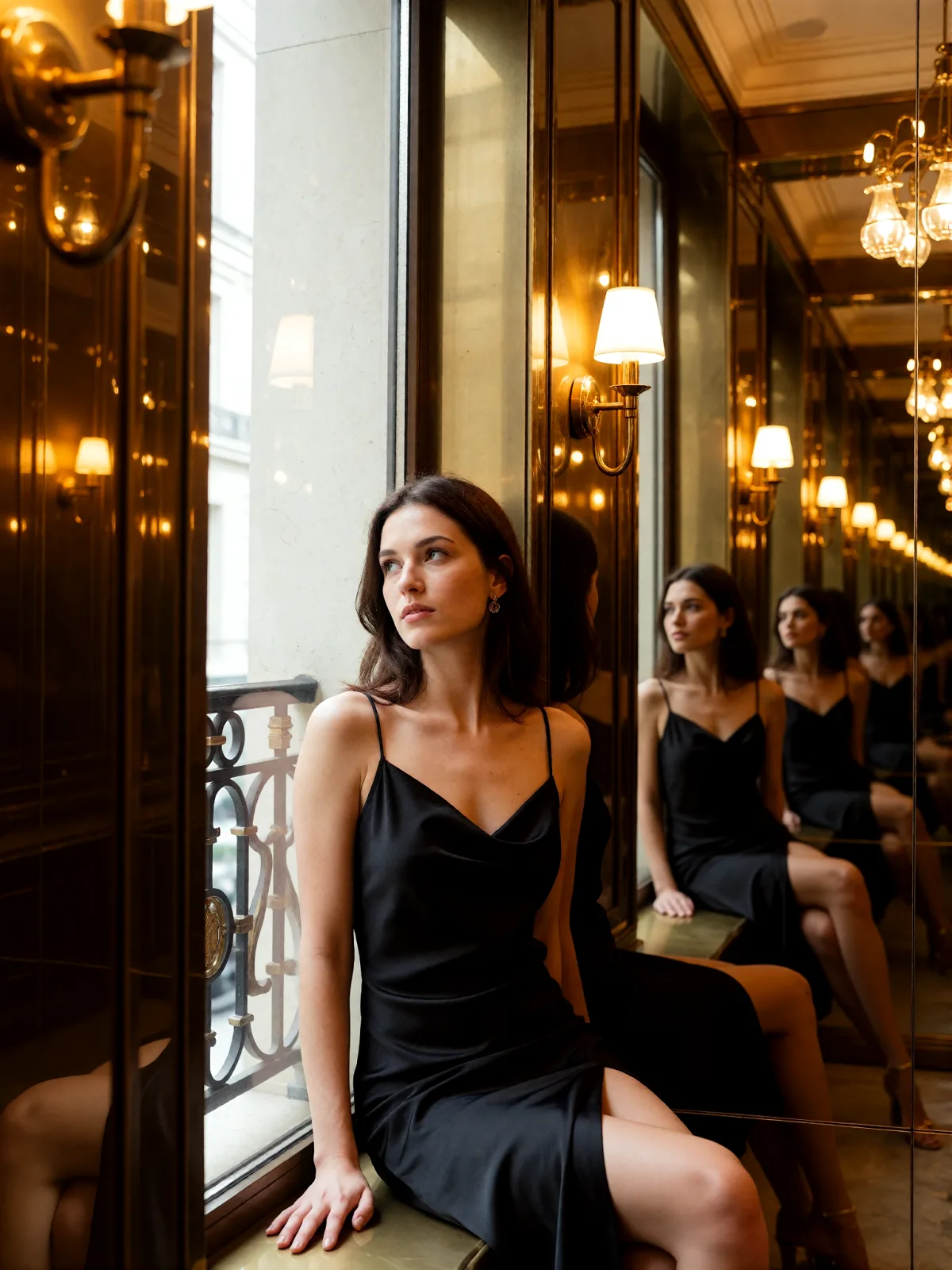
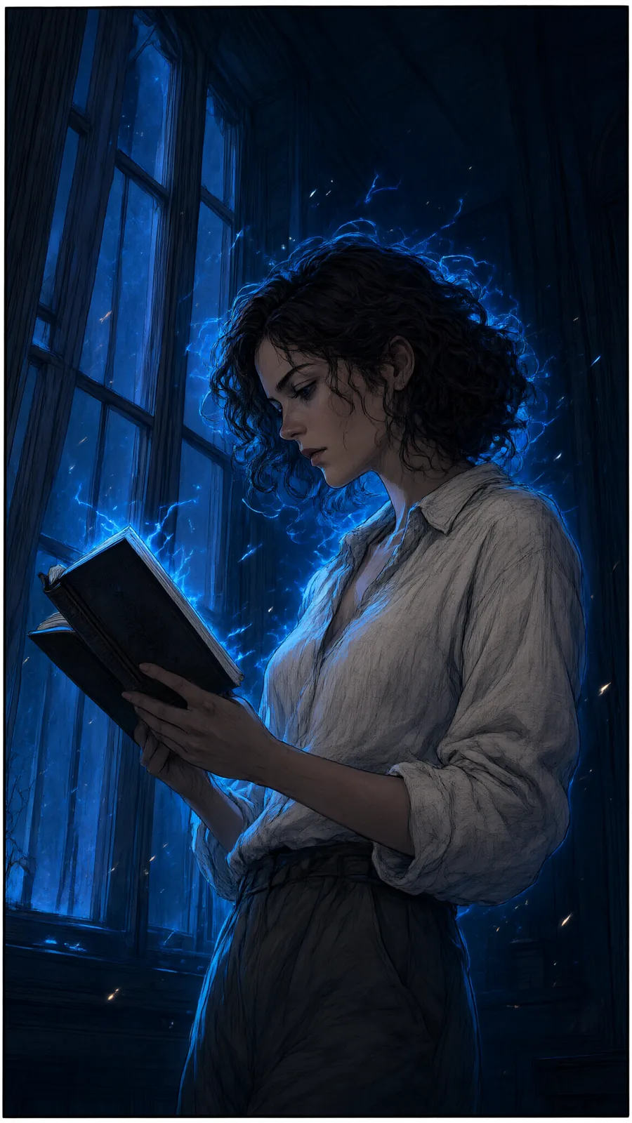
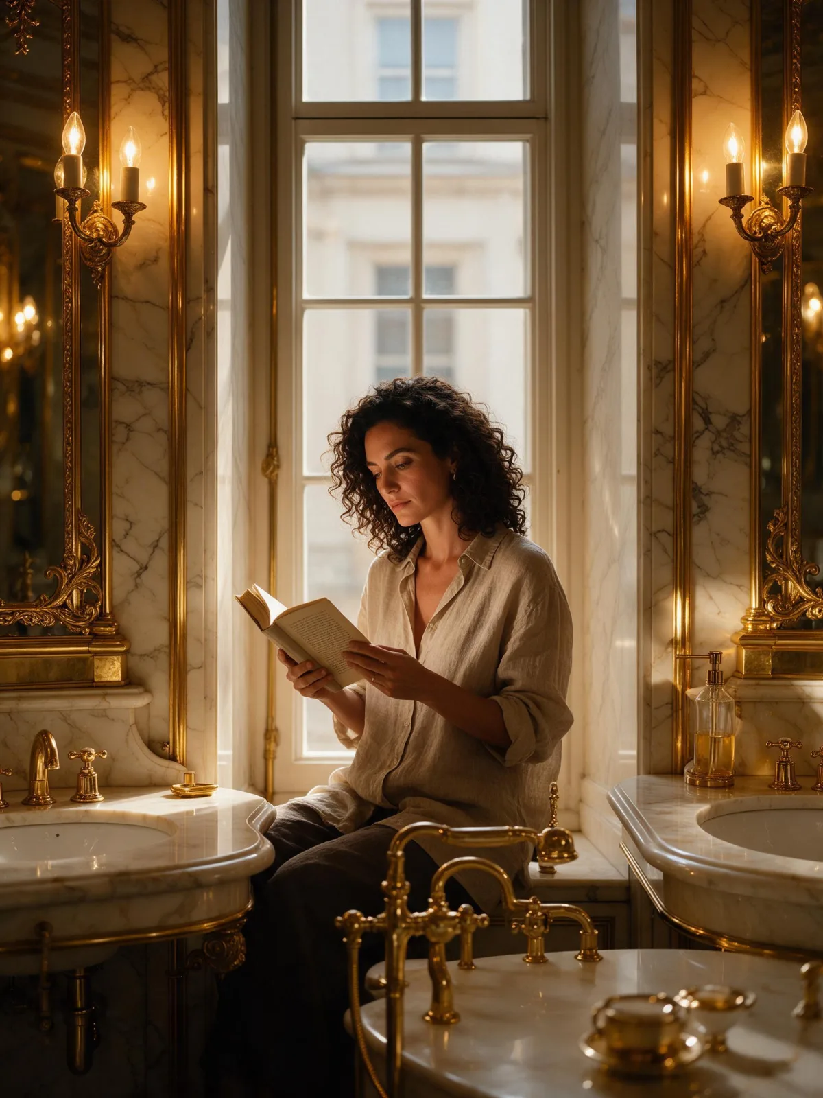
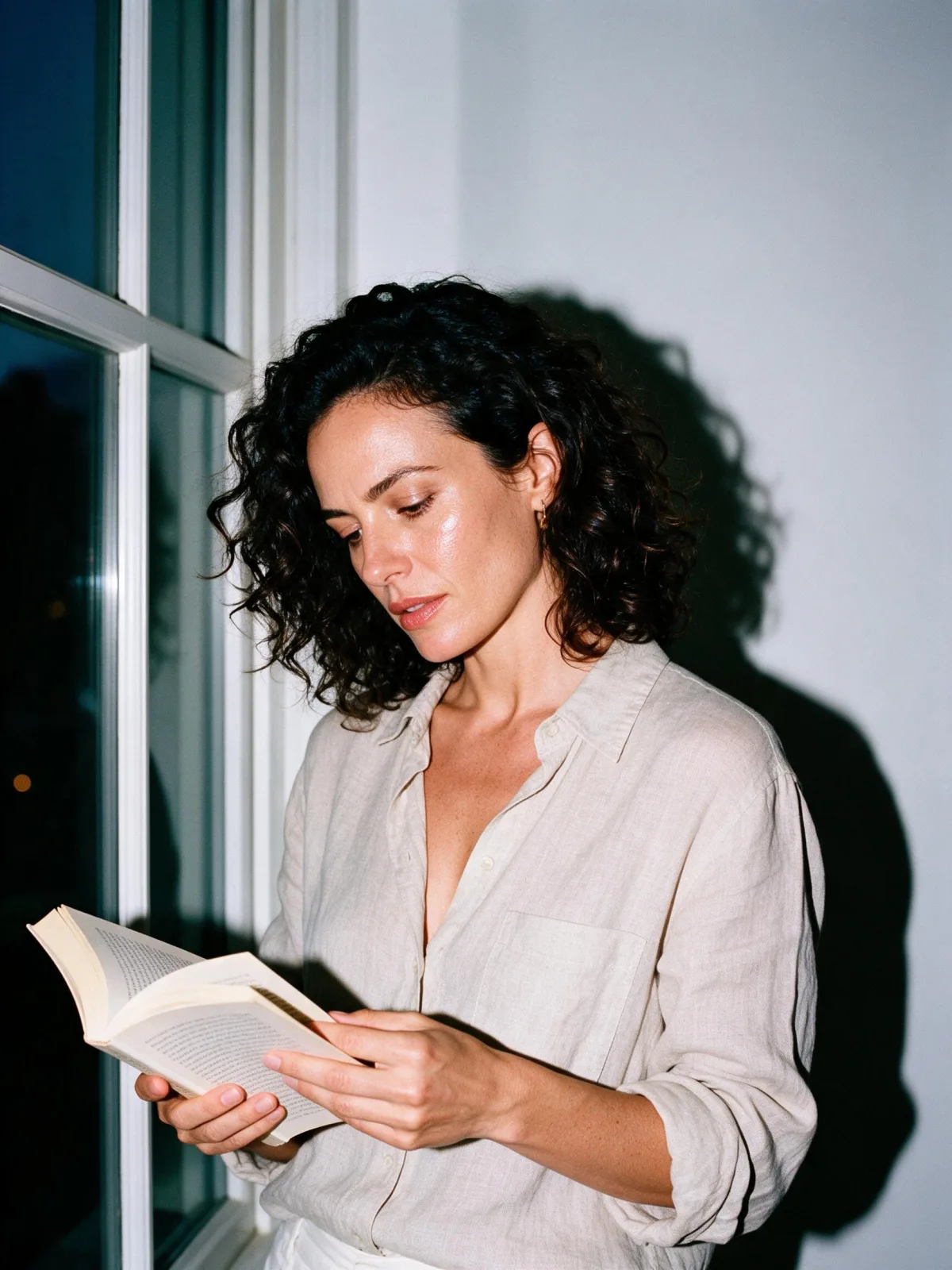
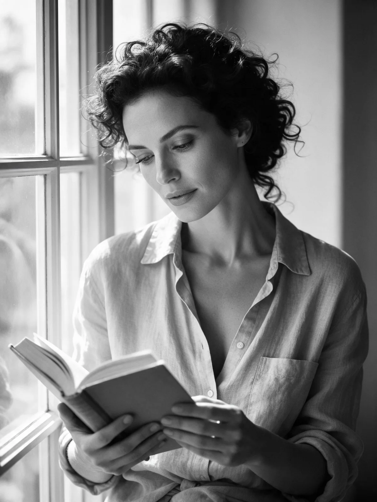
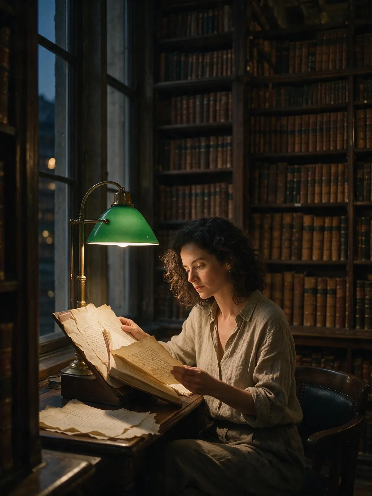
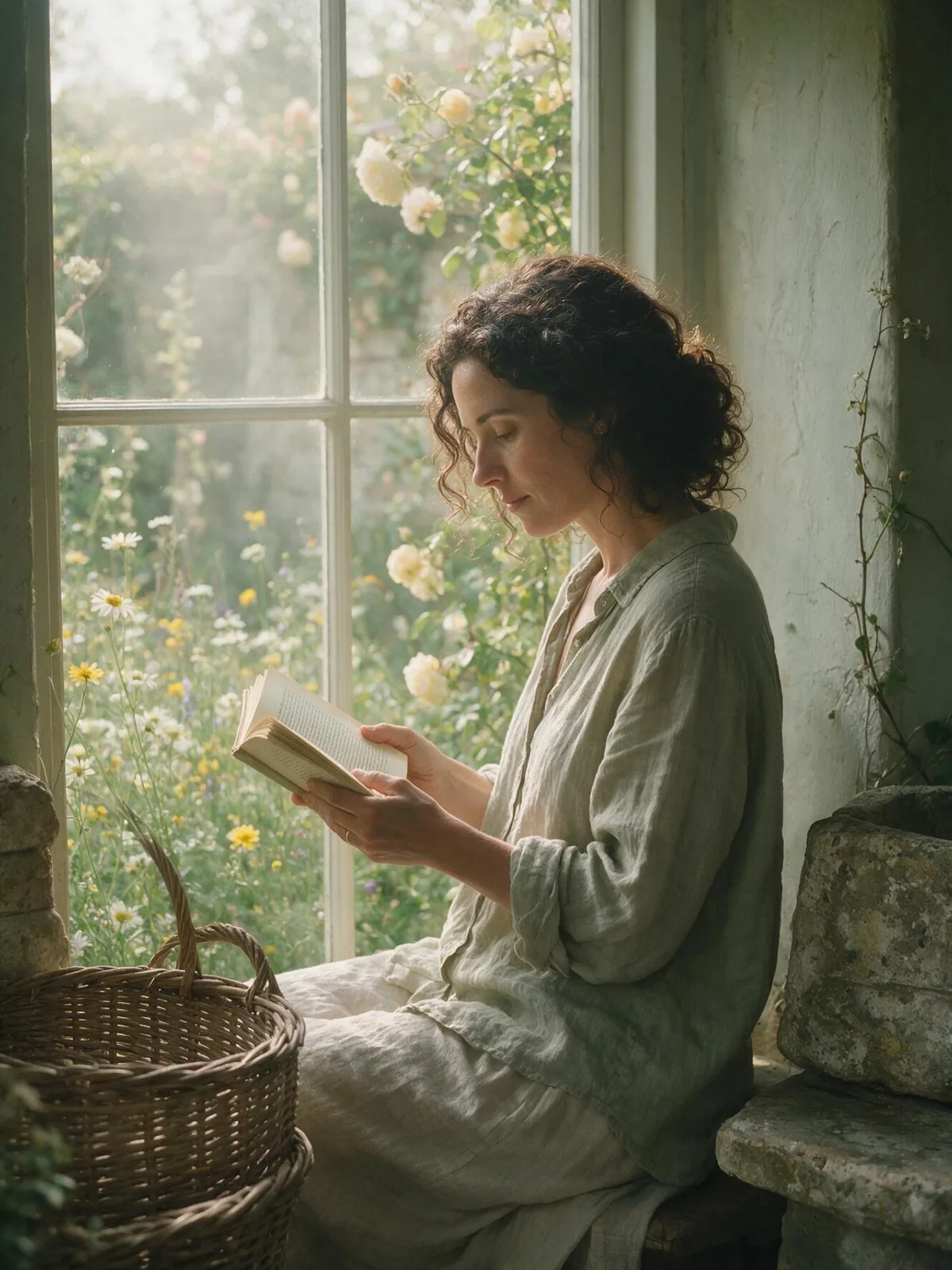
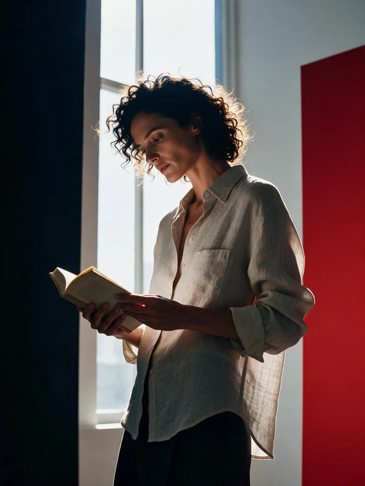
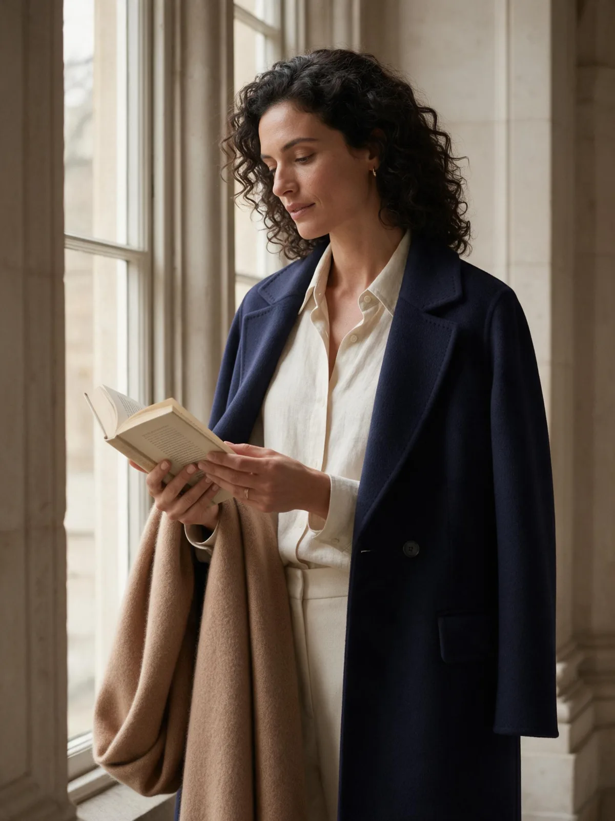
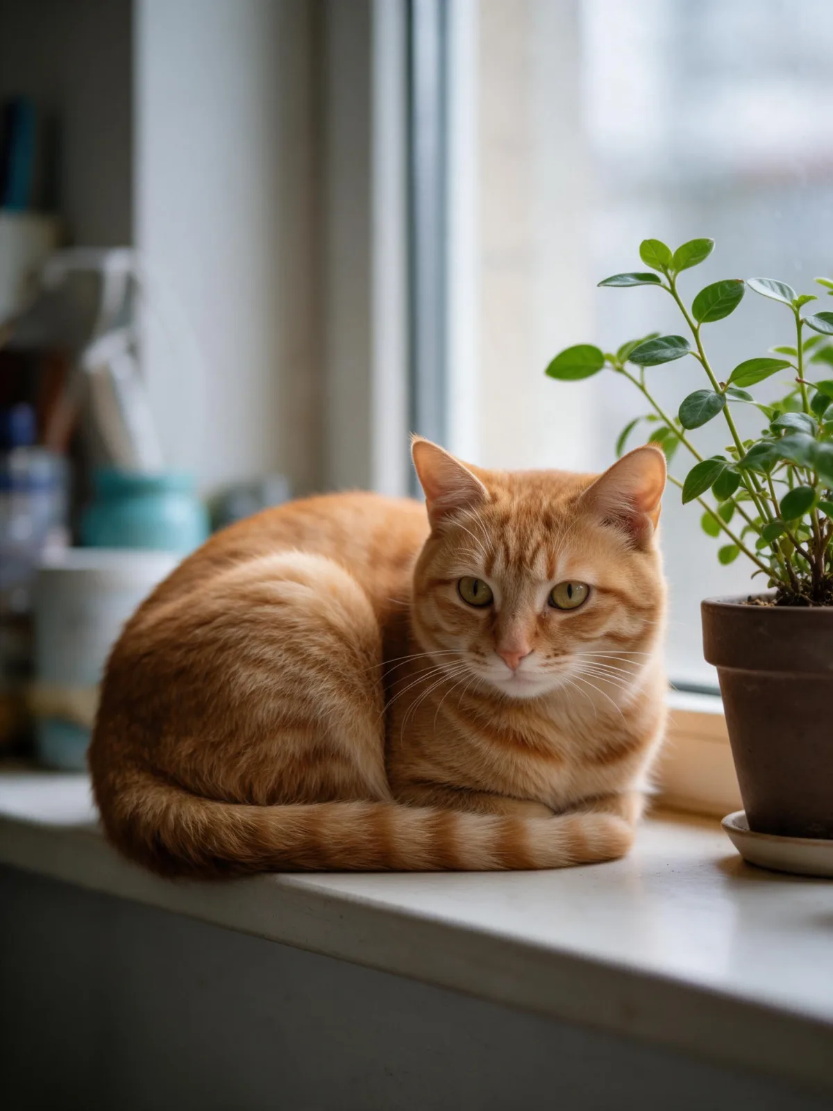
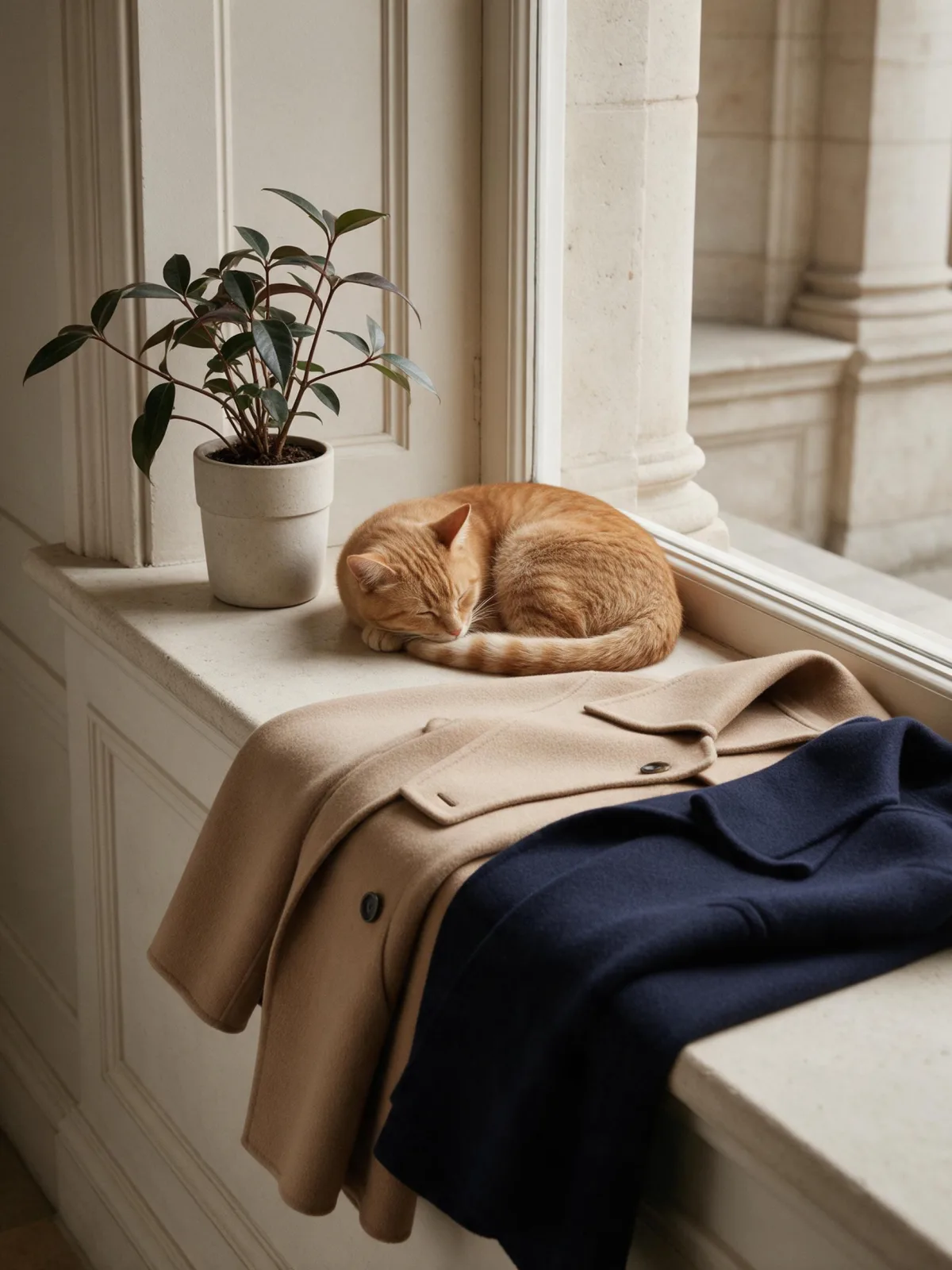
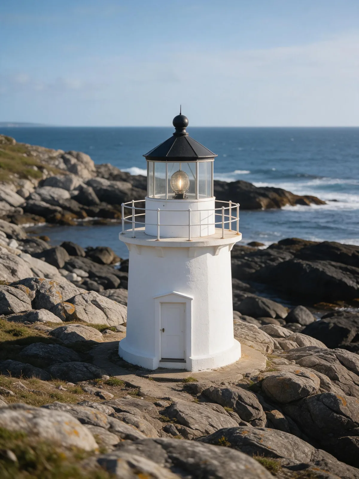
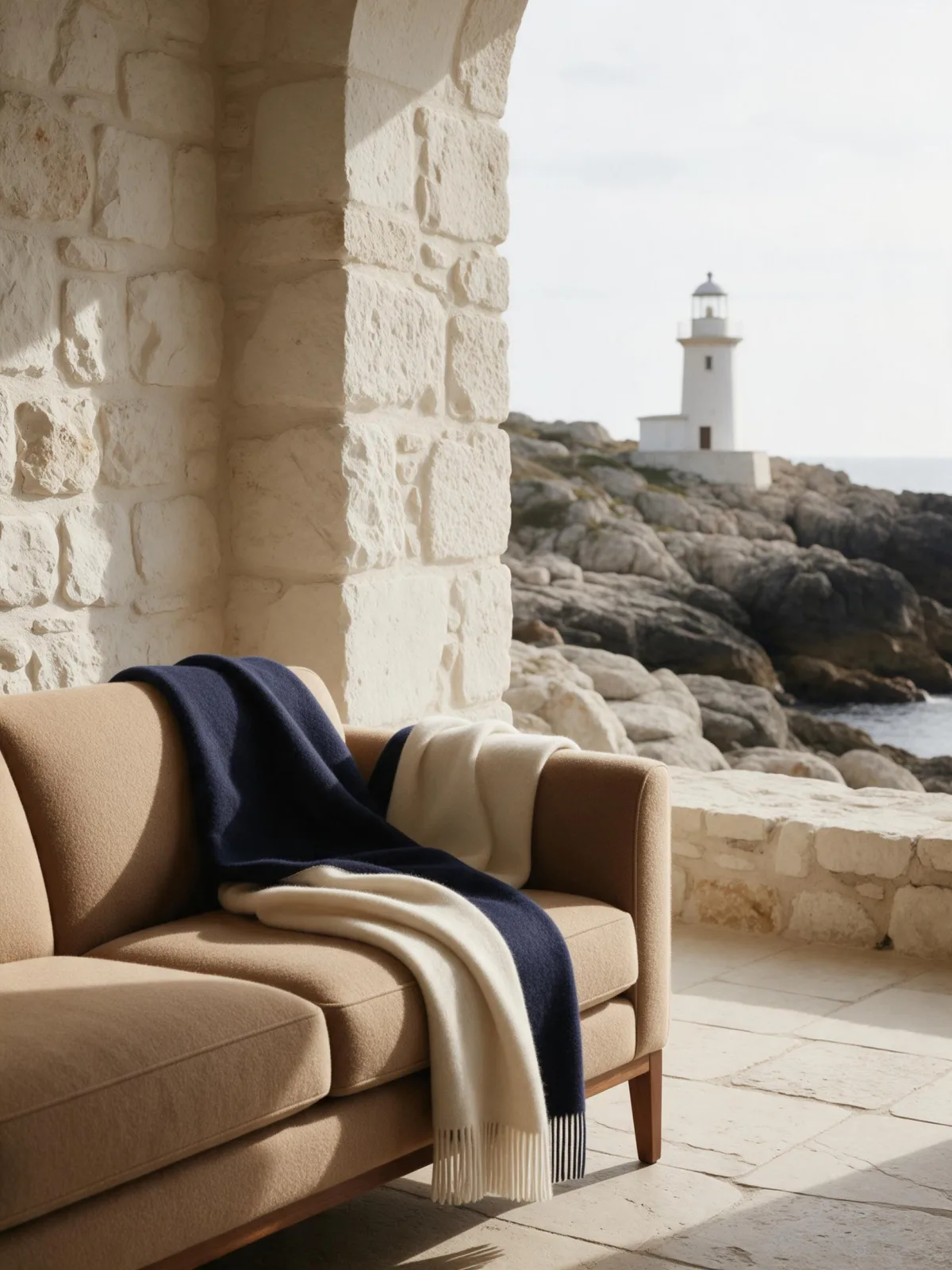
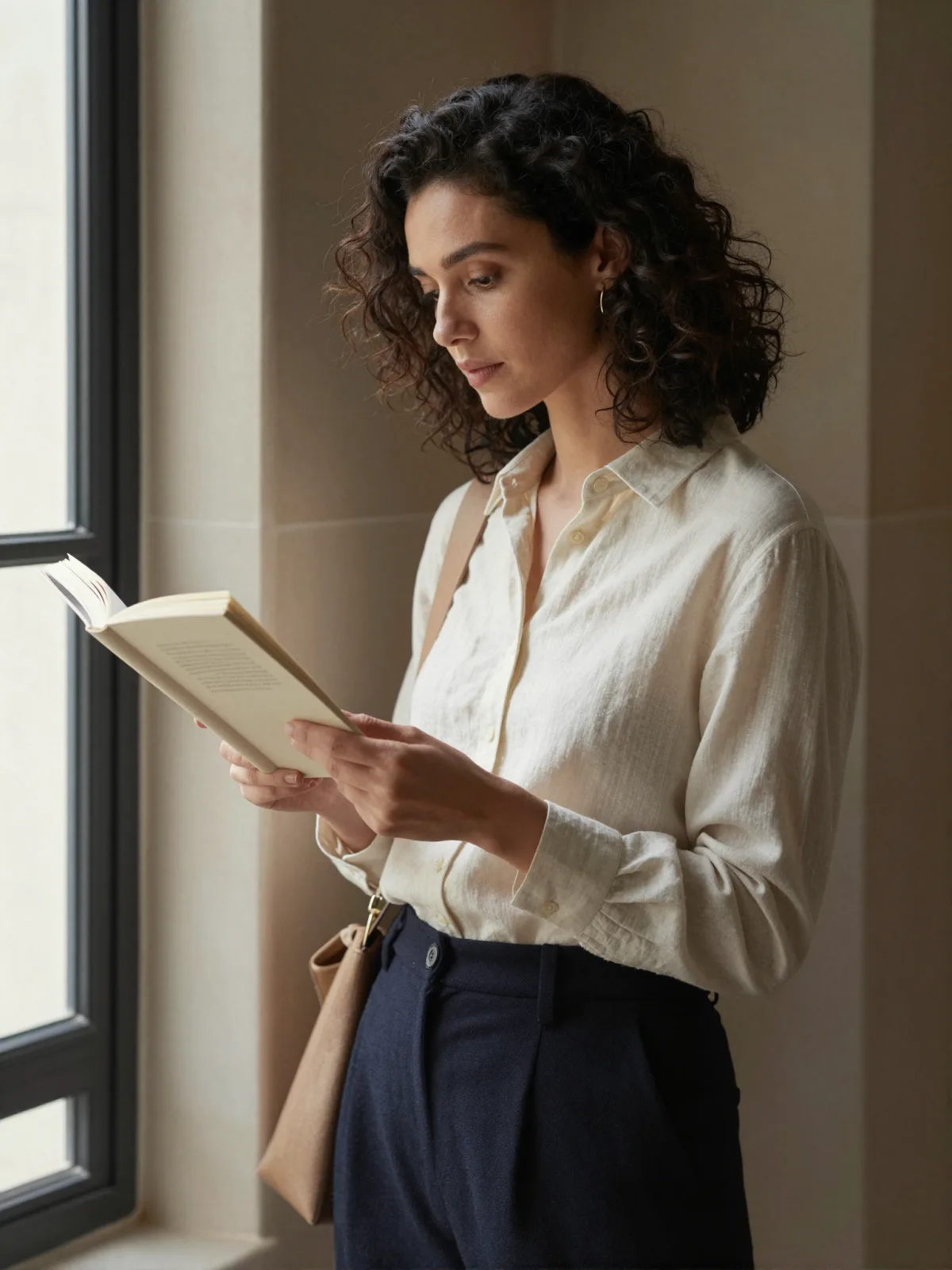
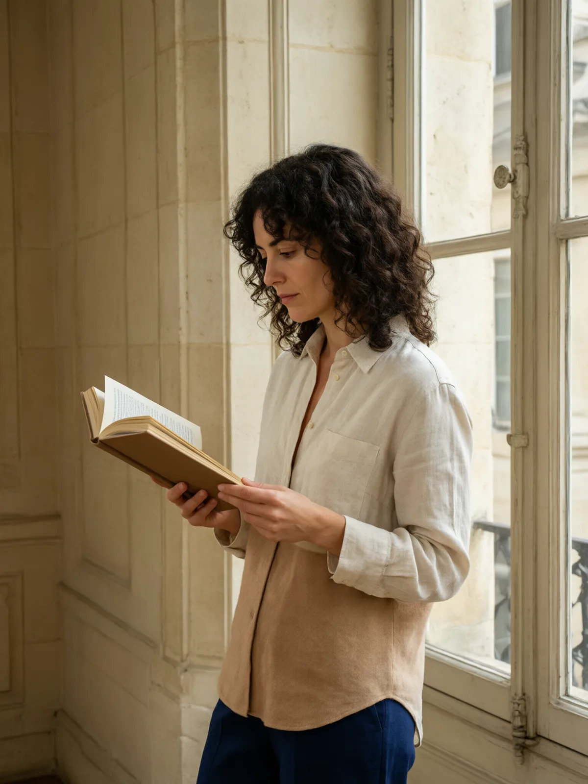
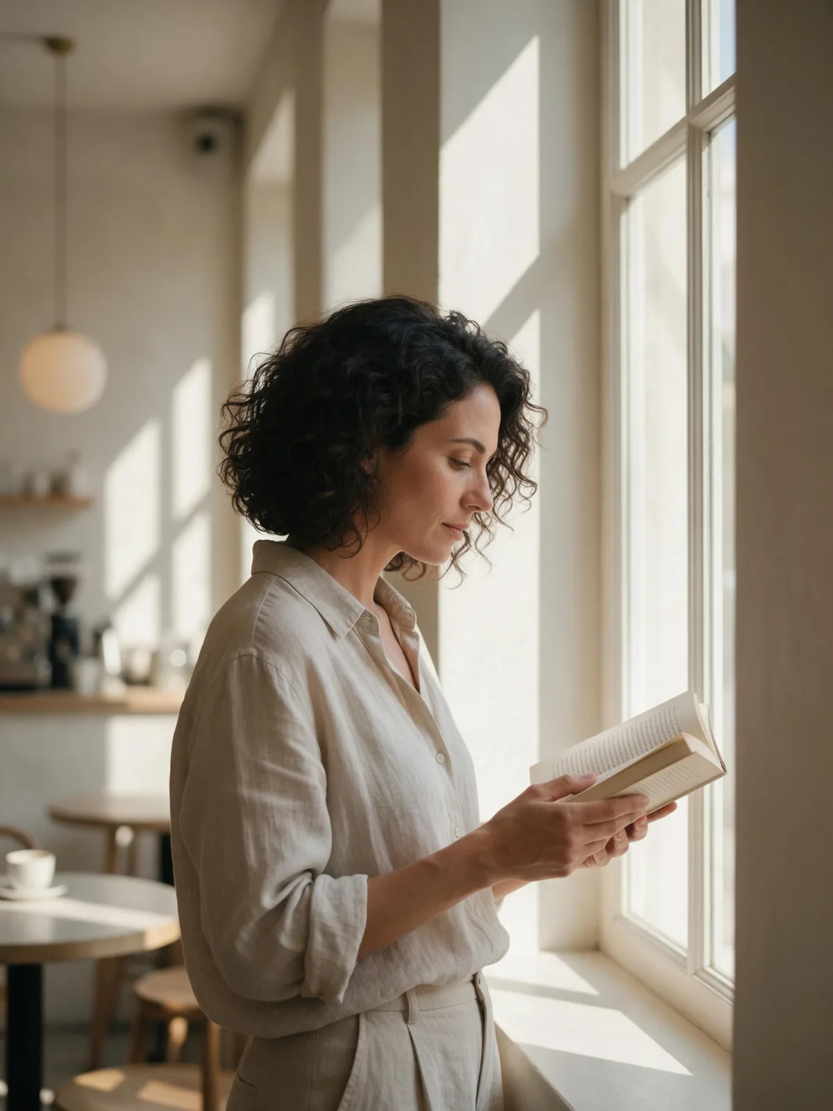
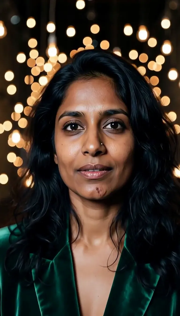
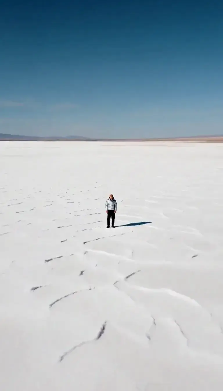
Quiet Luxury is the old-money aesthetic done properly: no logos, no shine, nothing loud. A palette of cream, camel and navy, tailored wool and cashmere, soft natural light in a classic stone interior — a library, a staircase, a hallway with tall windows — and a composition that is calm, balanced and a little formal.
The style dresses the scene in texture and restraint. You describe the subject: a man in a navy blazer reading in an armchair, a woman in a camel coat on a stone staircase, a leather weekender on a hallway bench, a golden retriever by a fireplace. Everything comes back looking understated and expensive.
It is ideal for menswear and womenswear brands, interiors, hospitality, private-banking decks and anyone who wants an image that signals taste without trying. Because the palette is strict, whole series made with it look consistent.
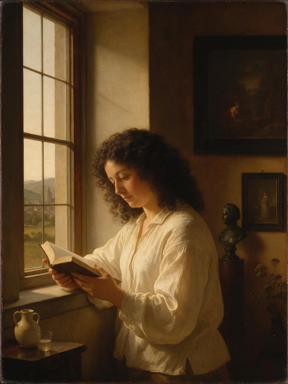
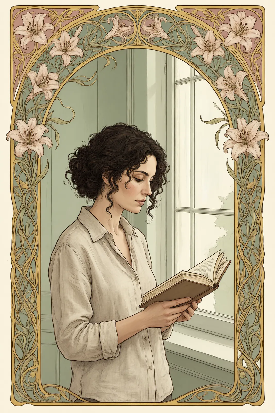
For this composition, we recommend 3:4. For a cooler, more editorial variant use Runway Editorial; for a painterly version of the same mood, try Classical Oil.
What makes the look work is restraint. Nothing is shiny, nothing is branded, and the light is always soft and natural. Resist the urge to add gold, chandeliers or champagne; they read as loud rather than rich. It is a reliable choice for lookbooks and product pages where the clothing must look expensive without distracting from it.
Subjects to paste as they are: “a man in a navy cashmere sweater reading in a leather armchair”, “a woman in a camel coat walking down a stone staircase”, “a leather weekender bag on a hallway bench beside tall windows”. Calm activities and good fabric are all you need.
Finishes that work on top: Film Grain for a subtle analog texture, Golden Hour for warm late-afternoon light through tall windows. Avoid Soft Bloom if you want the crisp, tailored feel.