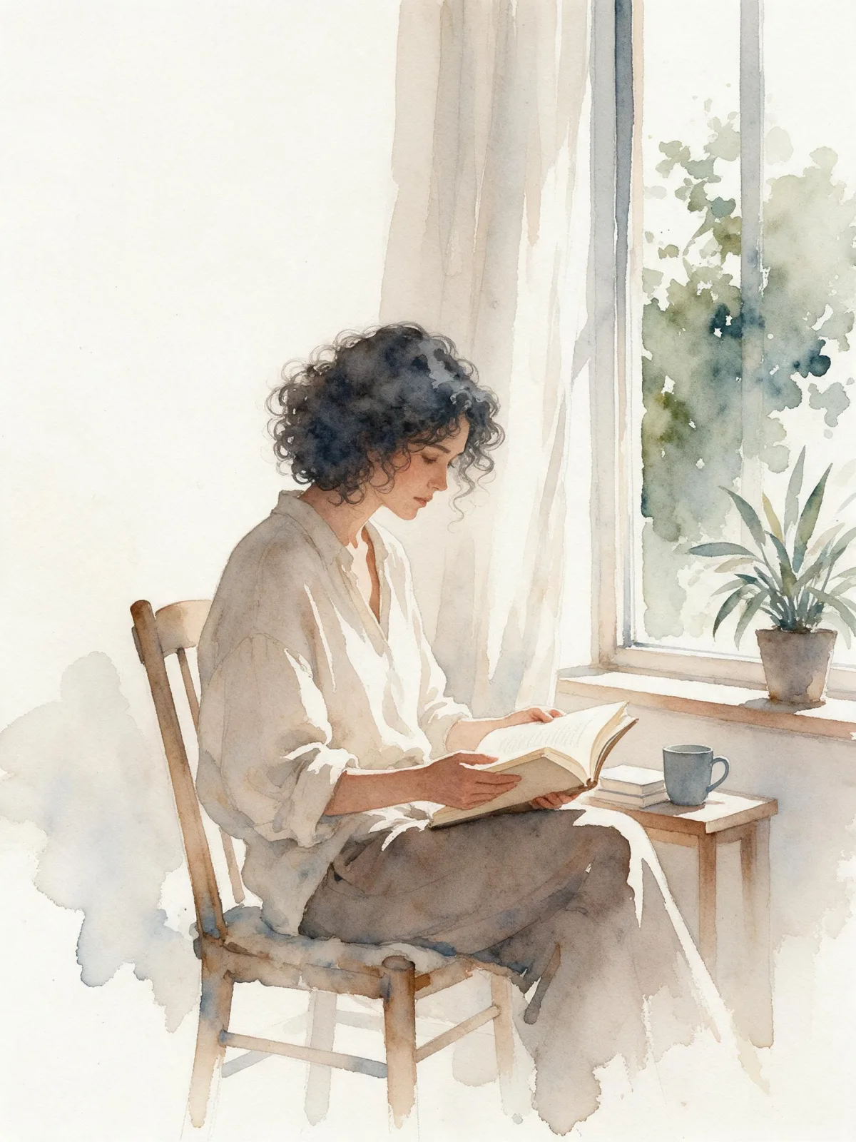
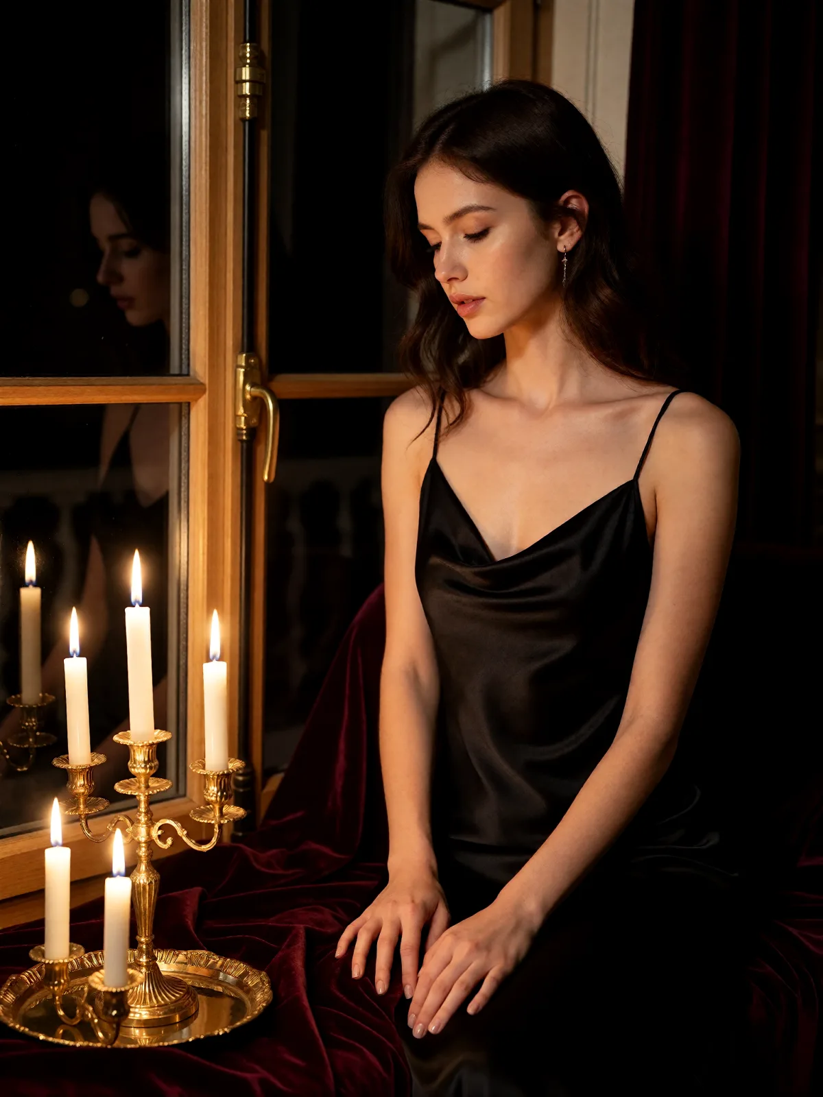
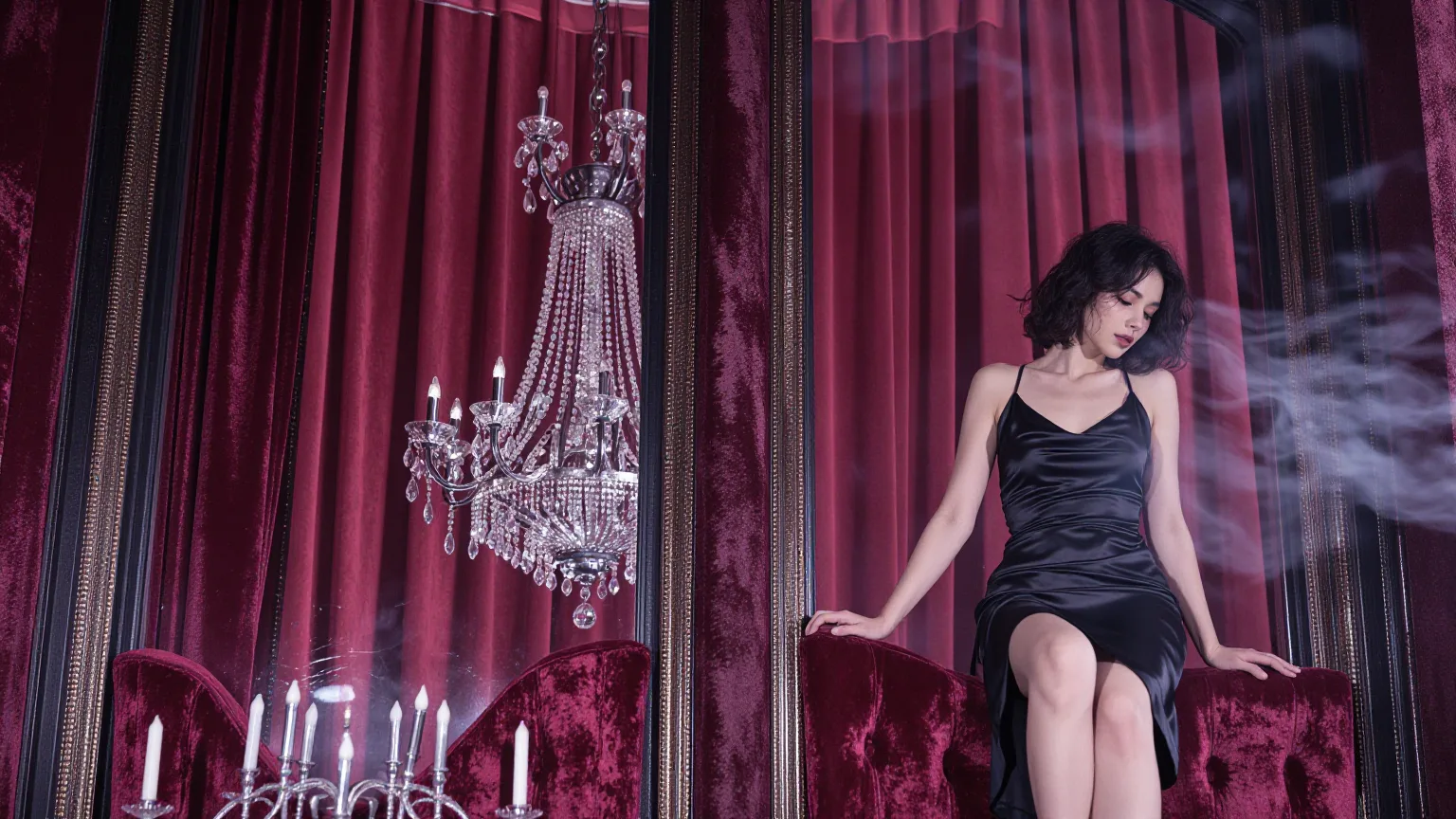
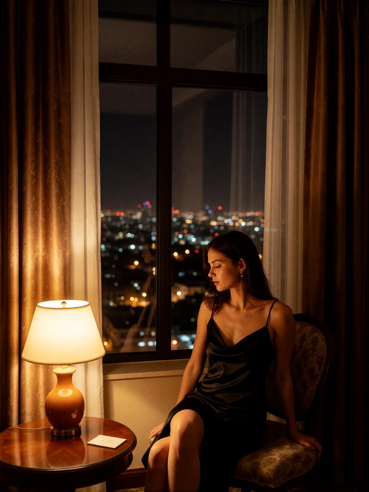
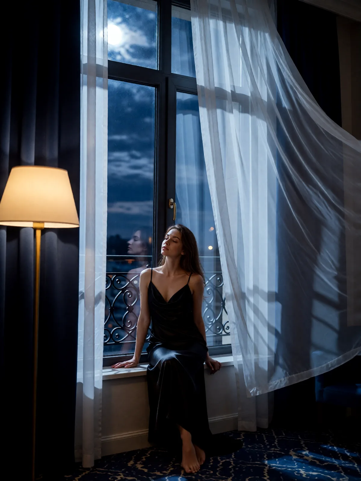
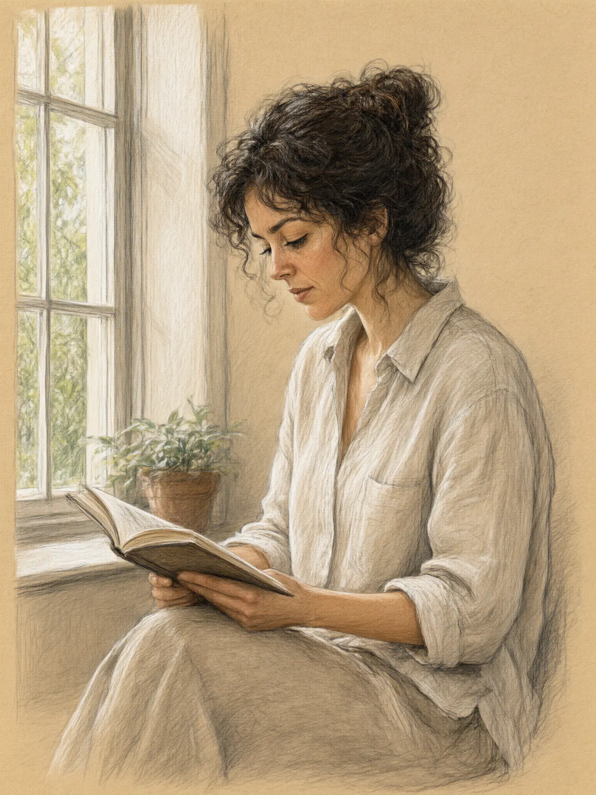
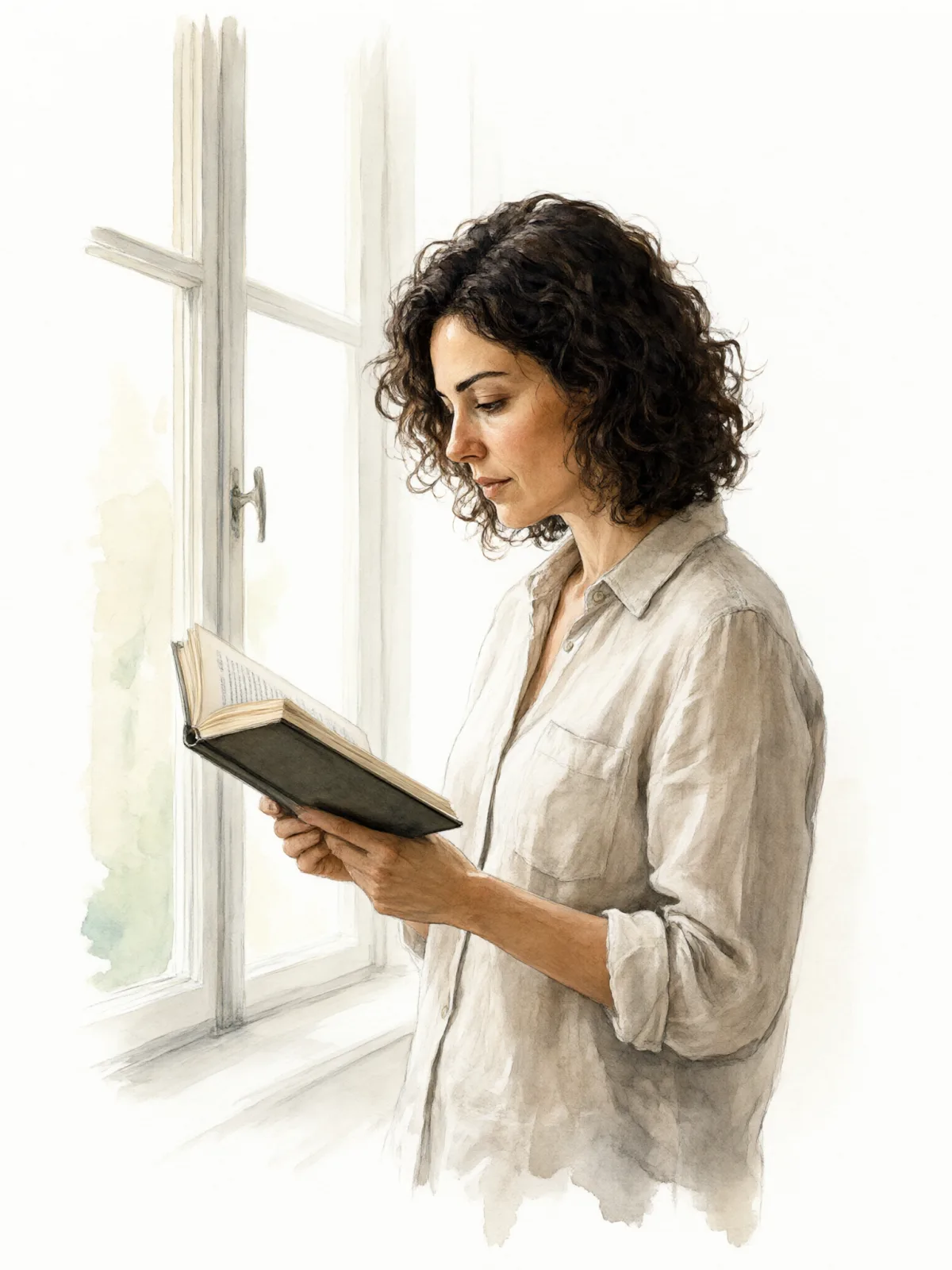
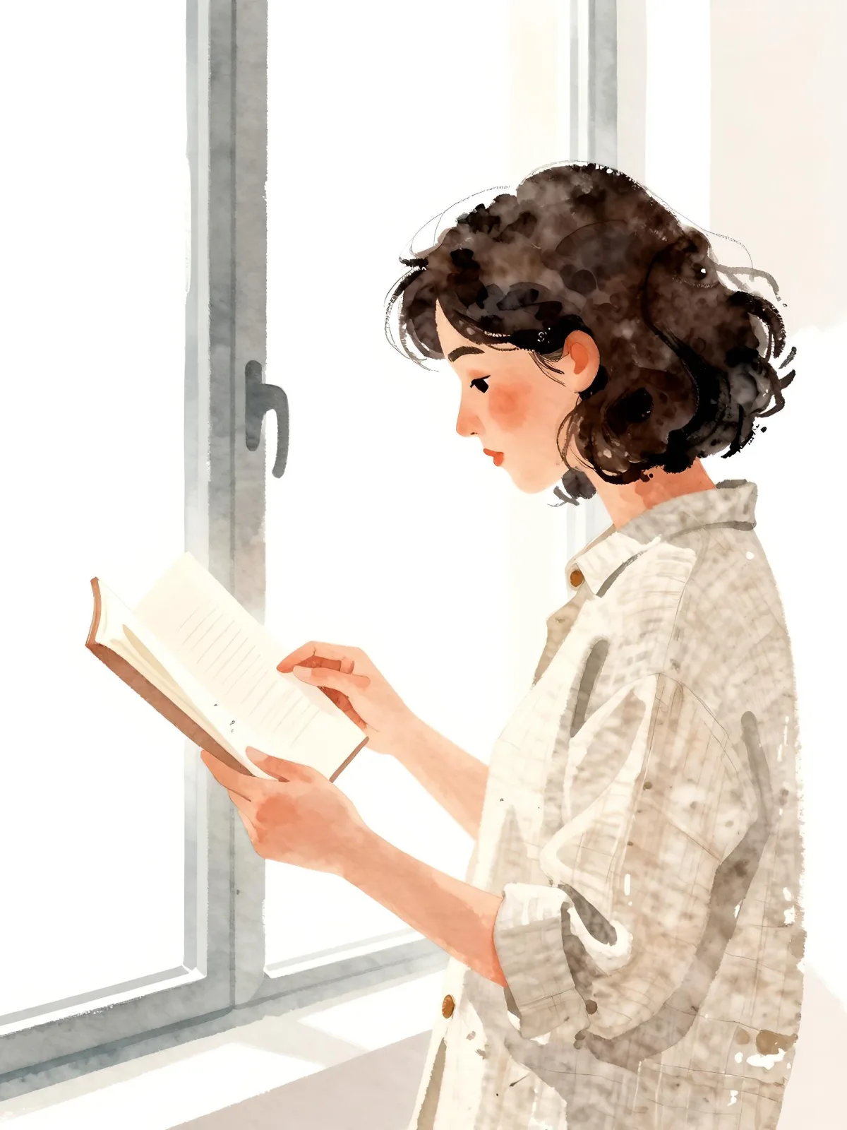
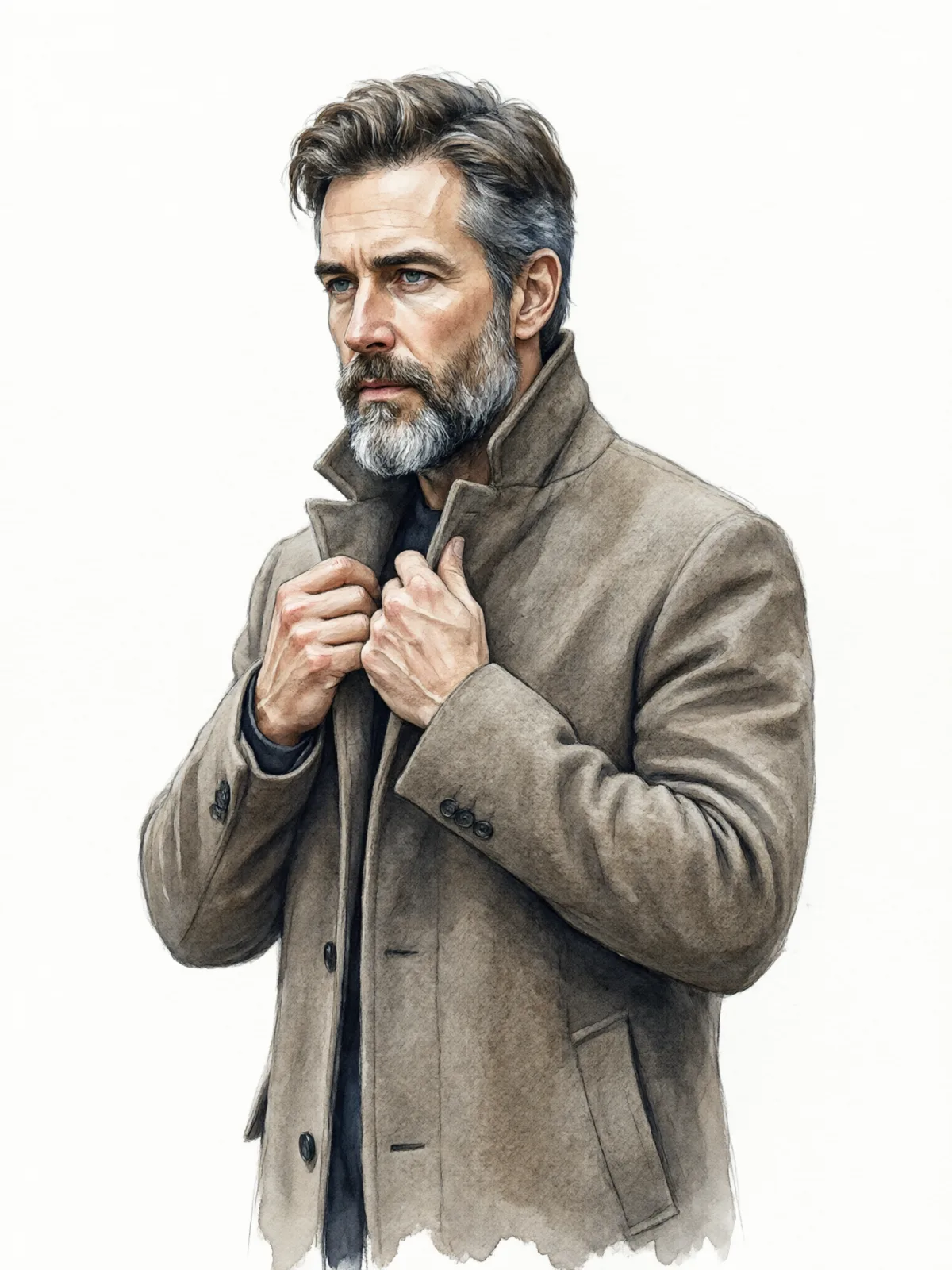
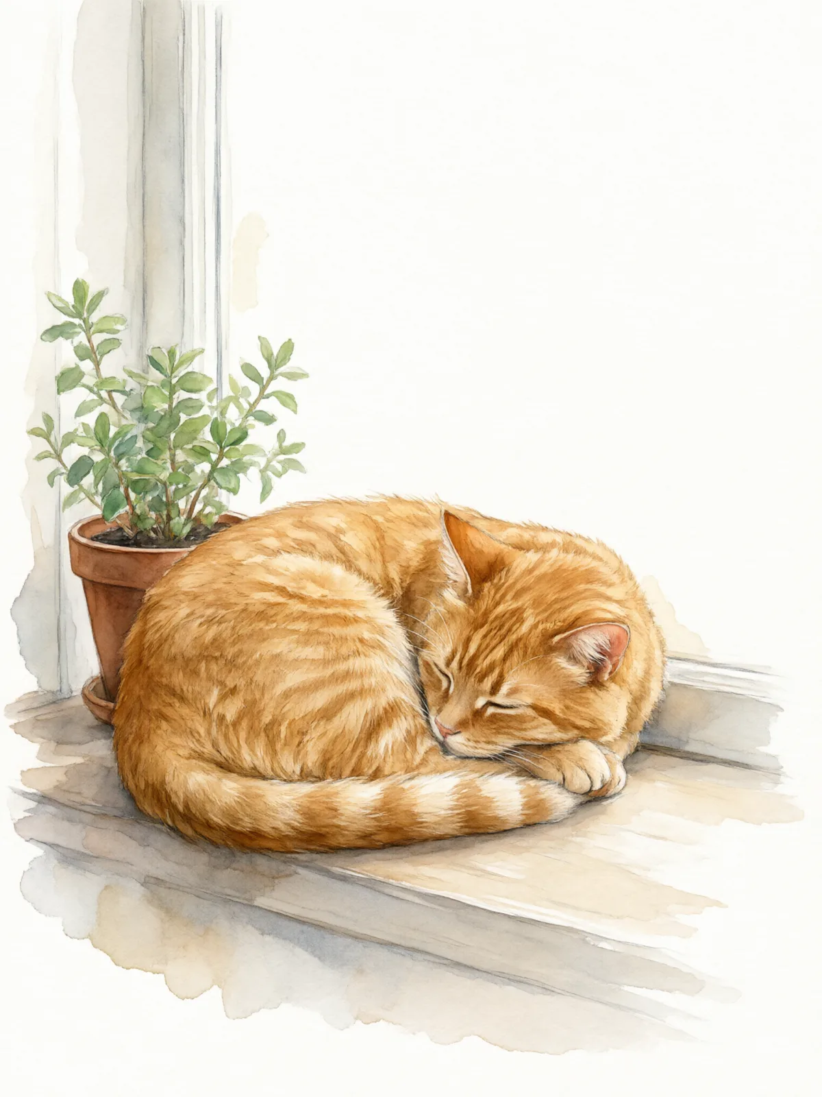
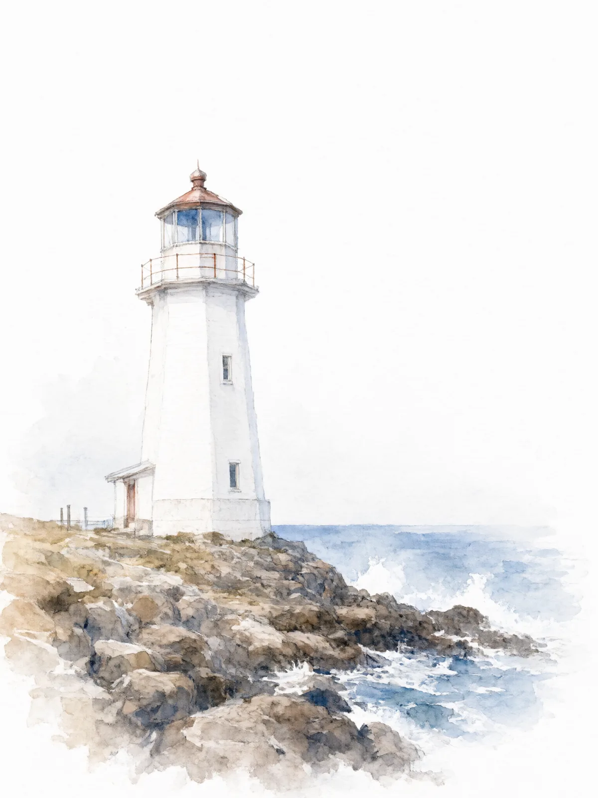
Soft Watercolor paints your subject the way a good illustrator does in a sketchbook: loose washes that bloom into each other, pigment gathering at soft edges, the grain of cold-press paper showing through, and plenty of white left untouched. A limited palette keeps it calm and elegant.
It is forgiving and flattering. Portraits, pets, flowers, buildings, food and landscapes all look good in it. Write a simple subject — a woman in a sun hat with a bicycle, a man reading on a park bench, a cat in a basket, a lighthouse on a cliff, a bowl of lemons — and the style handles the painting.
Use it for greeting cards, wedding stationery, children’s book mockups, travel journals, menus and gentle branding. The white space makes the images easy to combine with text.
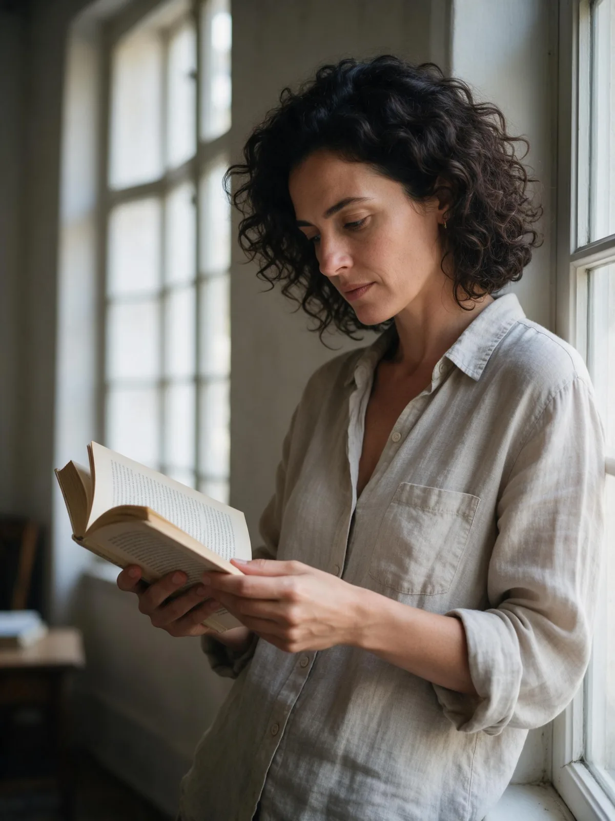
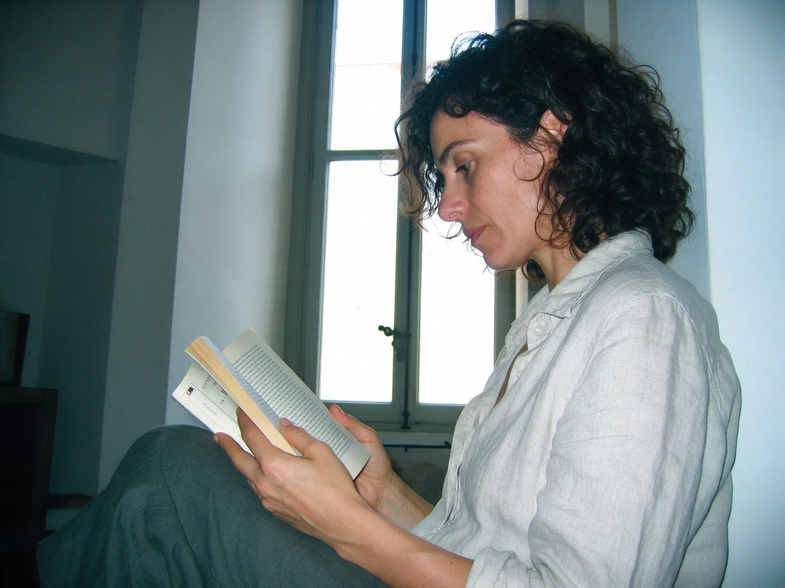
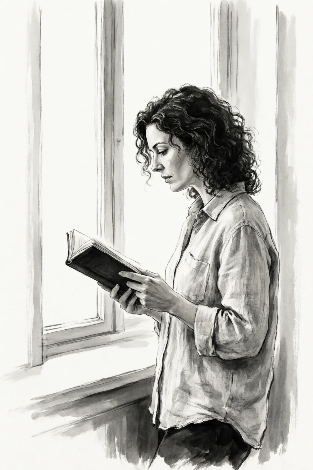
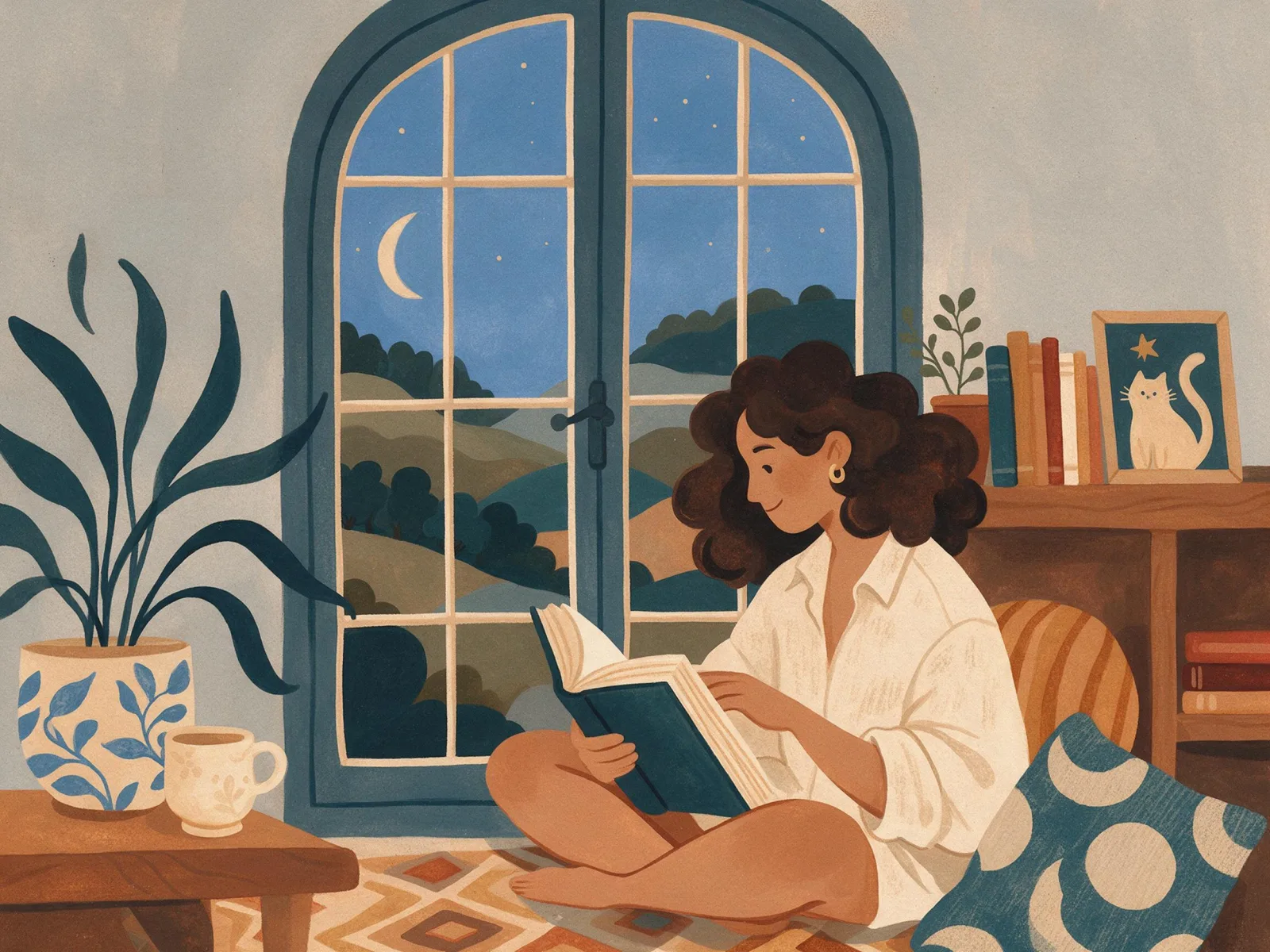
This is one of the most popular photo-to-painting styles: upload an image and it is repainted in watercolor with the composition, pose and clothing left as they were. For this composition, we recommend 3:4. For a monochrome brush look, use Ink Wash; for flat, matte color, use Storybook Gouache.
It is also one of the most forgiving styles for first-time users: even a short subject comes back looking finished and hand-made. Portraits keep a light, sketchbook feel rather than turning into heavy paintings, which suits invitations and personal gifts.
Subjects to paste as they are: “a woman in a sun hat walking a bicycle down a country lane”, “a man reading on a park bench under blossoming trees”, “a small white lighthouse on a green cliff”. Light, open scenes leave the paper room to breathe.
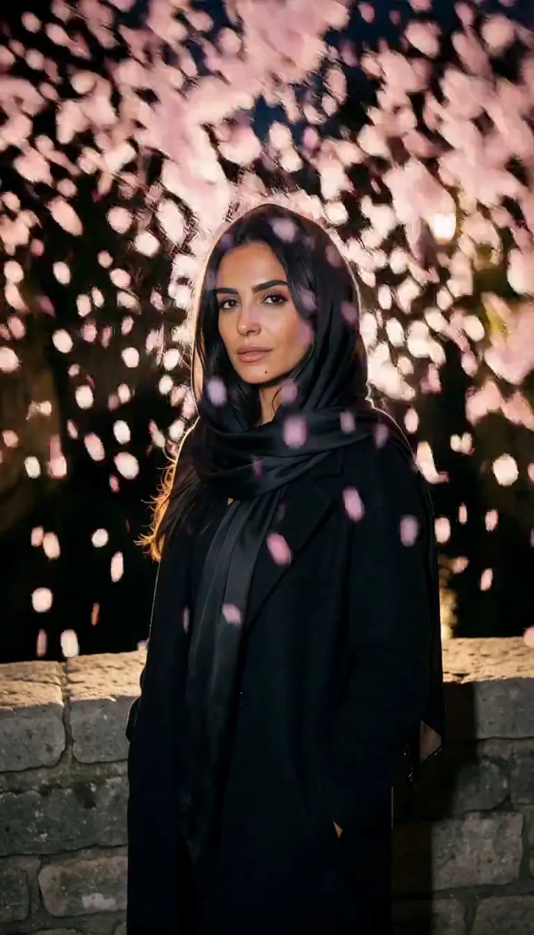
Finishes that work on top: Golden Hour for warm washes, Soft Bloom for a dreamier, more diffused painting. Monochrome works too, for a quiet grey wash study.