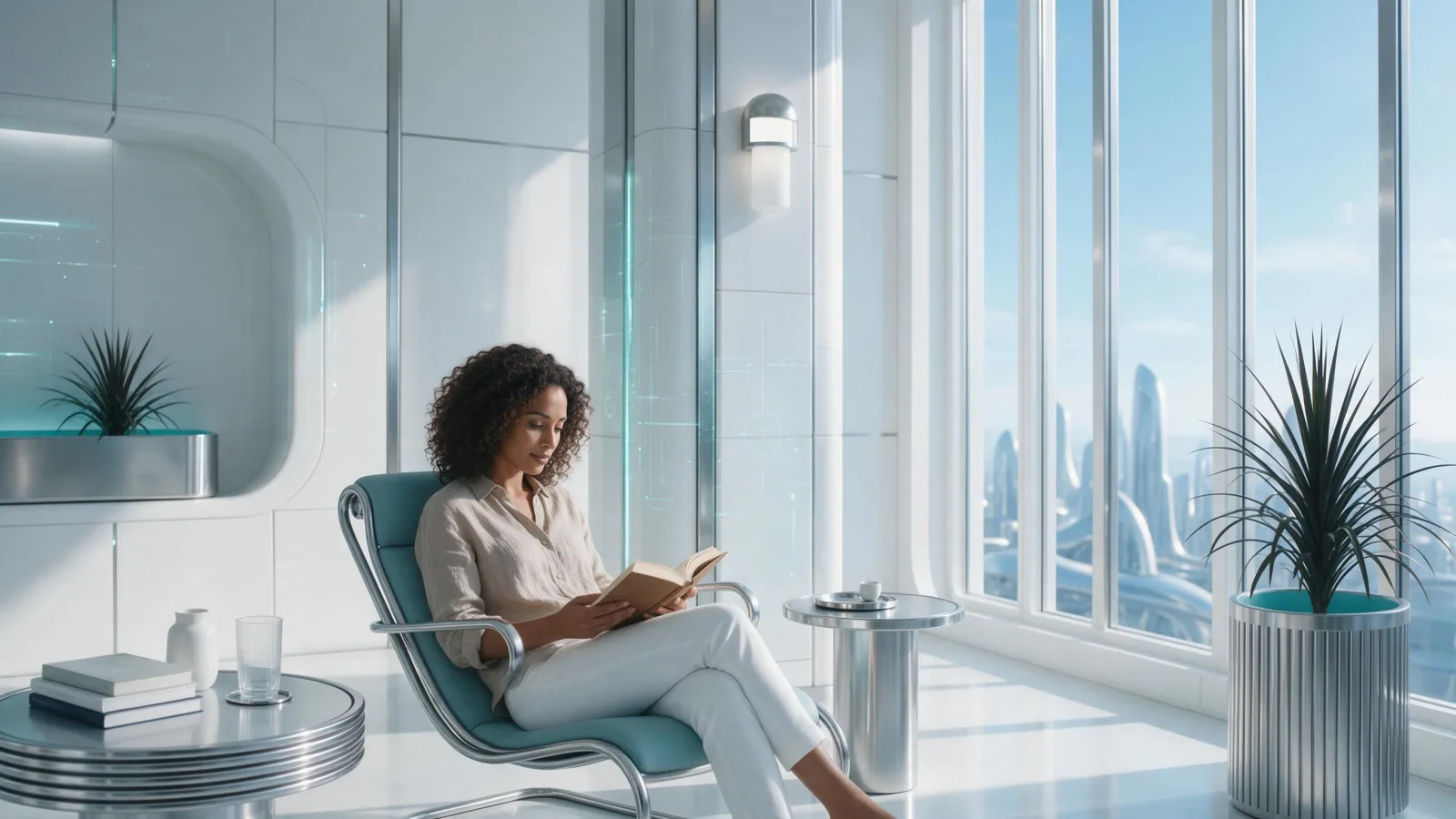
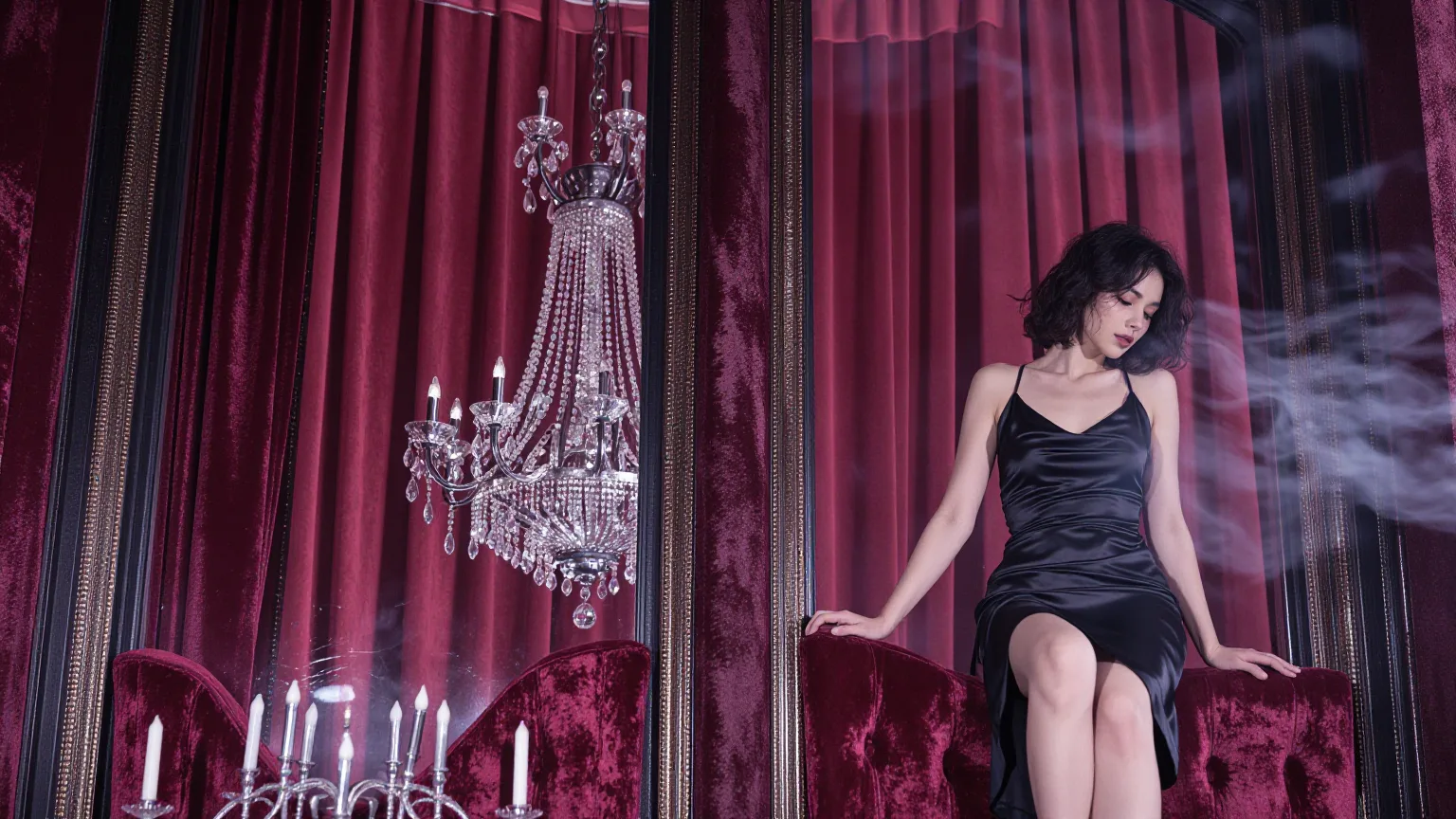
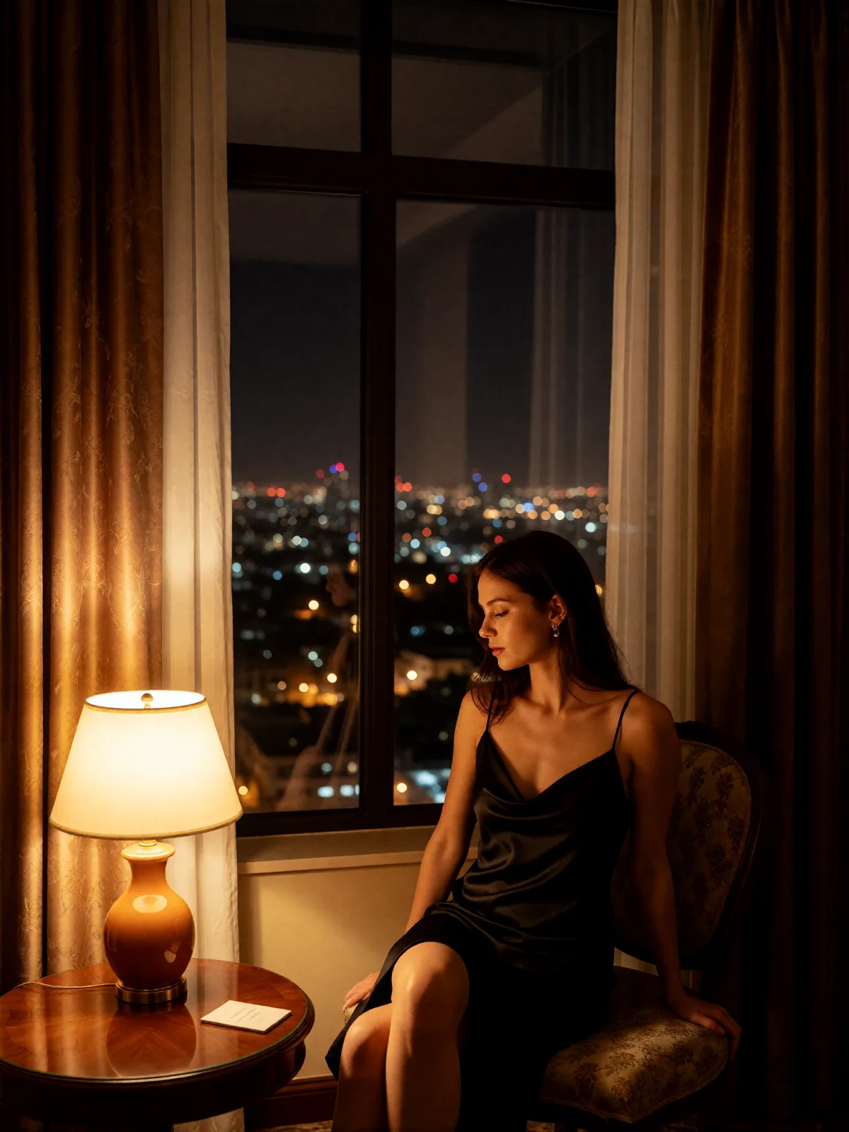
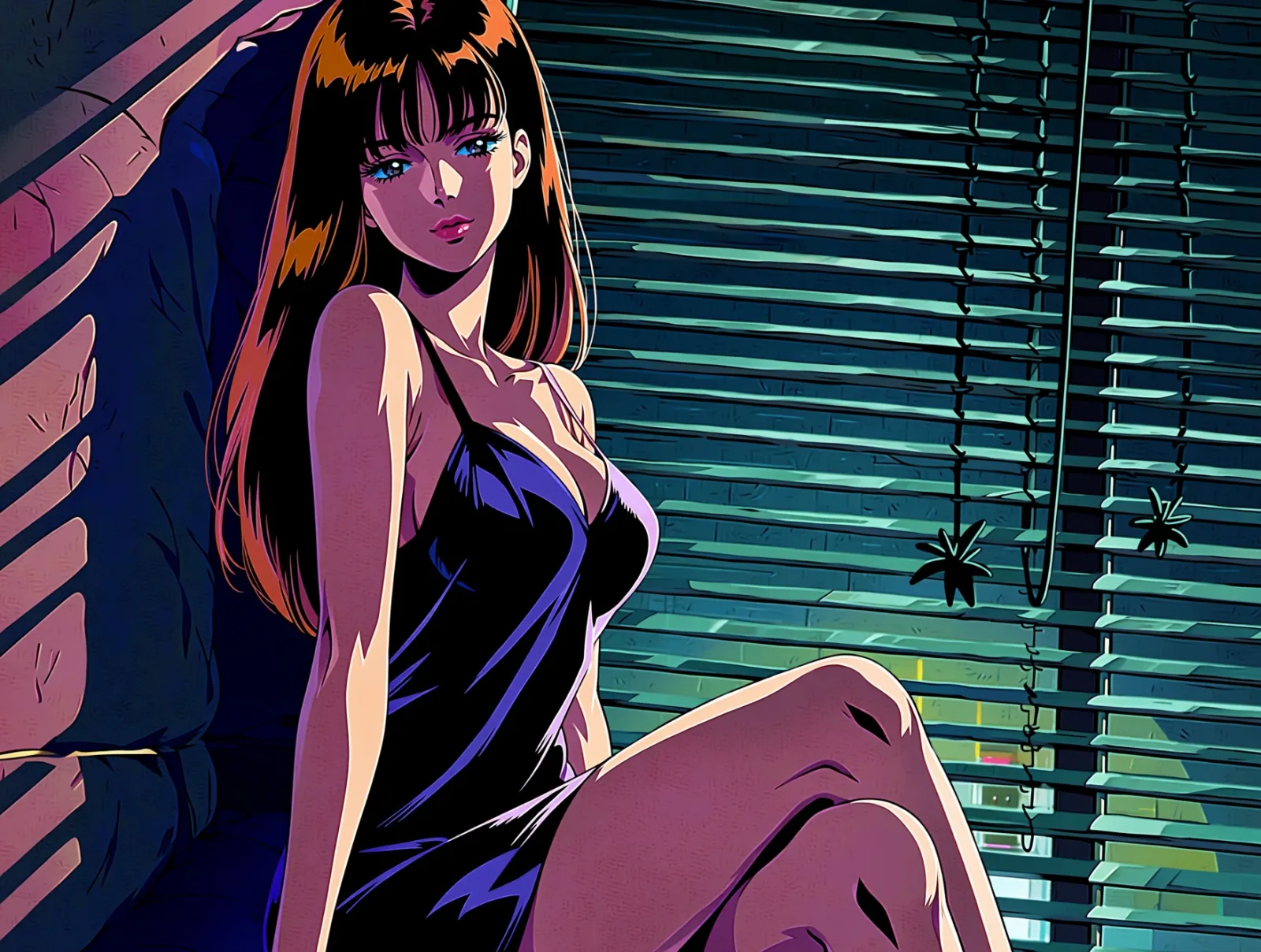
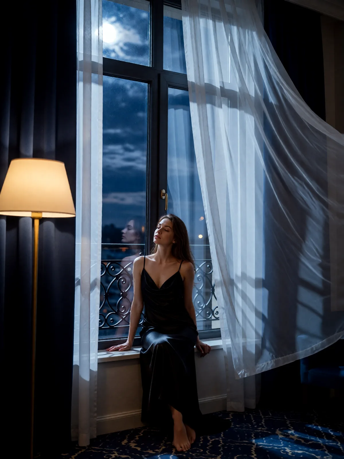
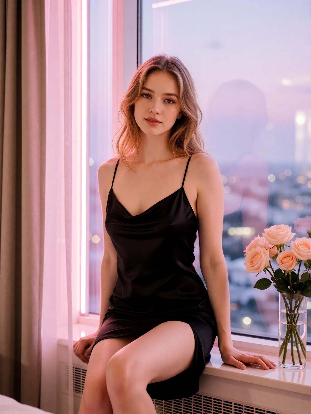
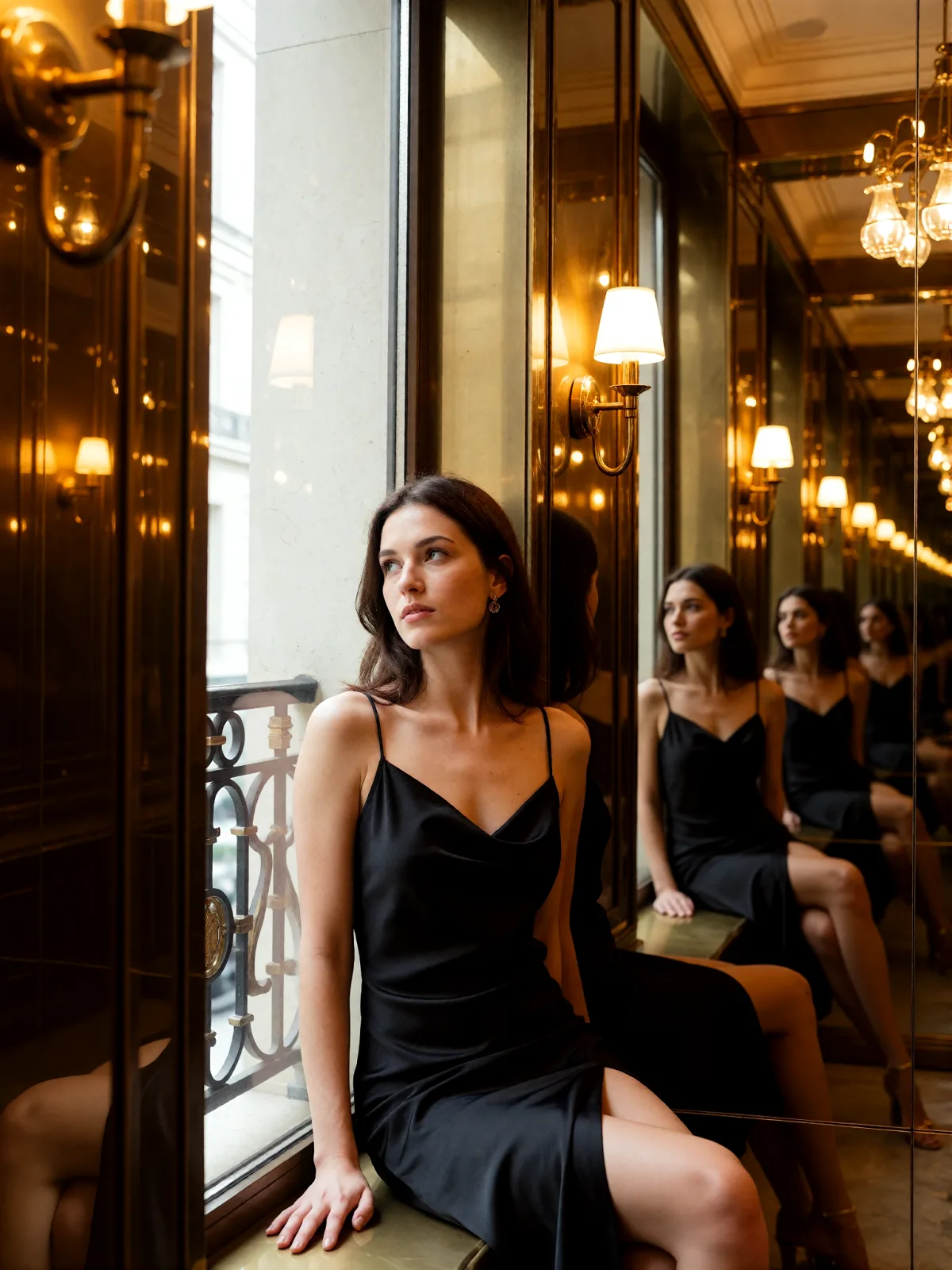
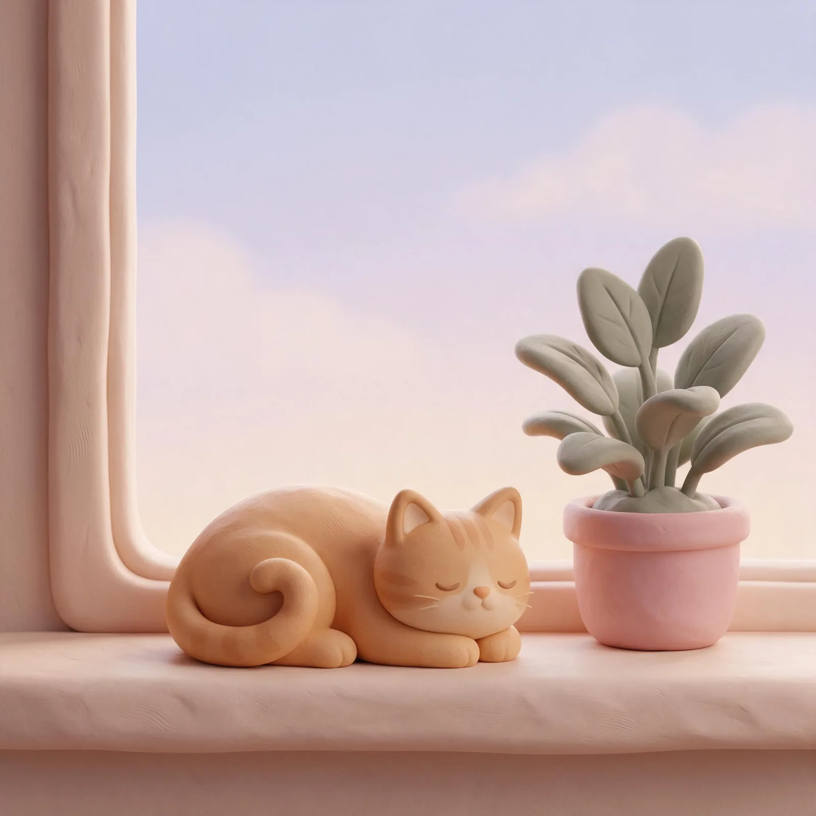
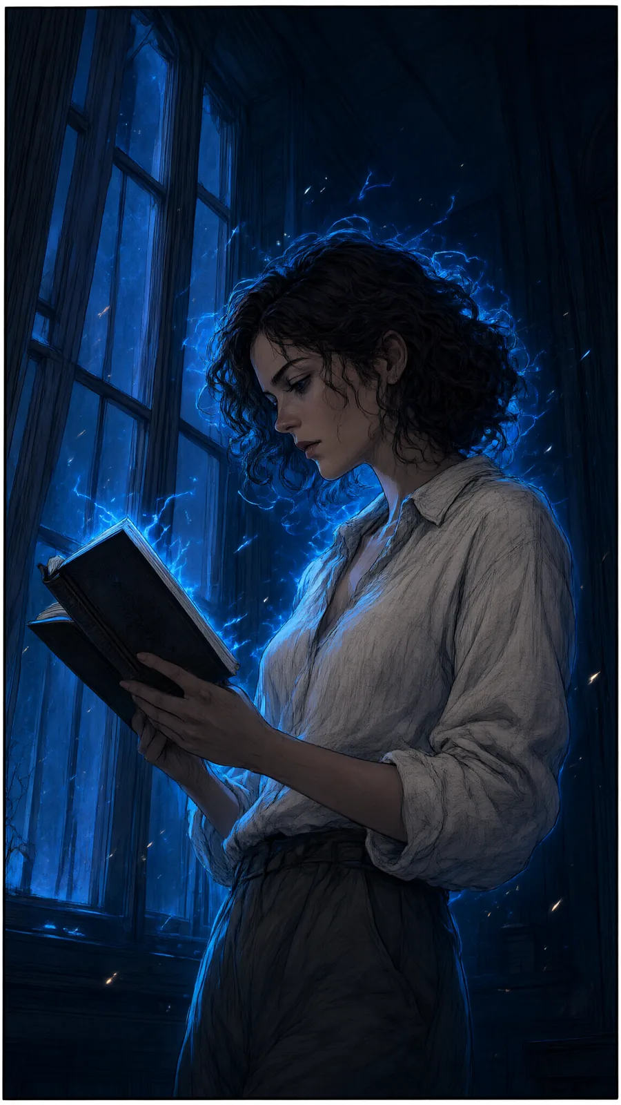
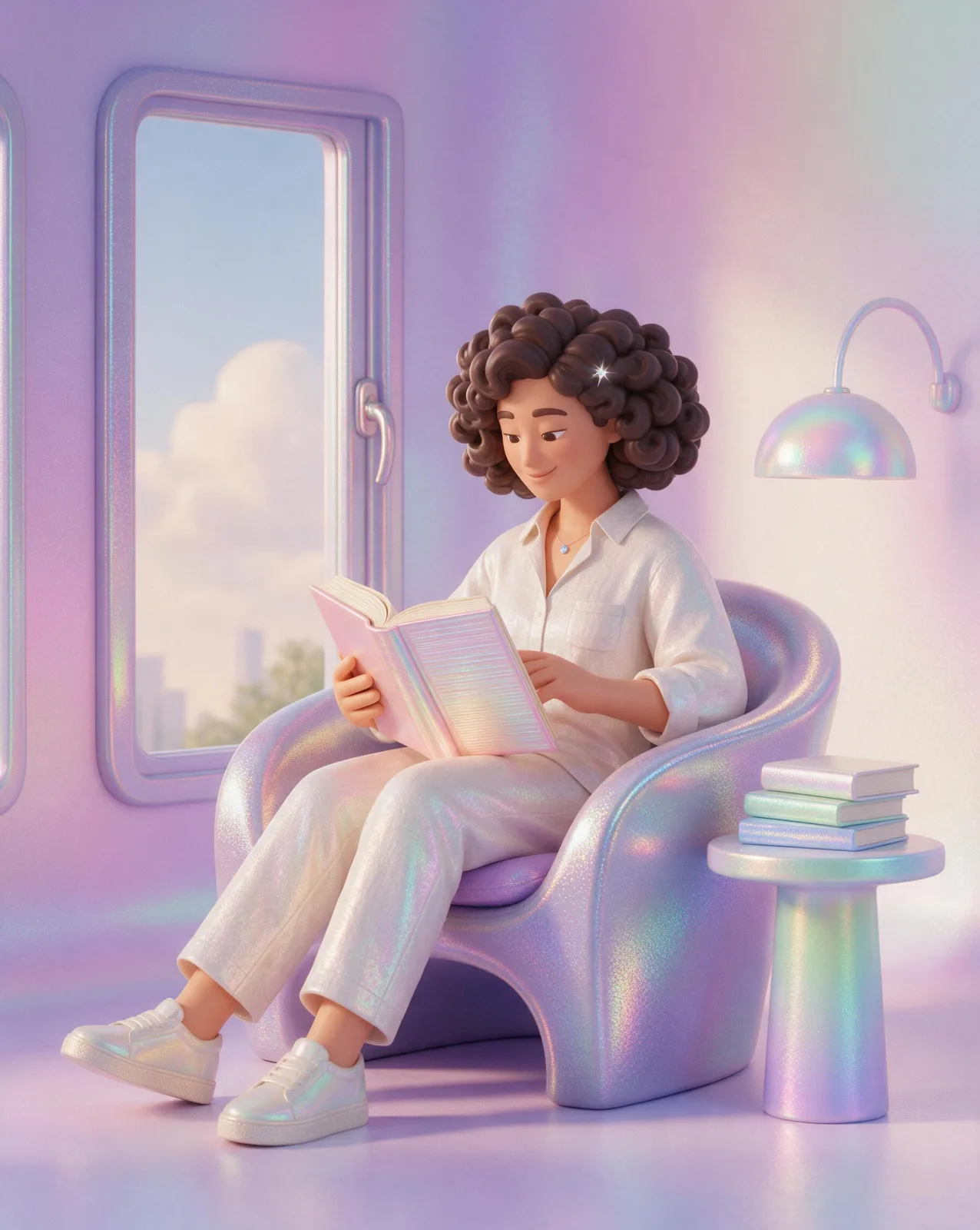
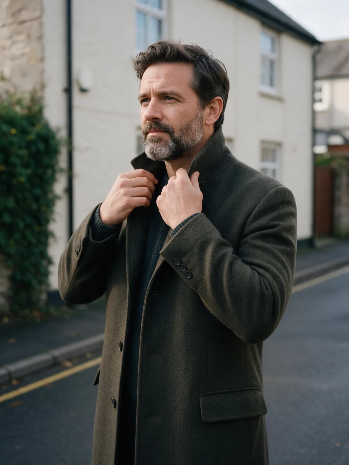
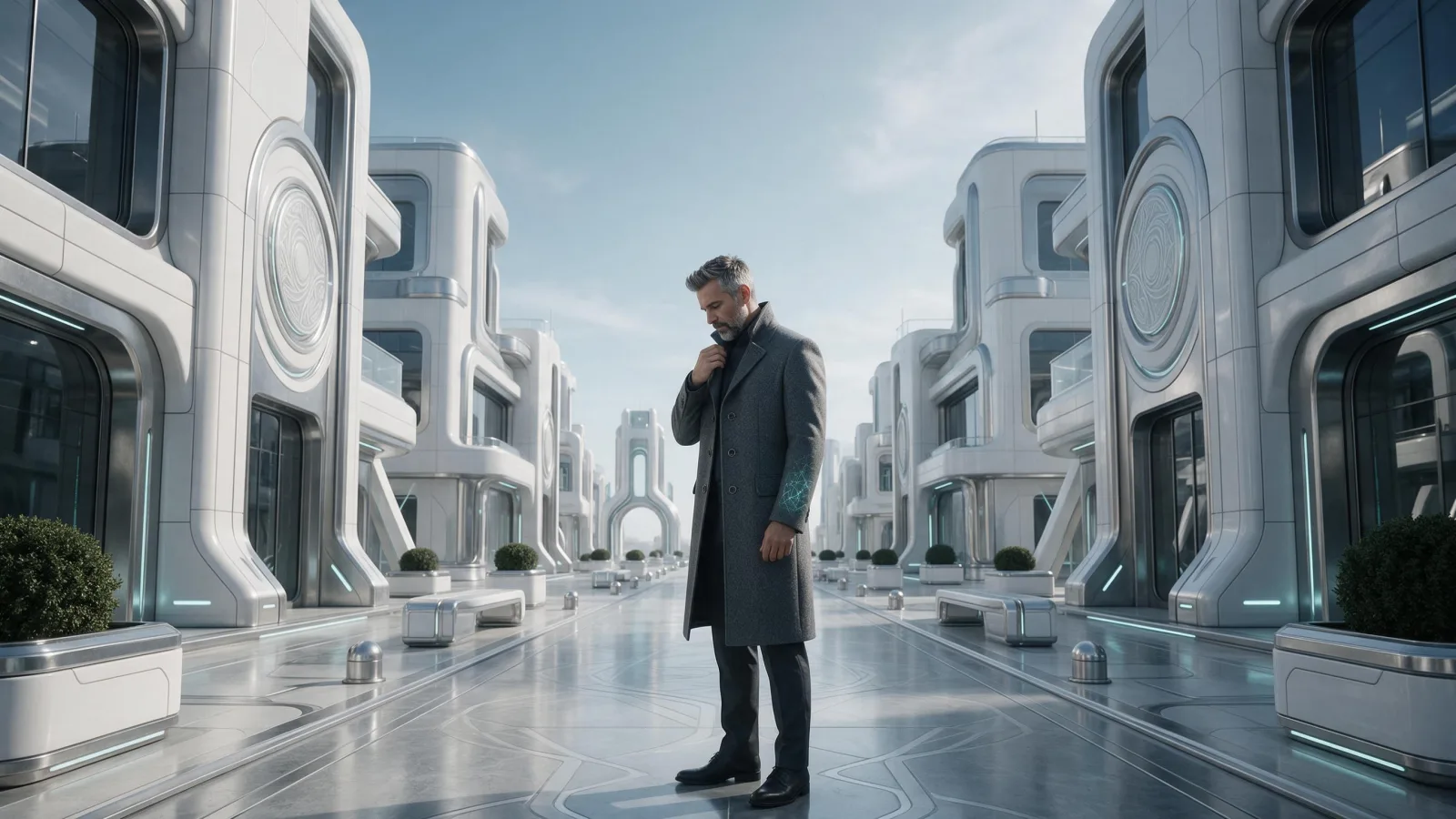
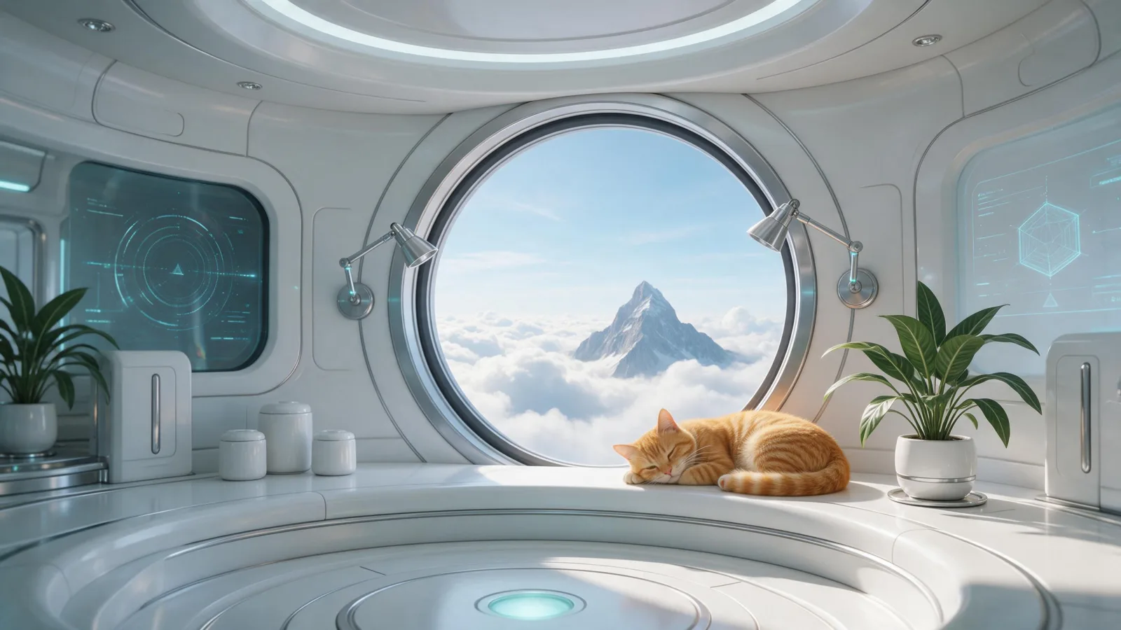
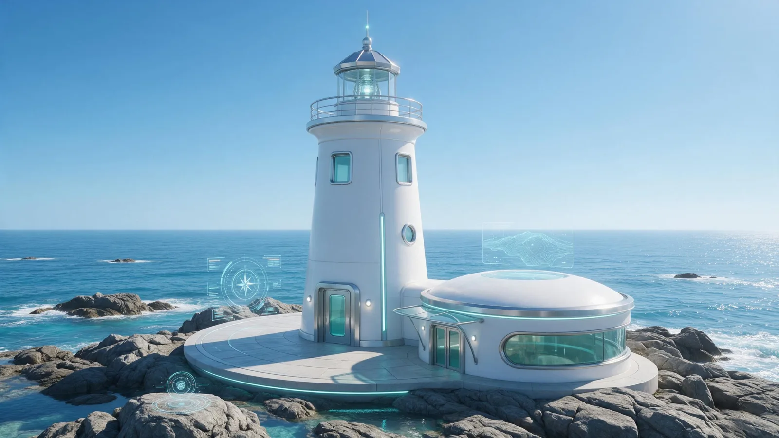
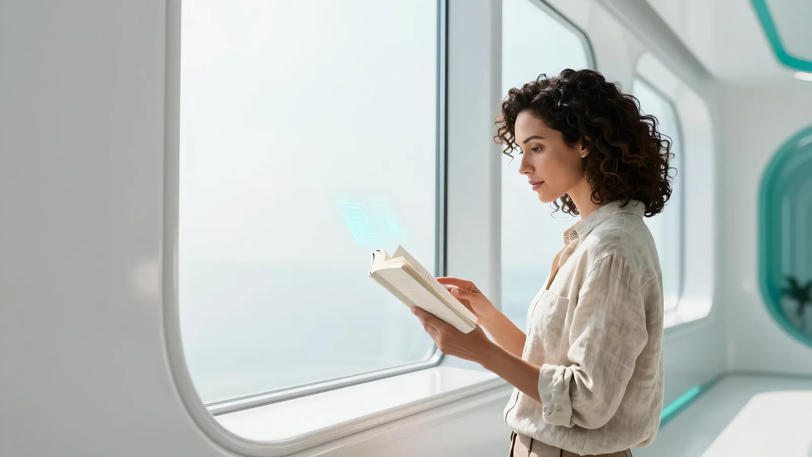
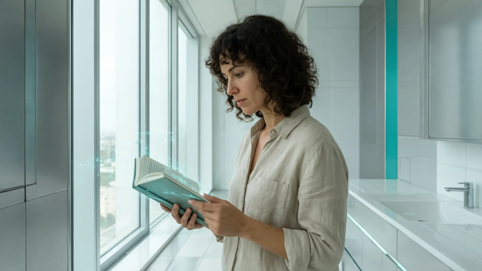
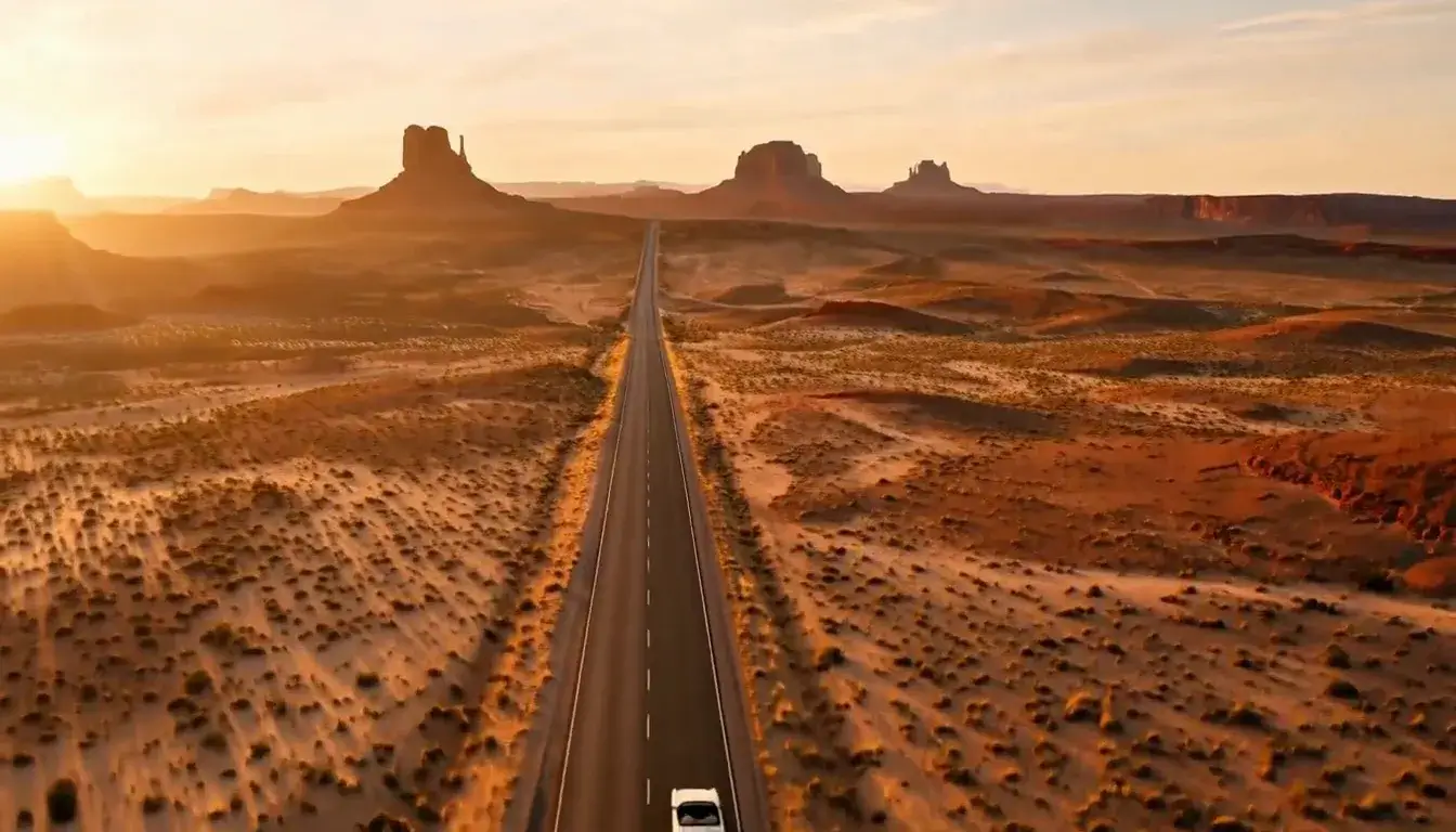
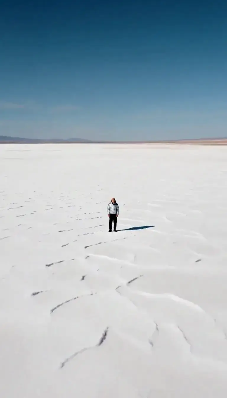
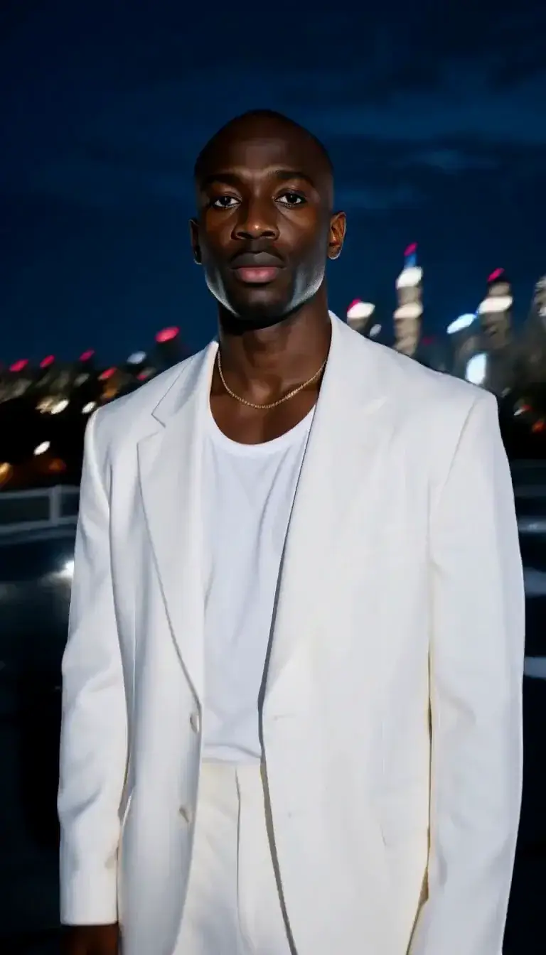
Chrome Future is a daylight take on cyberpunk: instead of rain and neon, a clean, bright, optimistic future. Brushed chrome and white ceramic surfaces, subtle holographic interfaces catching the sun, cool teal accents and architecture so precise and symmetrical it looks designed by a single hand.
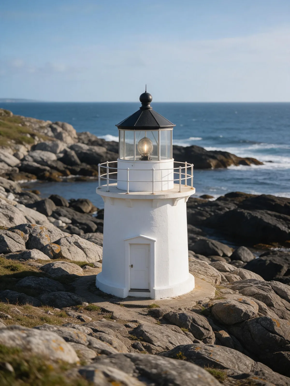
Write a subject and place it in tomorrow: a woman at a transparent workstation, a man waiting on a sky-bridge platform, a robot gardener tending a rooftop, a cat on a floating shelf, a lighthouse rebuilt as a chrome tower. The style keeps everything calm and premium rather than gritty.
Use it for tech brands, product launches, architecture and interior concepts, keynote visuals and science-fiction stories that do not want to look like every other neon city. The widescreen recommended frame suits banners and slides.
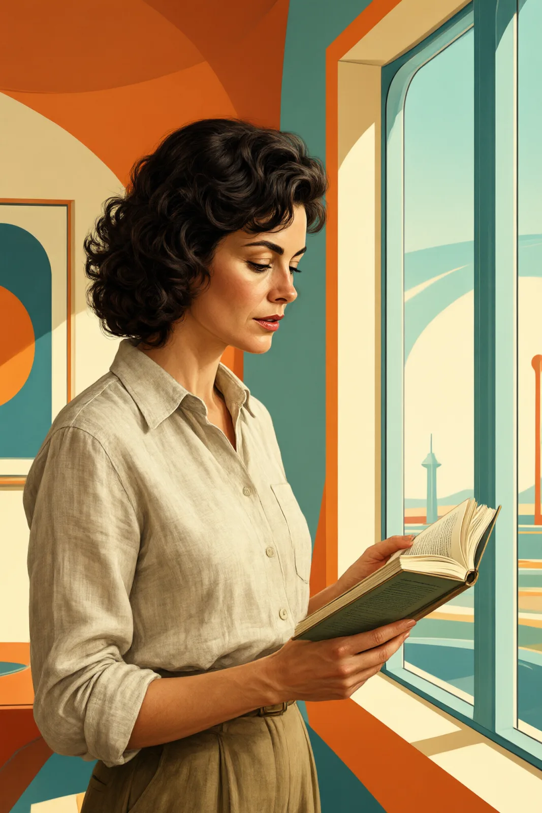
For a mid-century vision of the future, try Retro Futurism. This style works from text only: it draws a new image from your description and does not restyle uploaded photos.
It is also a smart choice when a brief says “futuristic” but the brand is calm, medical, financial or architectural: the look signals progress without any of the menace that neon and rain bring along. Keep people in light clothing and let the materials shine. Architecture concepts, pitch decks and product launches all benefit from its calm, confident mood.
Subjects to paste as they are: “a woman working at a transparent desk on a sky-bridge”, “a robot gardener tending plants on a white rooftop”, “a maglev train gliding into a glass station at noon”. Bright light, clean surfaces and one futuristic object are enough to set the scene.
Finishes that work on top: Soft Bloom adds glow to the holographic details, Film Grain gives it the texture of a film set. Golden Hour is disabled because warm low sun fights the cool daylight look.