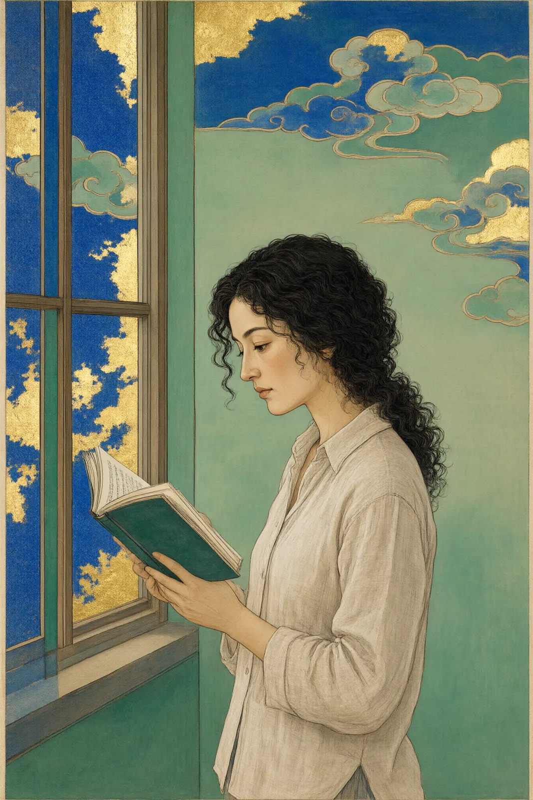
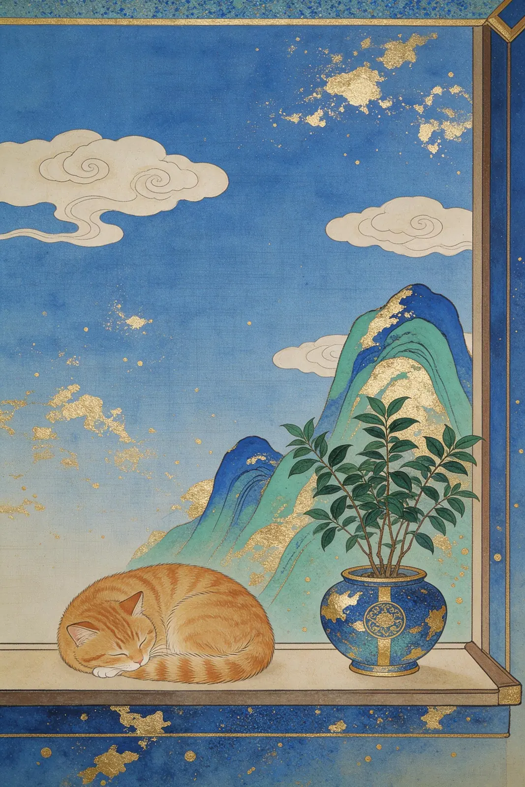
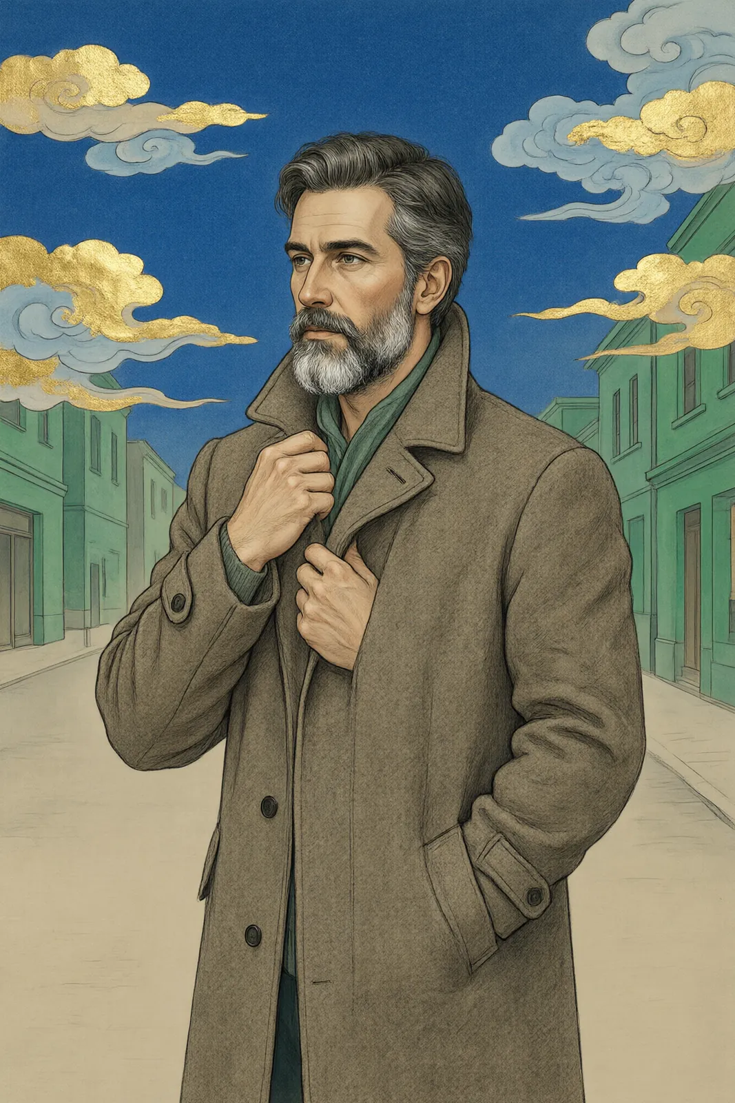
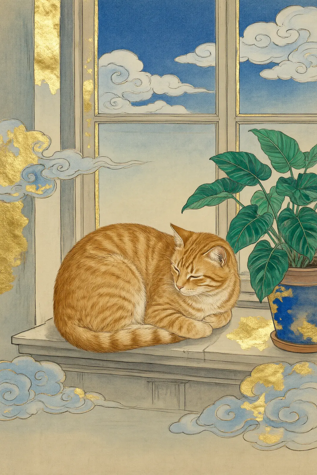
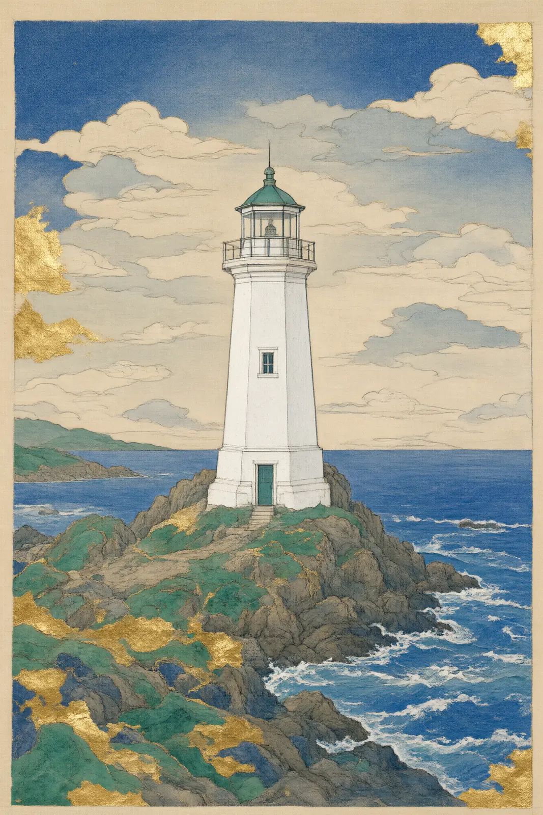
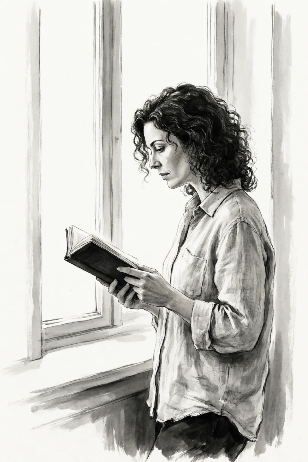
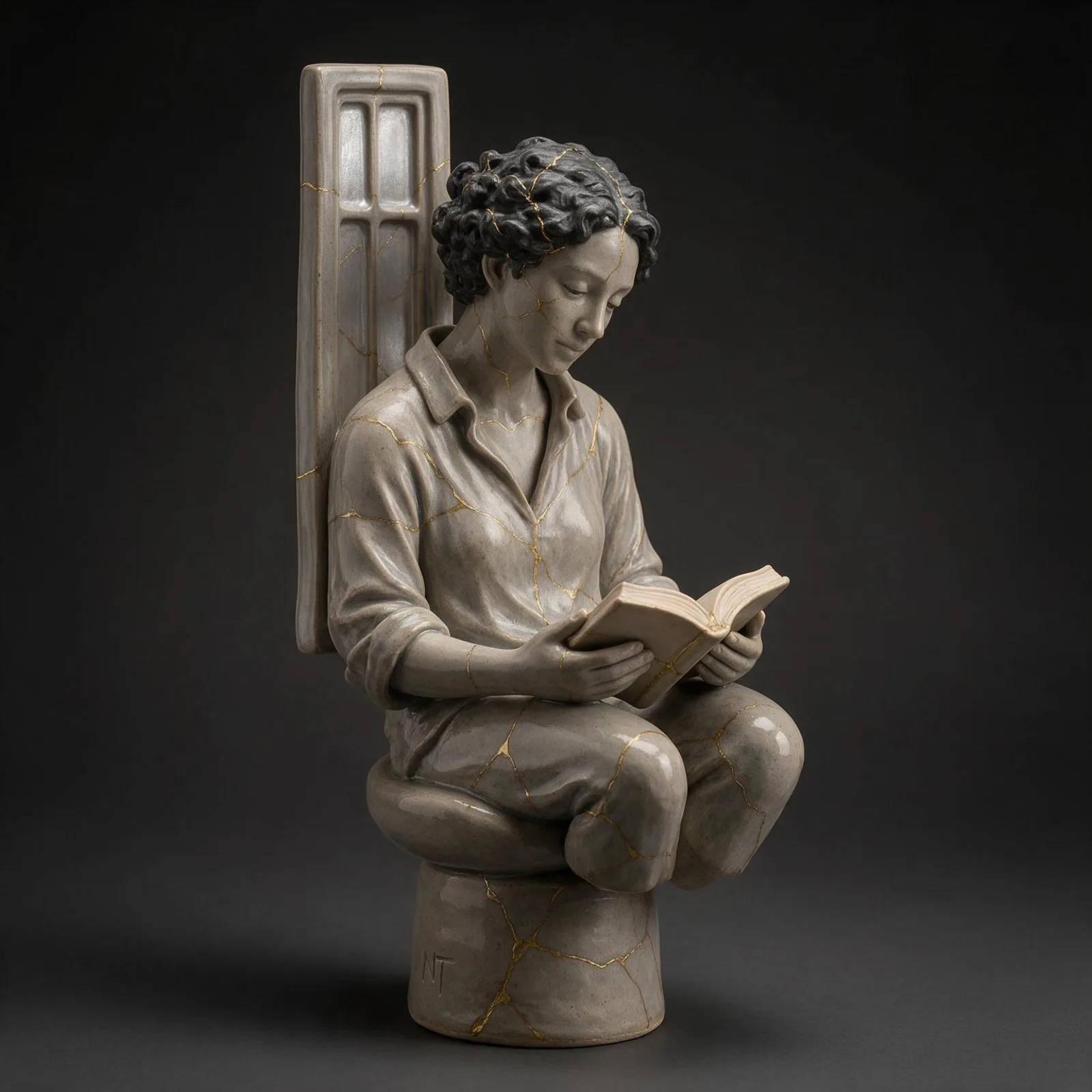
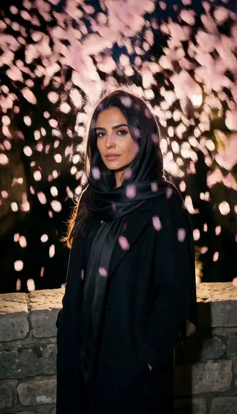
Nihonga Gold paints your subject the way Japanese-style painting on silk is made. Ground mineral pigments sit slightly granular on the surface — deep azurite blue, malachite green — patches of hammered gold leaf catch the light, and fine ink contour lines hold every shape. Clouds turn into flat, stylized bands, and the composition leaves calm open ground around the subject instead of filling every corner.
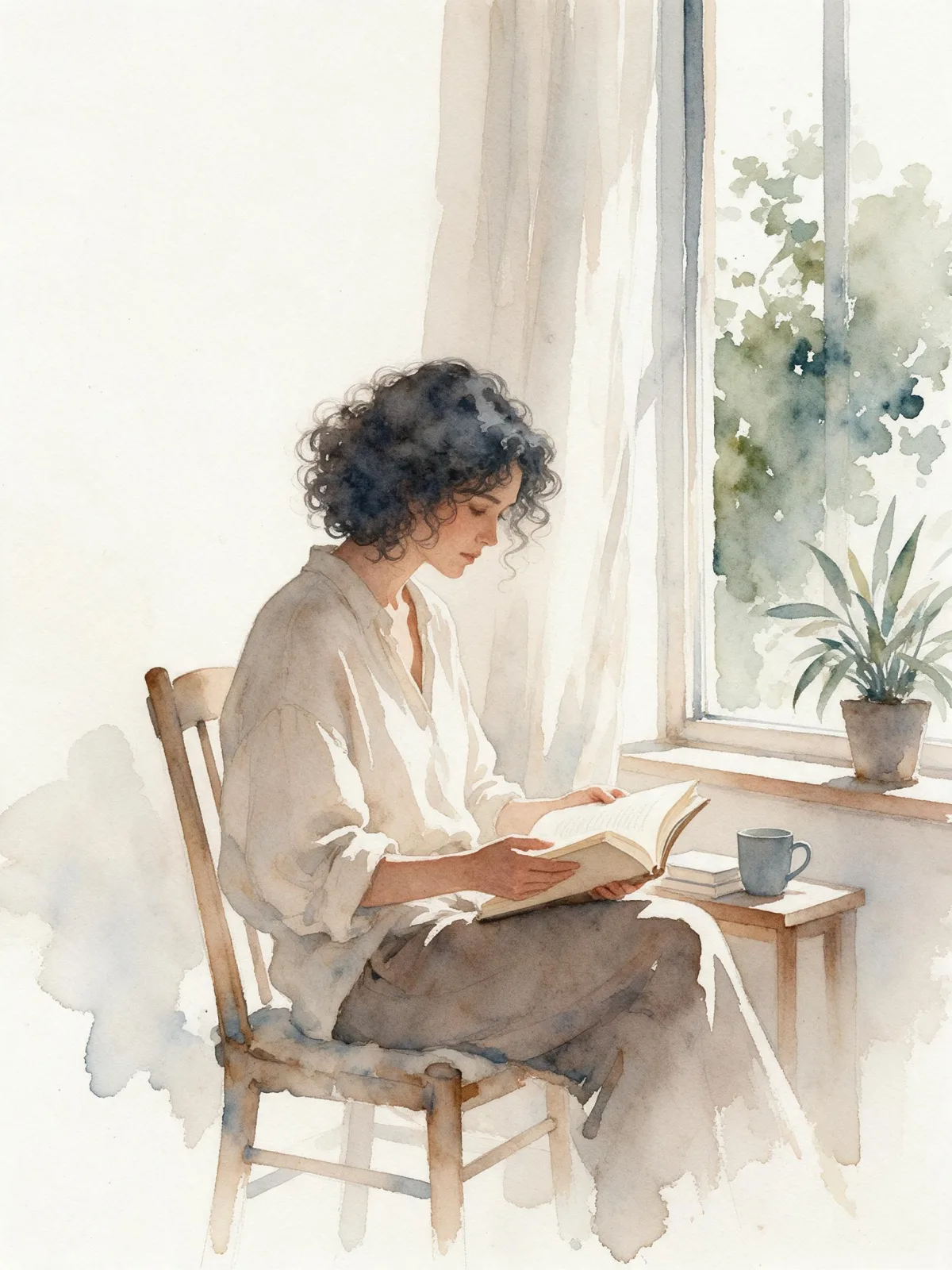
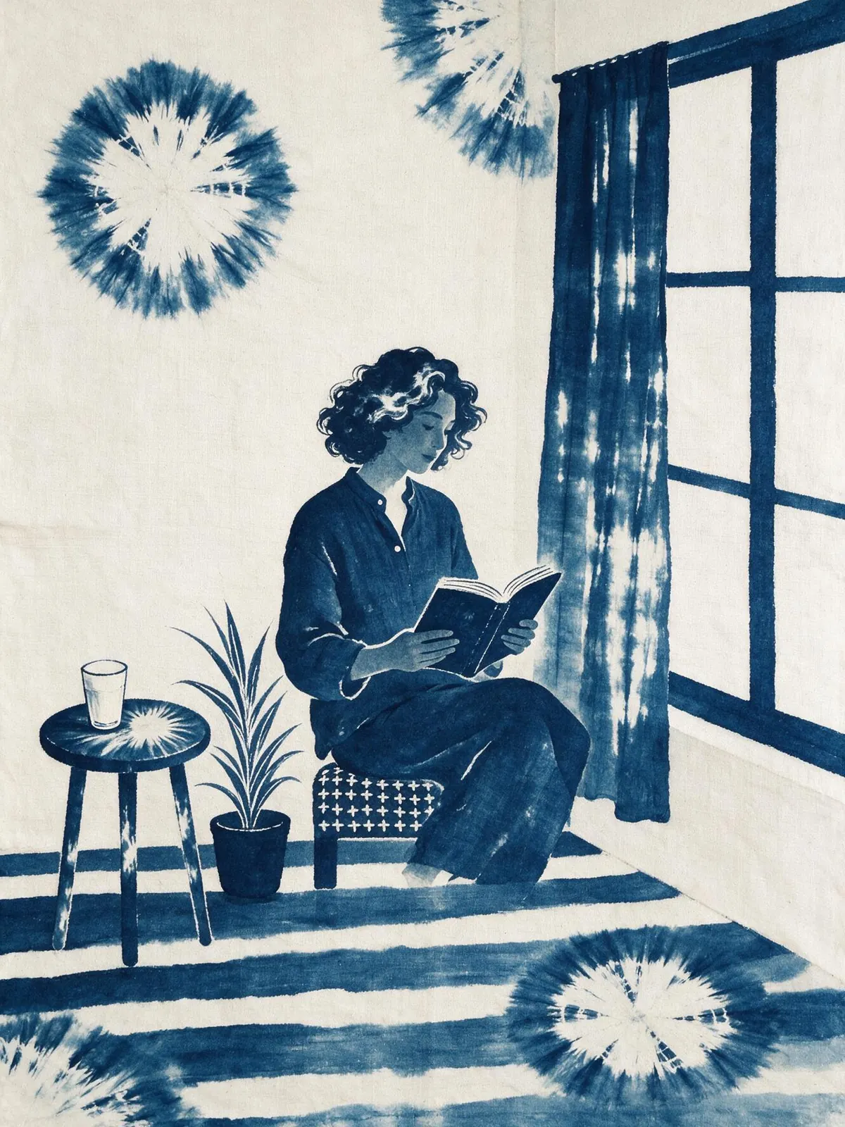
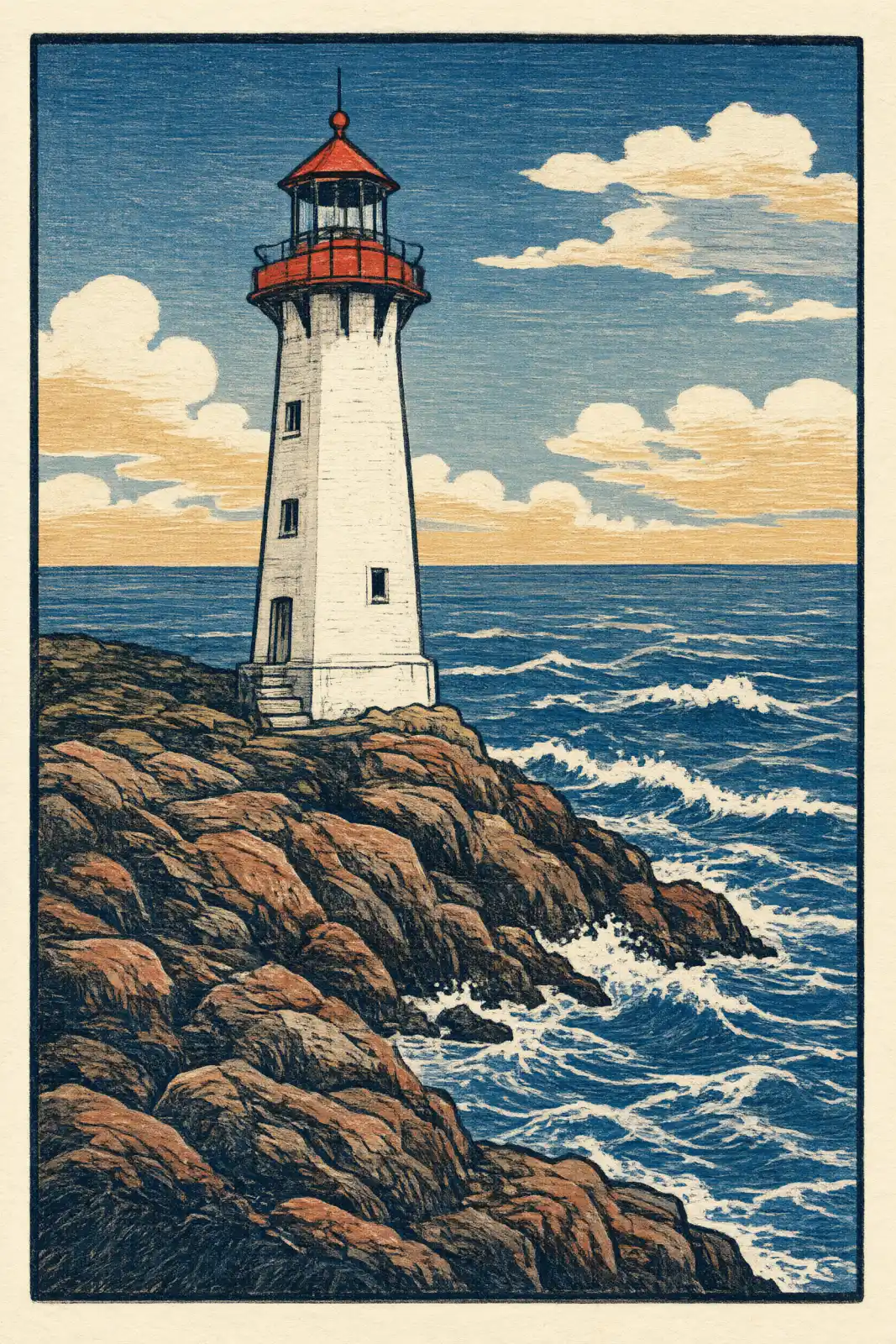
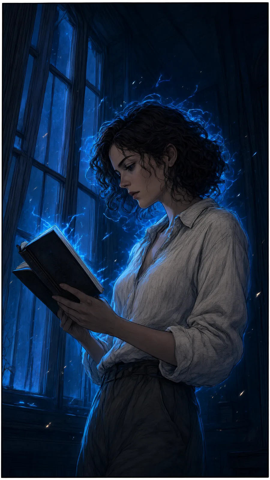
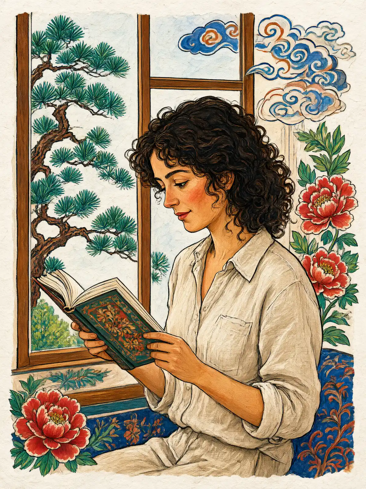
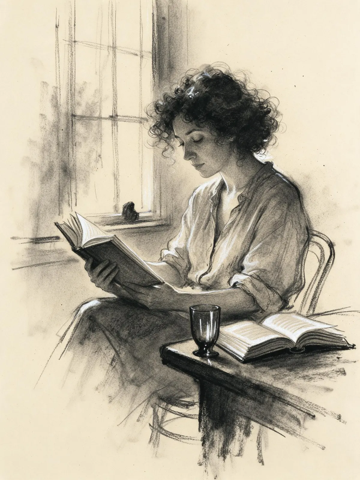
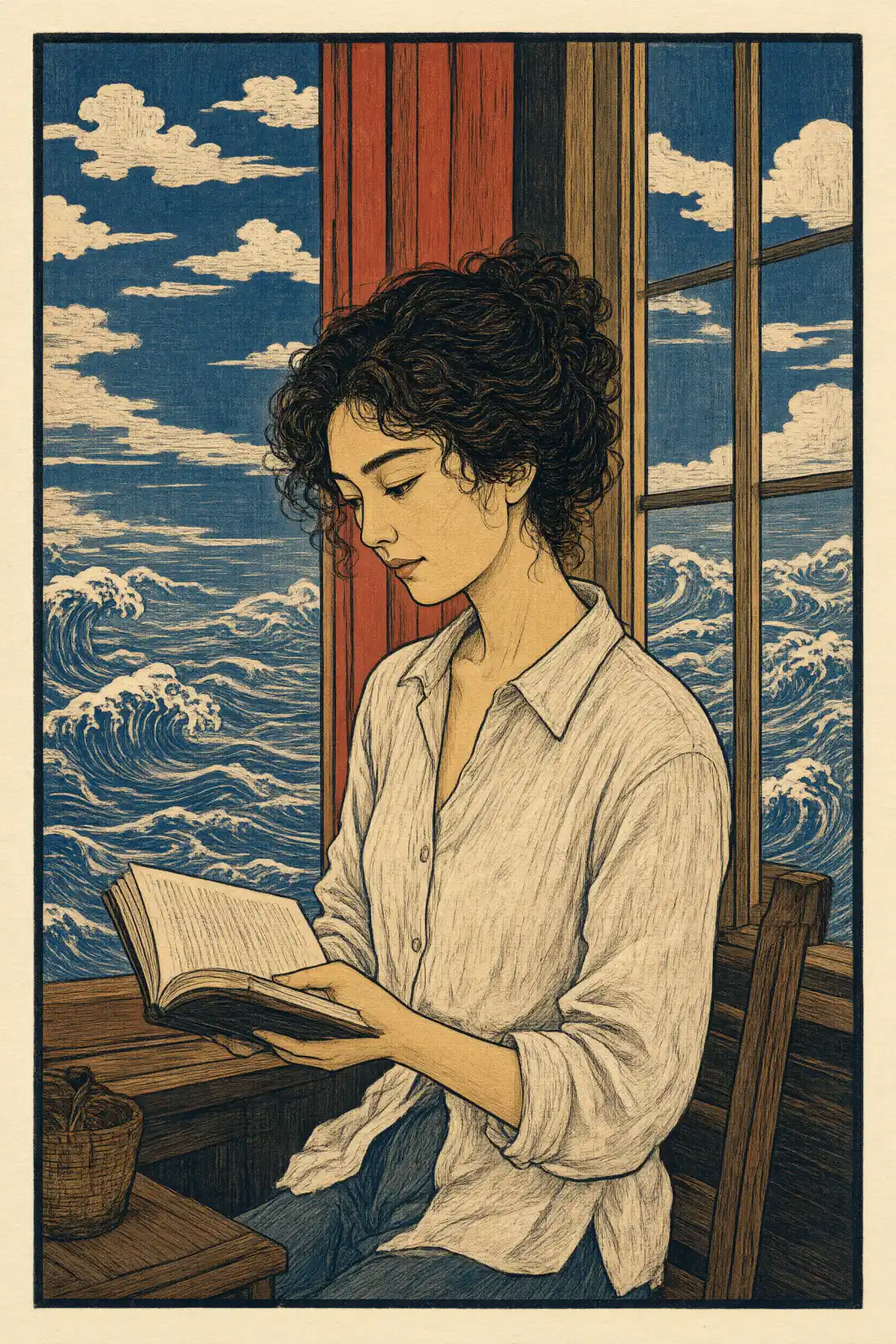
You write the subject; the style lays down the pigment. A person reading by a window becomes a quiet figure in a decorative interior, a cat on a sill turns into a small treasure framed by gold clouds, and a lighthouse on a rocky coast reads like a panel from a folding screen. It is at its best with one clear subject and a simple setting, because the gold and the open ground need room.
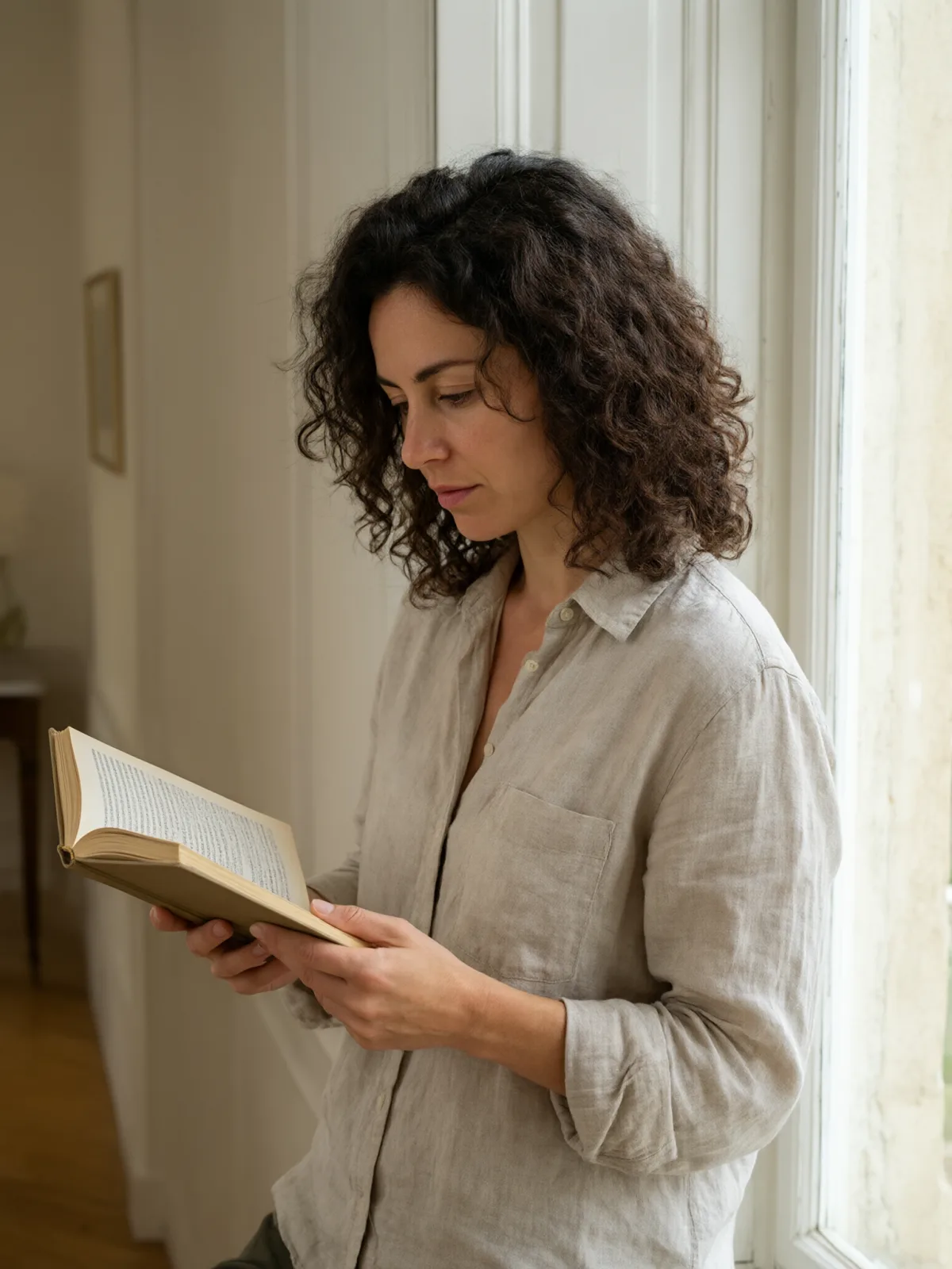
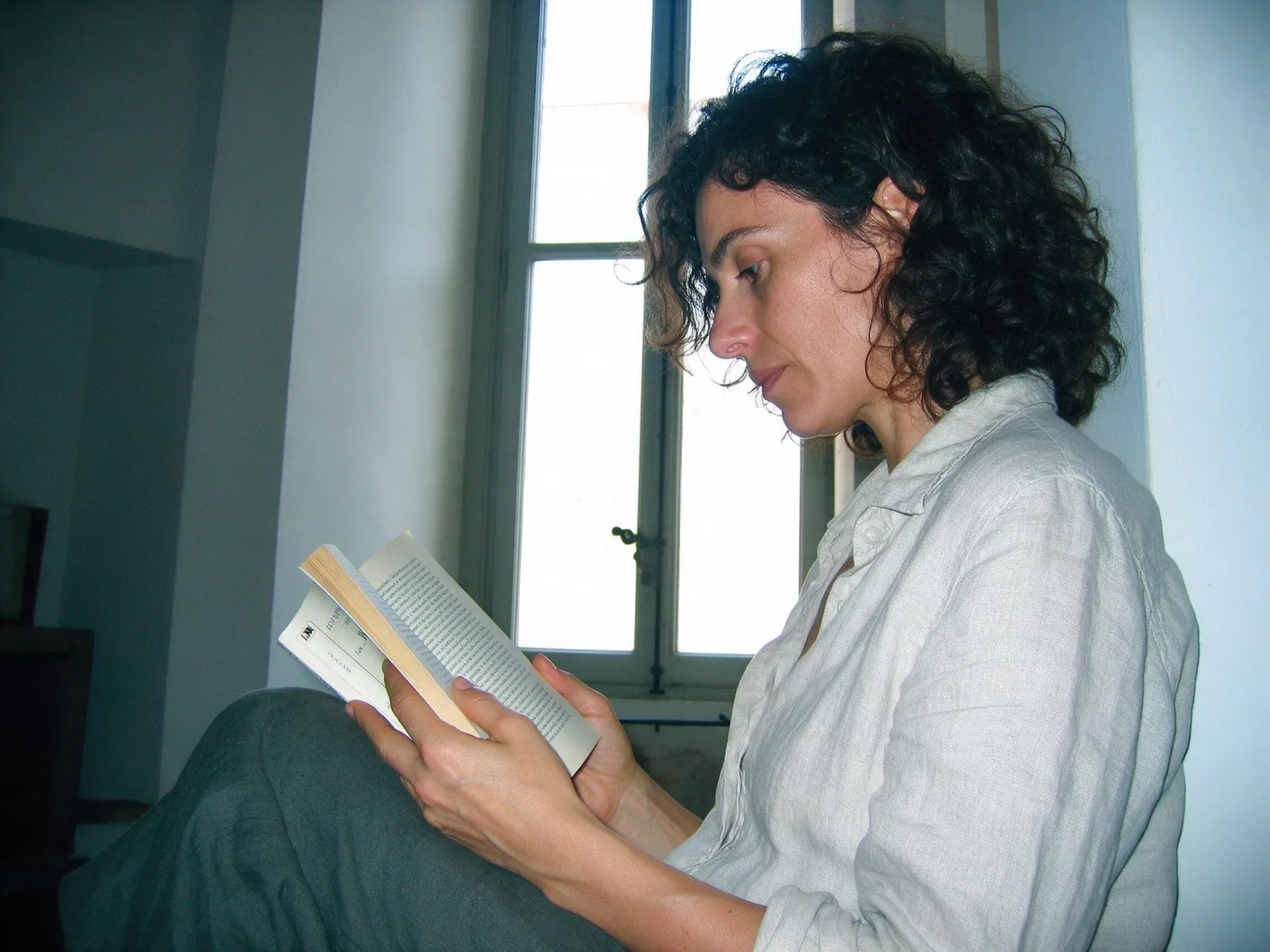
Use it for wall art, book covers, tea and ceramics branding, seasonal greetings and album artwork that should feel precious rather than loud. For this composition, we recommend 2:3, with 3:4 as another framing option. This style is text-to-image only: when we tried it on an uploaded photo, the person stayed photographic and only the background or the clothes changed, so describe your subject in words instead. On the recommended model faces keep their natural color; some faster models let the blue-green palette wash over everything.
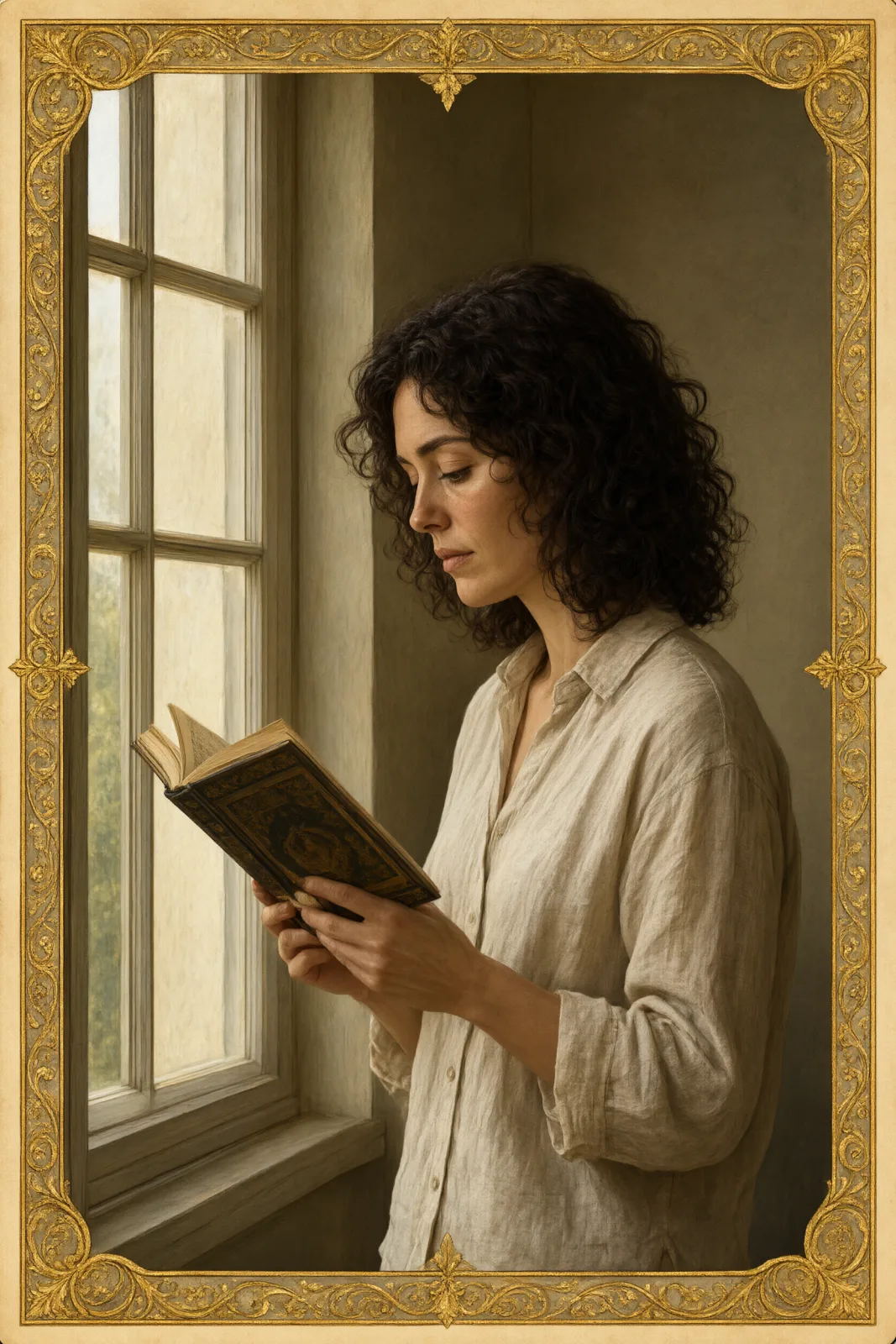
Subjects to paste as they are: “a white heron standing in a shallow river”, “a woman in a long coat walking under autumn maples”, “two koi circling in a dark pond”. For black ink and empty paper, try Ink Wash; for carved flat color and patterned waves, Woodblock Tide; for gilded borders and symbols, Tarot Gilt.