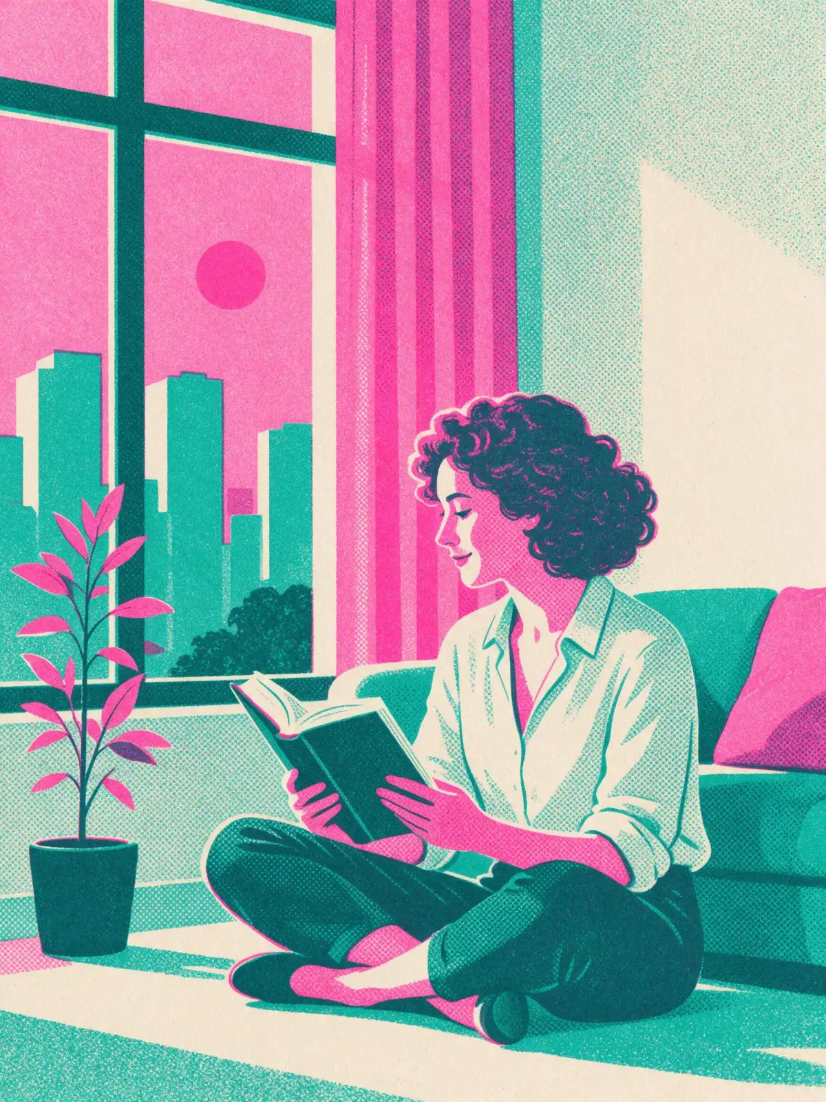
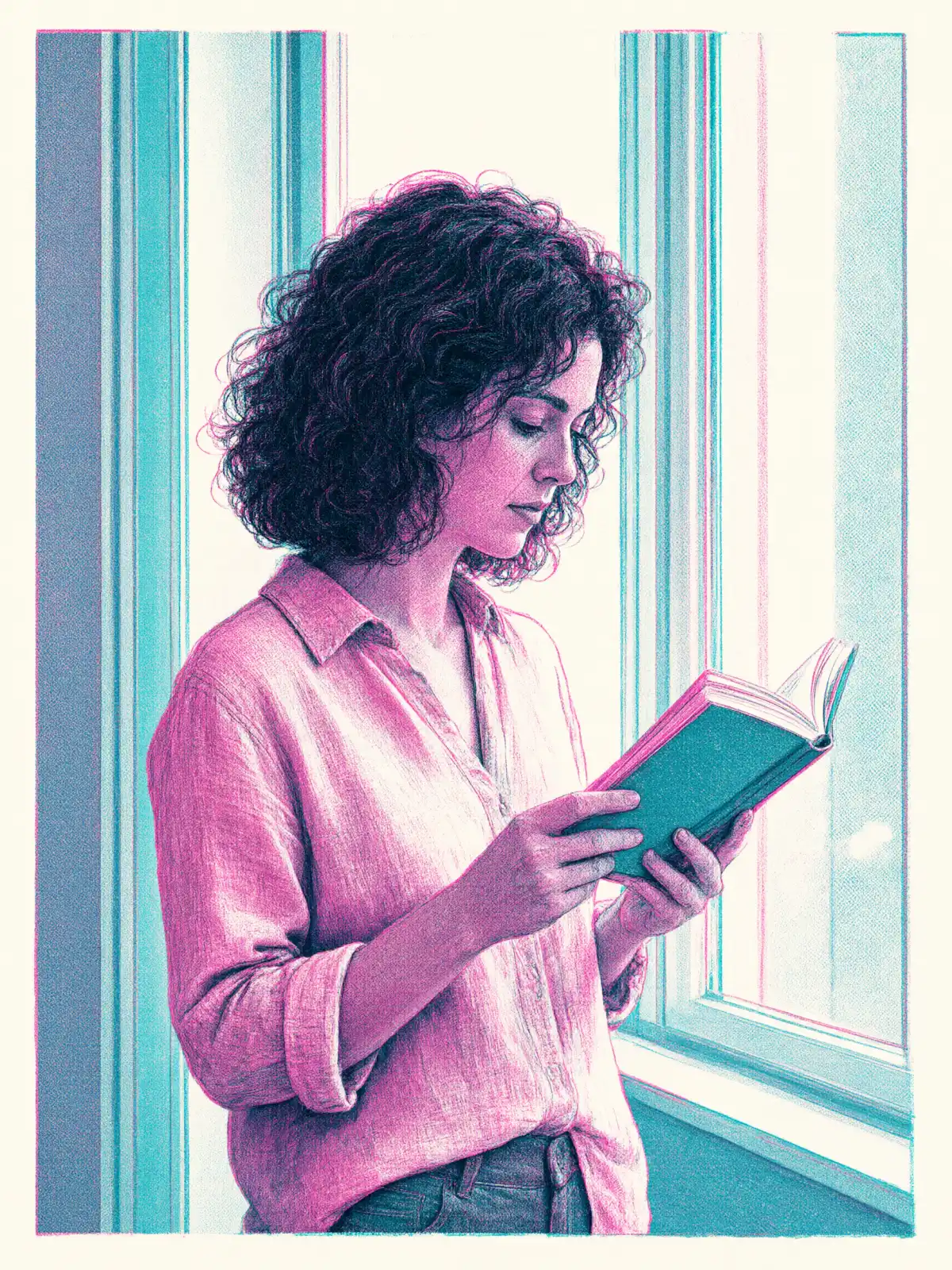
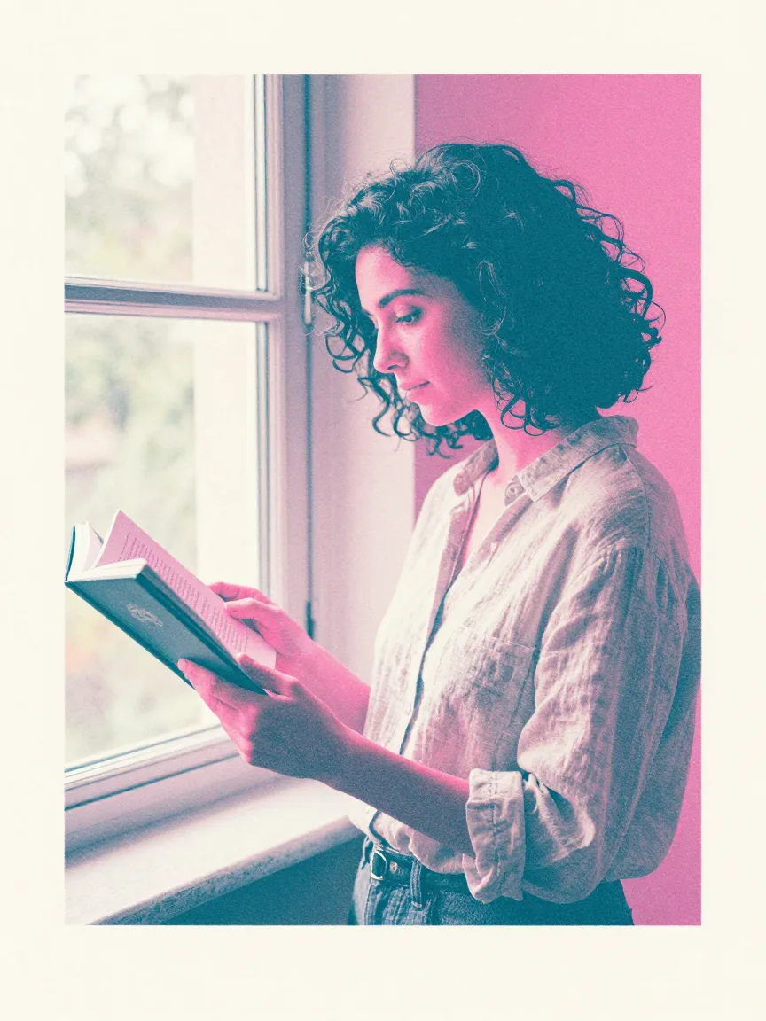
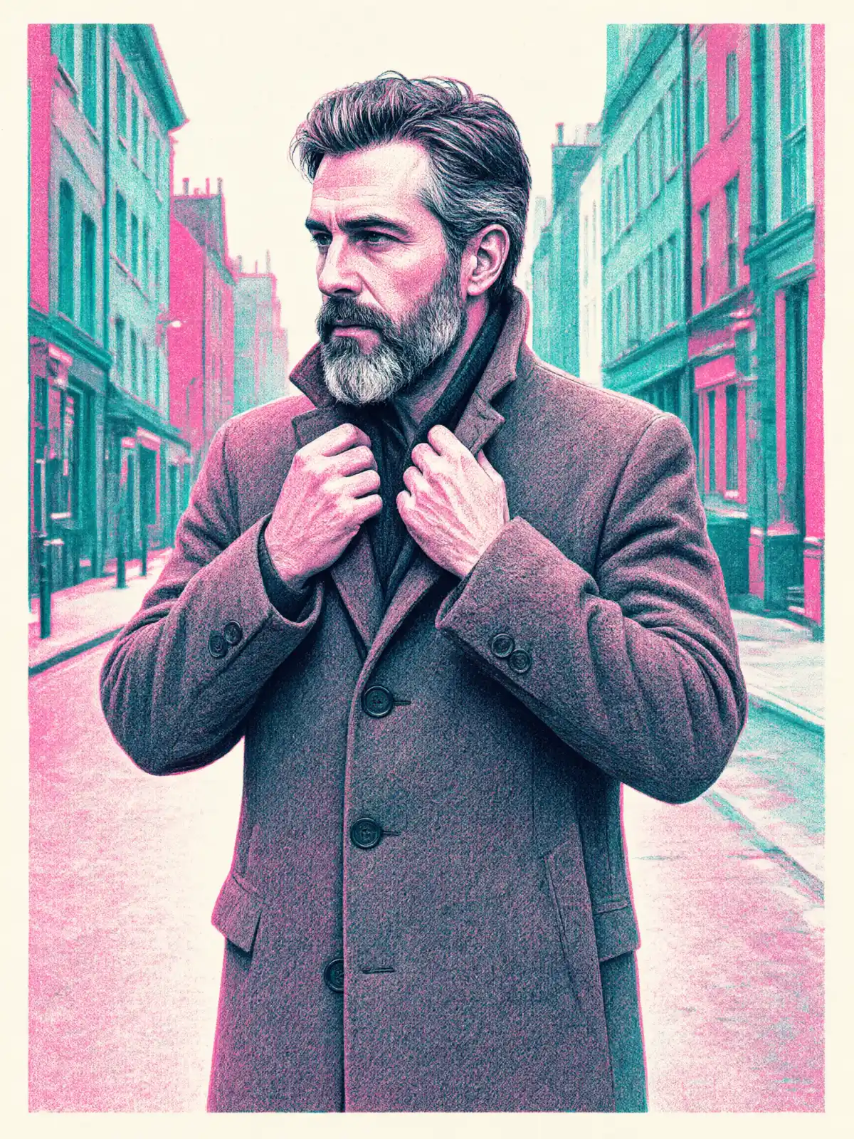
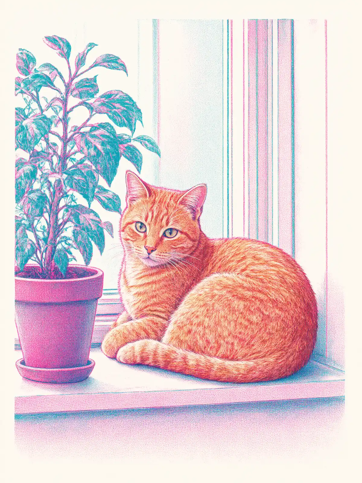
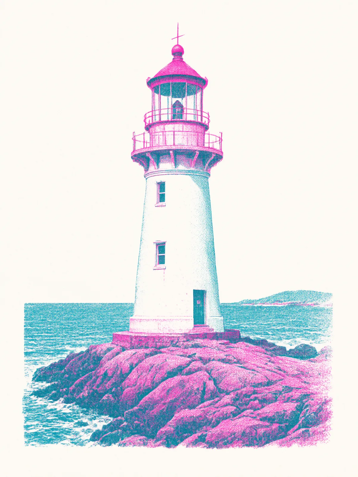
Riso Duotone prints your subject the way small presses and zine makers do: two inks only, fluorescent pink and teal, laid down as grainy halftone dots on off-white paper. The layers never line up perfectly — a thin sliver of pink peeks out beside the teal — and that slight misregistration is exactly what makes it feel printed by hand rather than made on a screen. Shapes are flat and graphic, and where the two colors overlap they mix into a deep, inky violet.
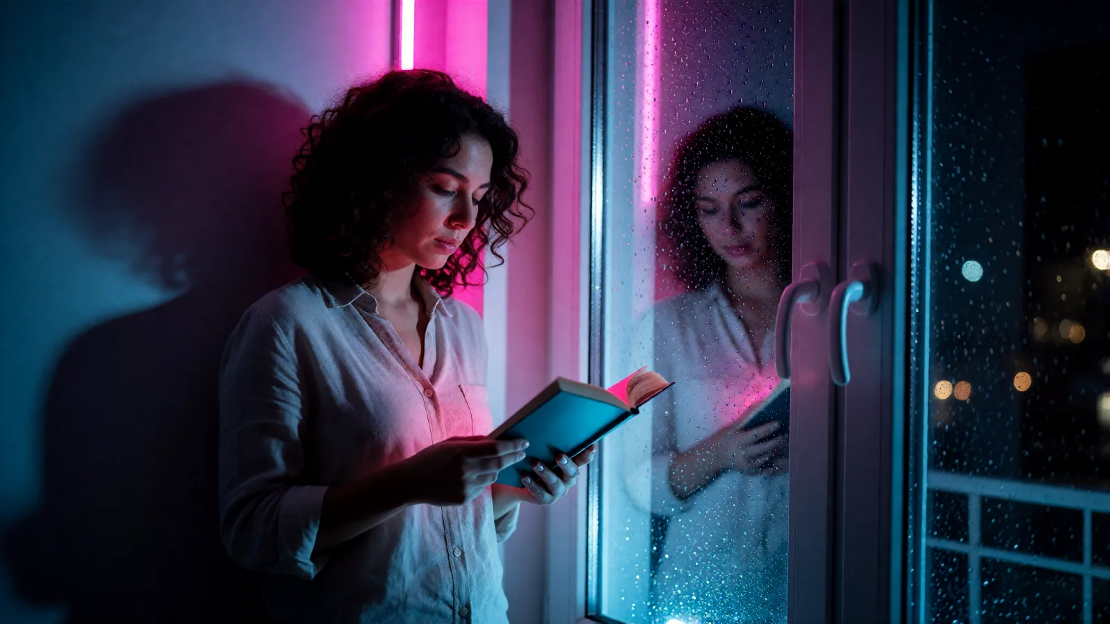
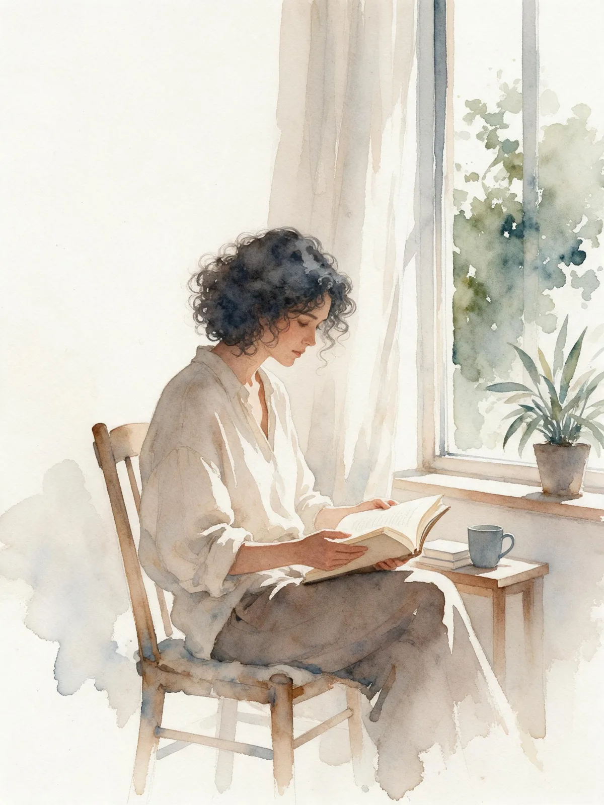
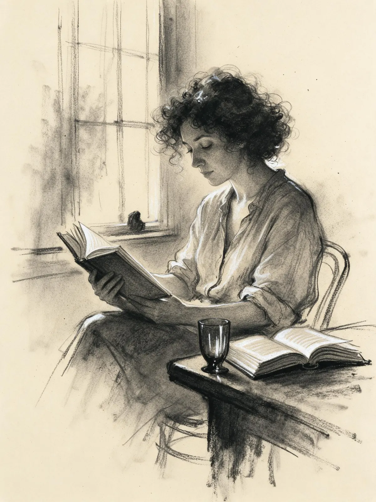
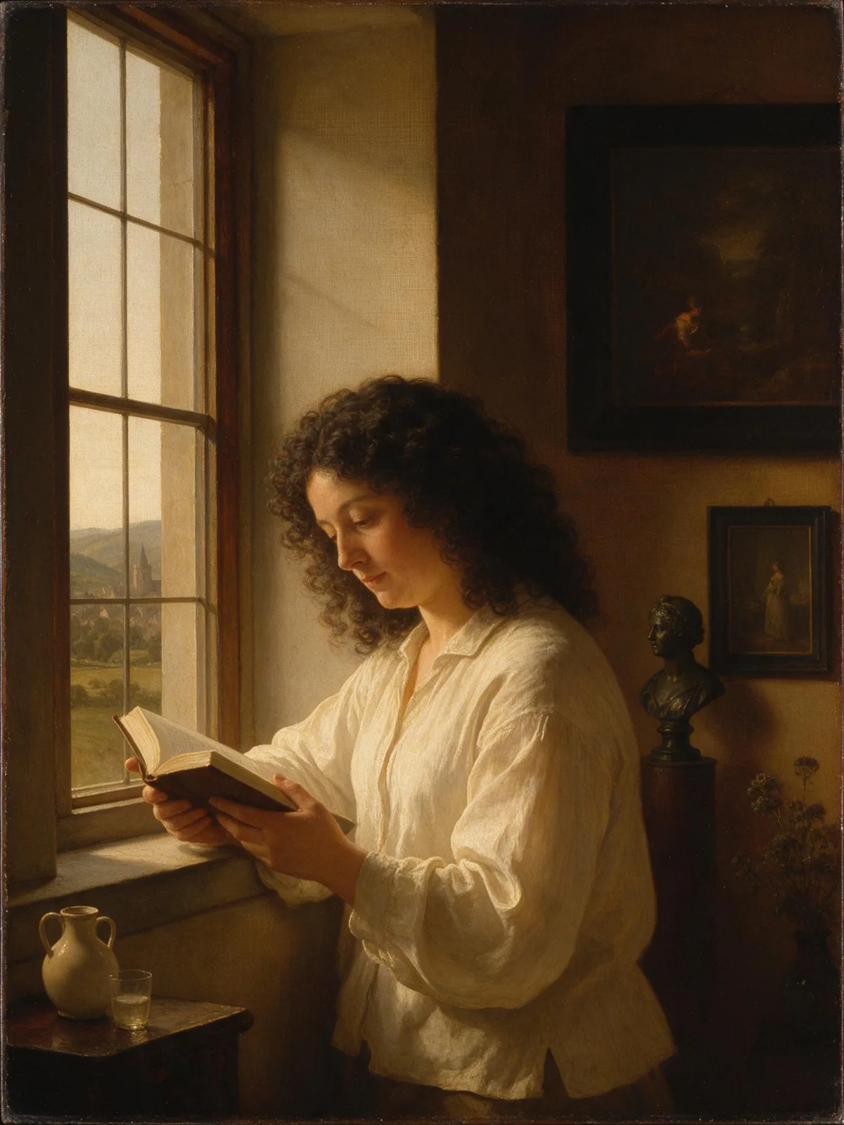
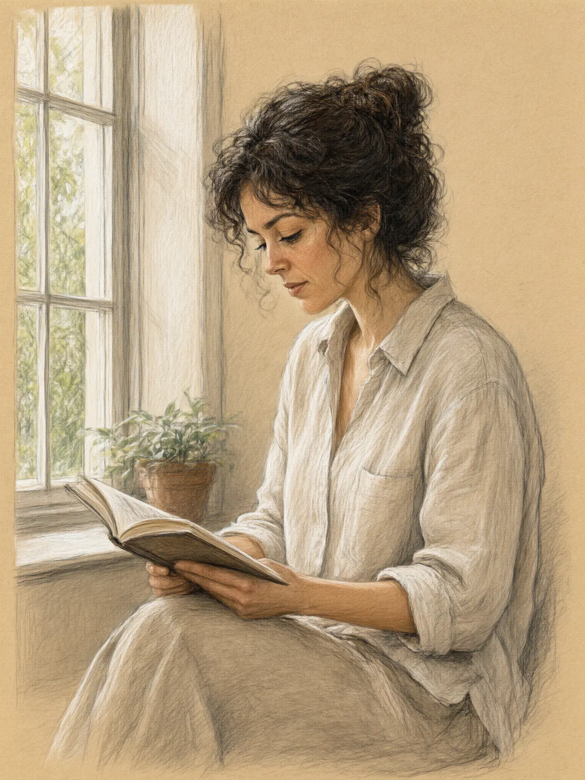
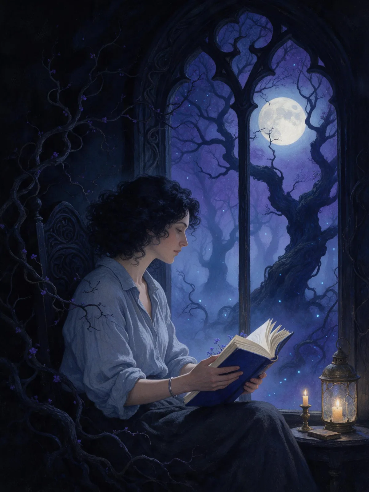
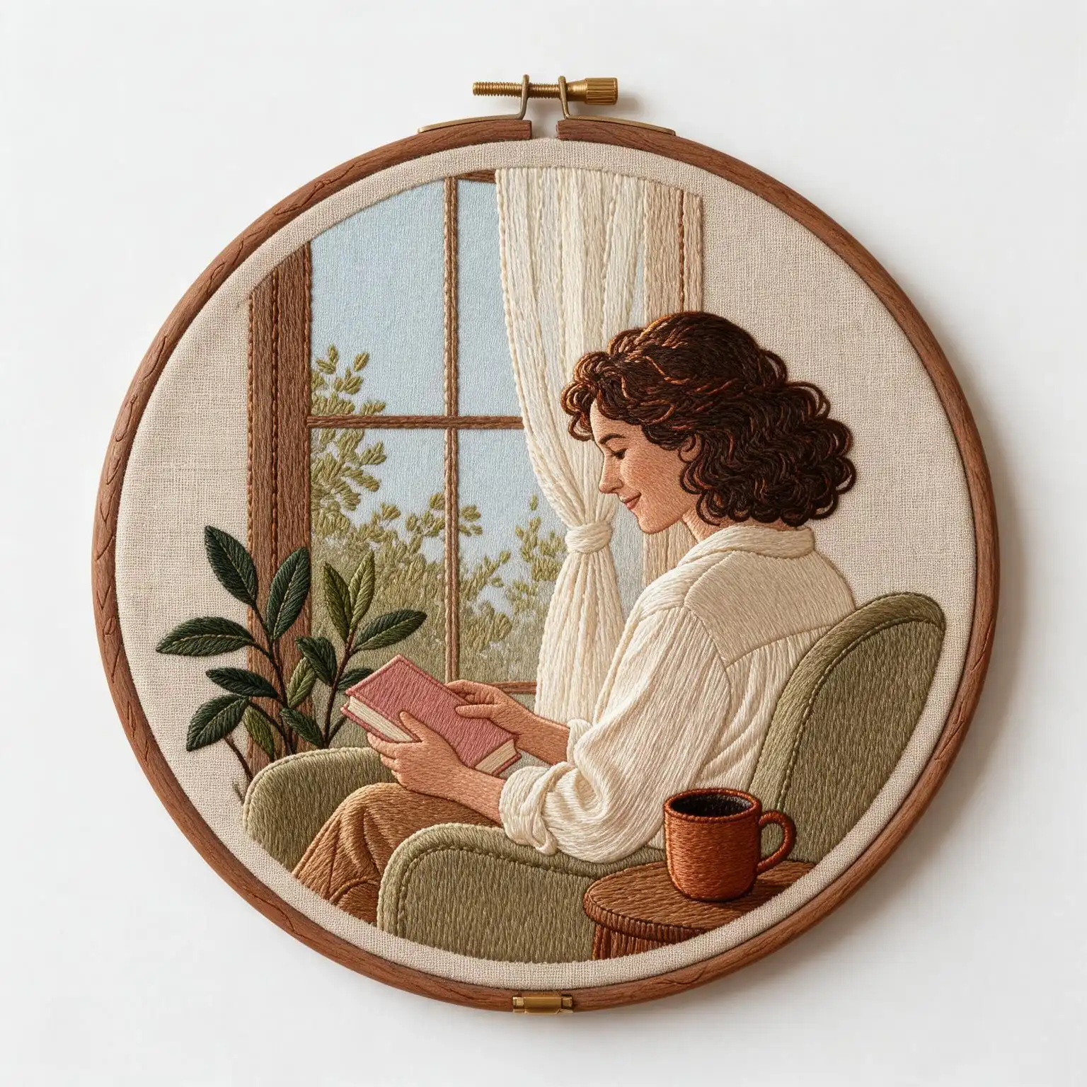
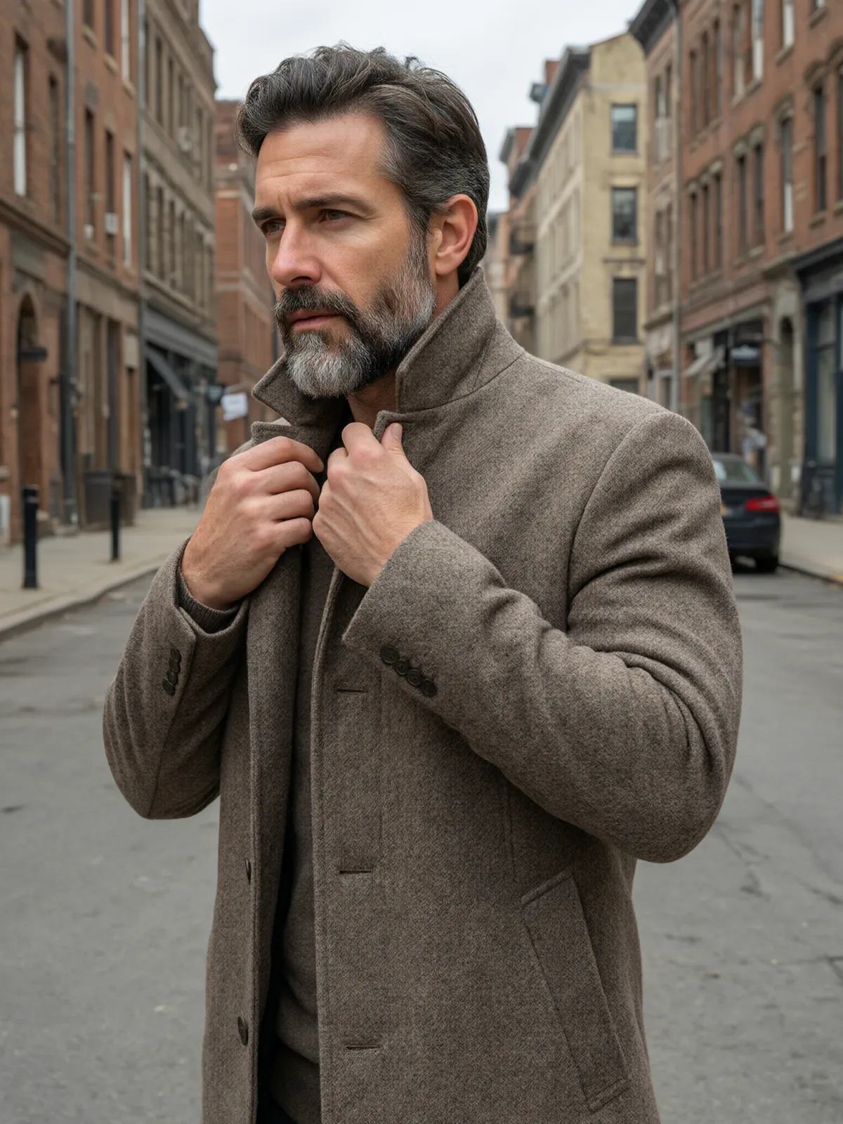
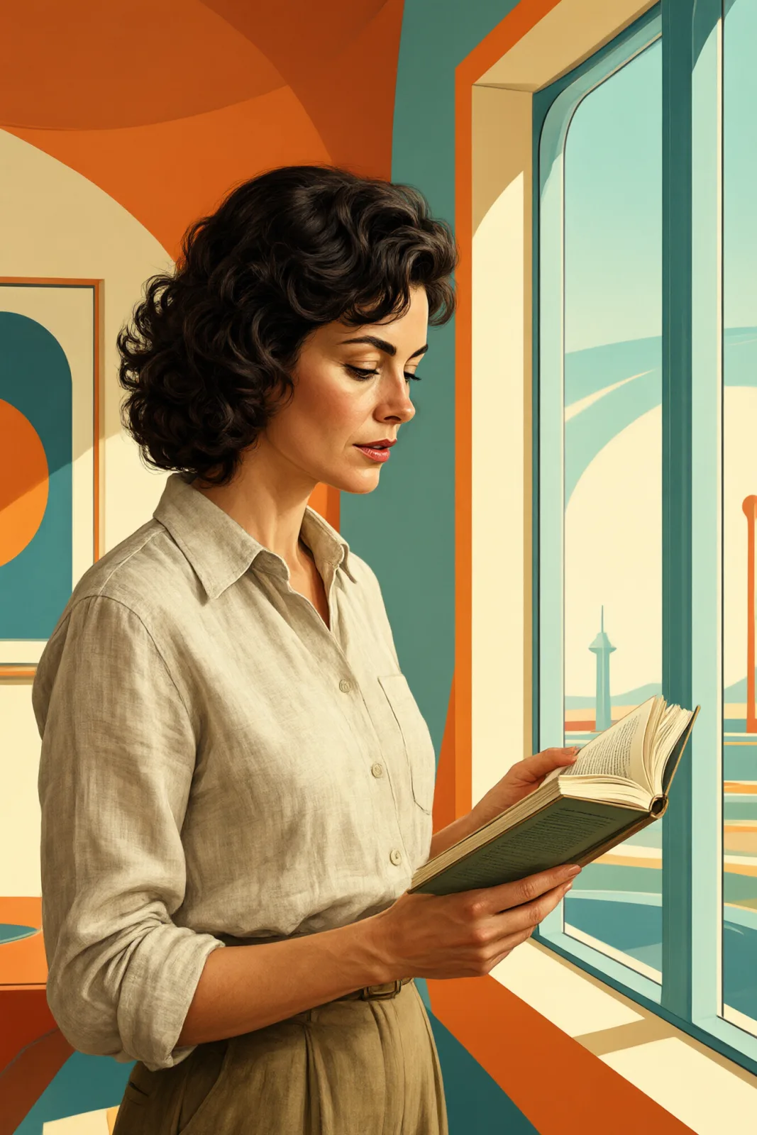
You write the subject; the style supplies the press. It flatters bold, simple compositions: a woman reading by a window, a man in a long coat on a city street, a cat curled up in the sun, a lighthouse on a pink rock above teal water. Plants, bicycles, coffee cups and city skylines all look great in two colors.
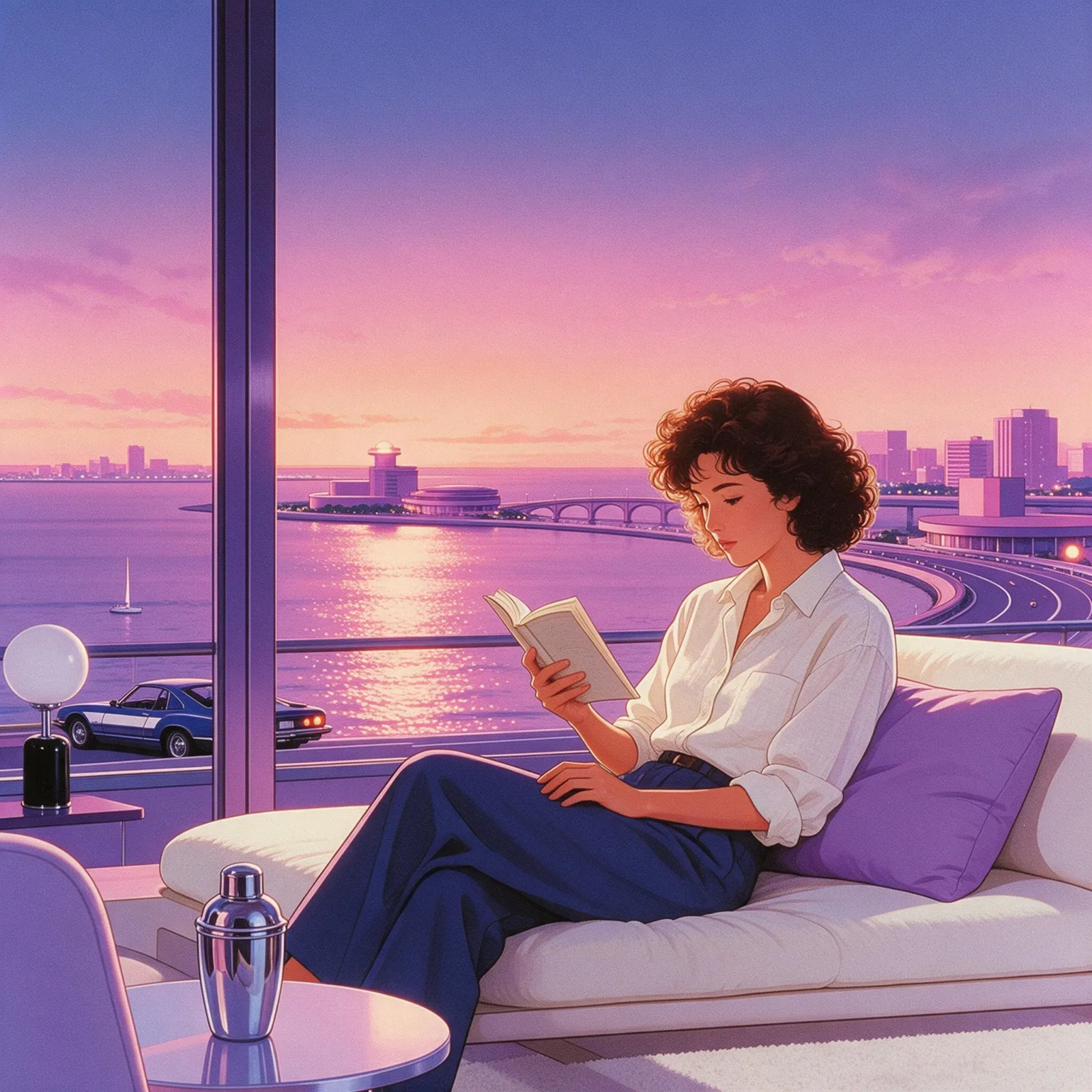
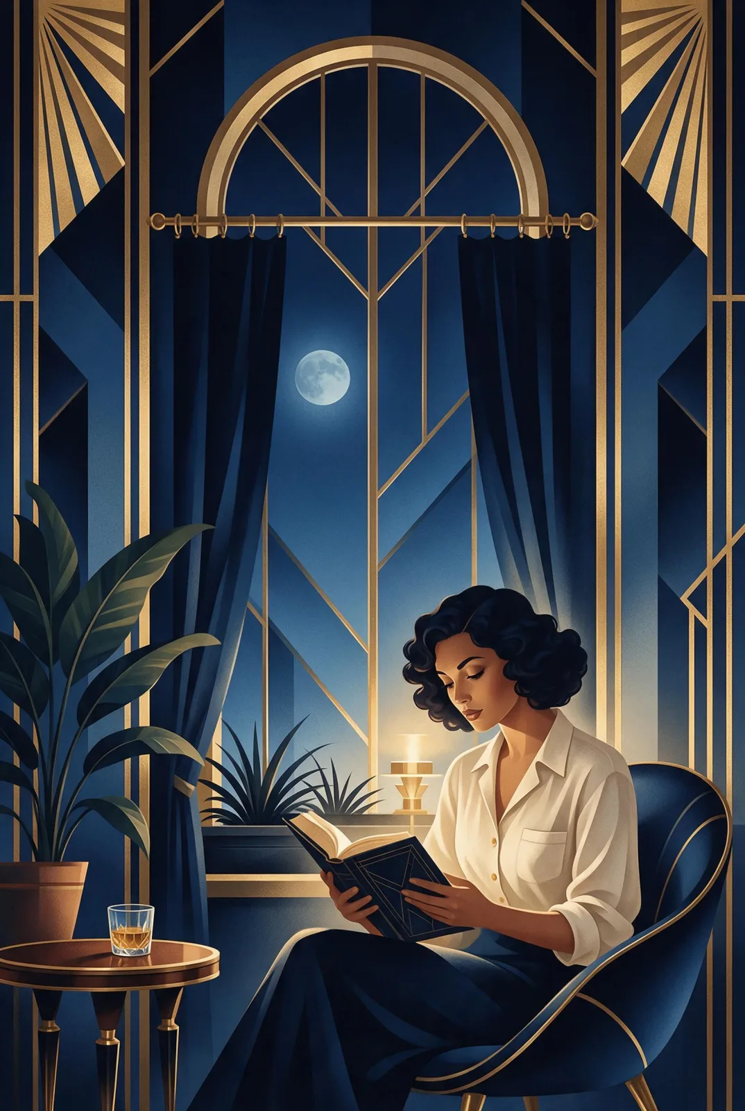
Use it for gig posters, zines, book and podcast covers, merch prints, tote bags, event flyers and bold social graphics. For 1970s space-age painting, use Retro Futurism; for neon-pastel 1980s illustration, City Pop Dusk; for gold-and-navy poster glamour, Deco Nocturne.
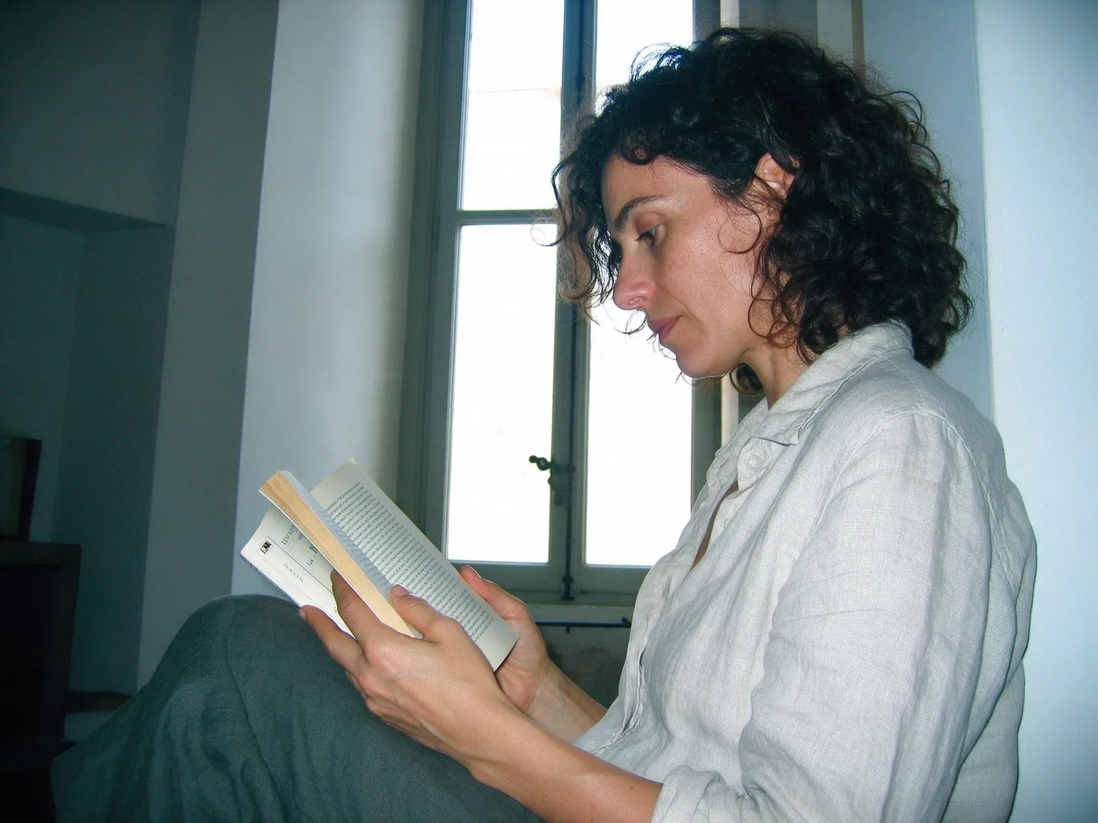
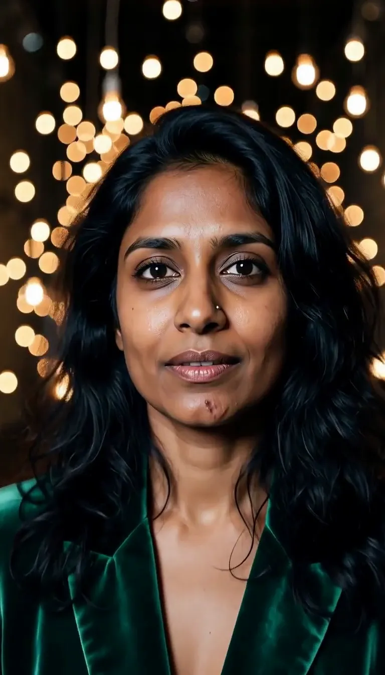
For this composition, we recommend 3:4, with 2:3 as another framing option. Riso Duotone also works on an uploaded image: in image-to-image mode it reprints your photo as a two-color risograph with grain and slight misregistration, and keeps the composition, pose and clothing unchanged. Photos with strong shapes and simple backgrounds print best.
Subjects to paste as they are: “a woman riding a bicycle past a row of palm trees”, “a stack of books and a coffee cup on a windowsill”, “a man reading a newspaper on a park bench”. Two or three clear shapes are enough; the inks do the rest.
Finishes that work on top: Film Grain for an even rougher print. Monochrome is switched off here, because the look is defined by its two colors.